All Latest 620 A/B Tests
Test #285 on
Ibood.com
by  Lukas Jorissen
Feb 27, 2020
Desktop
Product
X.X%
Progression
Lukas Tested Pattern #7: Social Counts On Ibood.com
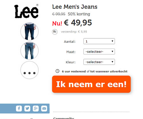
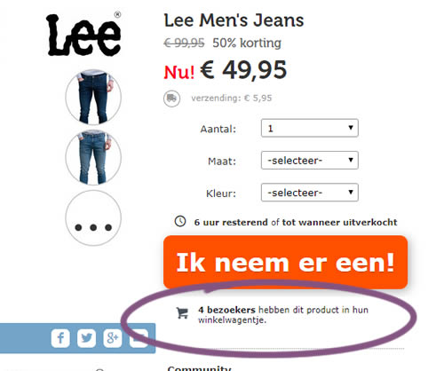
In this experiment, realtime social proof information has been added below an add-to-cart button. The variation shows how many users that have viewed, or placed a product into their basket. Translated to "4 visitors have this product in their shopping cart."
Which A Or B Actually Wins? Find Out Before You Test.
Members see every test result — the winners, the flat ones, and the losers — along with exact effects and sample sizes. Use it to estimate your tests and prioritize by probability, not gut feel. Start every experiment with the odds on your side.
Test #284 on
Thomasnet.com
by  Julian Gaviria
Feb 19, 2020
Desktop
Mobile
Listing
X.X%
Progression
Julian Tested Pattern #78: Tags, Badges And Structured Information On Thomasnet.com
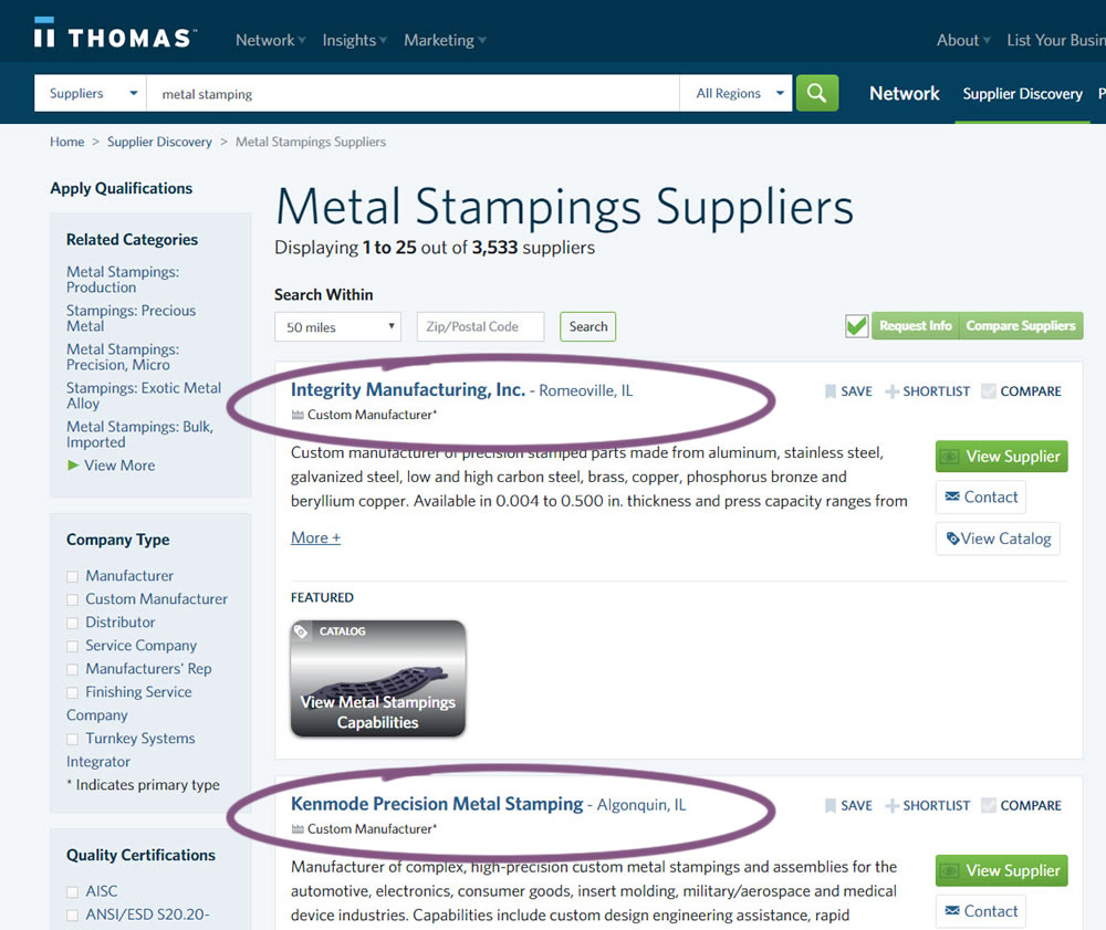
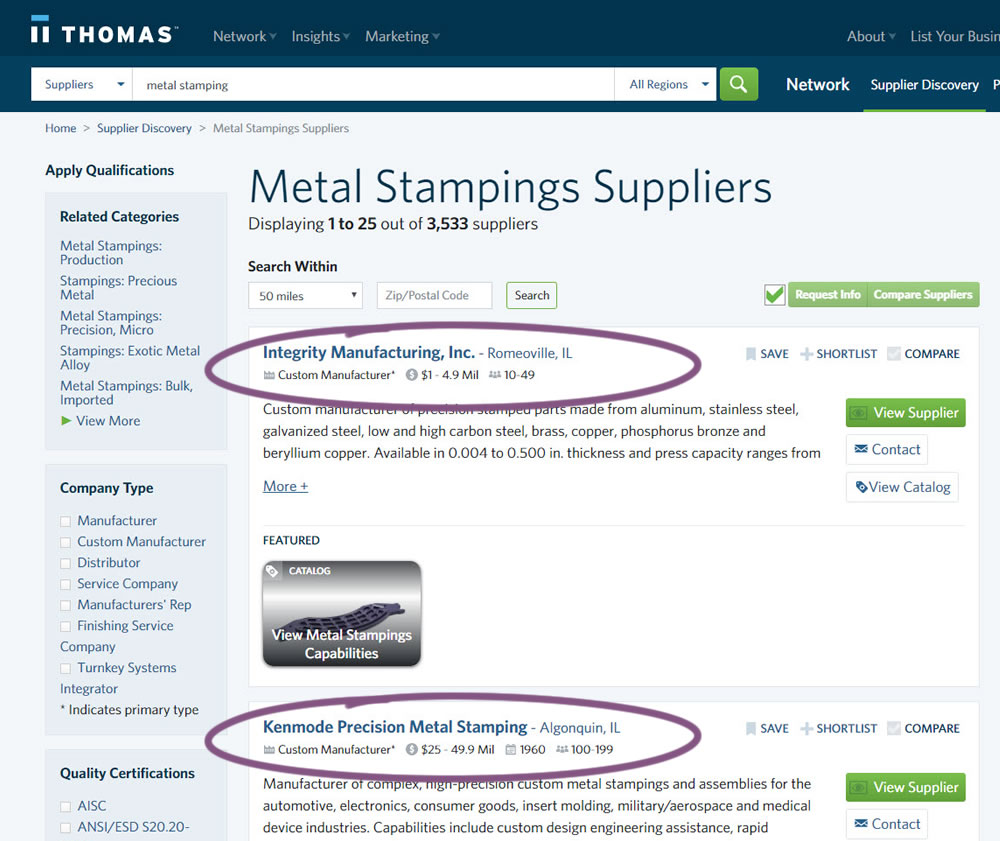
In this experiment, structured data tags were displayed on a listing page to help potential buyers make better decisions. The additional information about the listed companies included: annual revenue, employee count, and year of establishment.
Test #282 on
Thomasnet.com
by  Julian Gaviria
Feb 07, 2020
Desktop
Mobile
Listing
X.X%
Progression
Julian Tested Pattern #51: Shortcut Buttons On Thomasnet.com
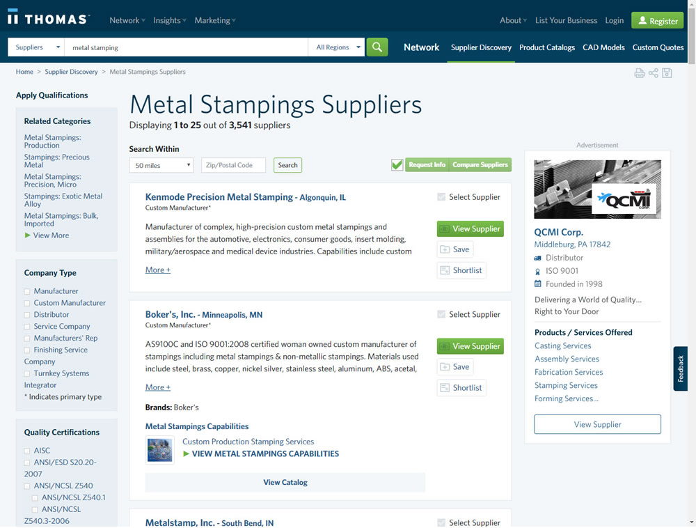
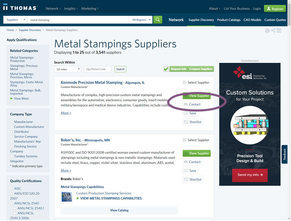
In this experiment, a contact button was added to a listing / search results page to make it faster to contact a company. This same button was also visible on the company detail page.
Test #281 on
Backstage.com
by  Stanley Zuo
Jan 31, 2020
Desktop
Listing
X.X%
Progression
Stanley Tested Pattern #116: Links Or Buttons On Backstage.com
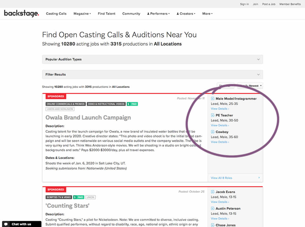
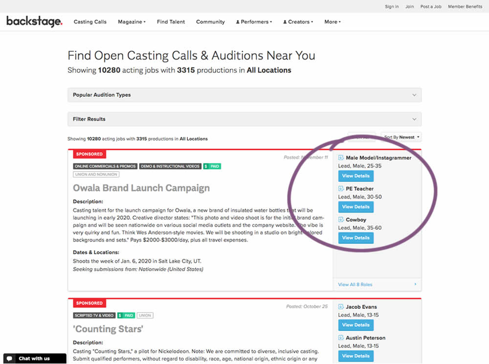
In this experiment, multiple view detail links for a listing tile were turned into higher contrast buttons.
Test #280 on
Volders.de
by  Alexander Krieger
Jan 24, 2020
Desktop
Mobile
Signup
X.X%
Progression
Alexander Tested Pattern #3: Fewer Form Fields On Volders.de
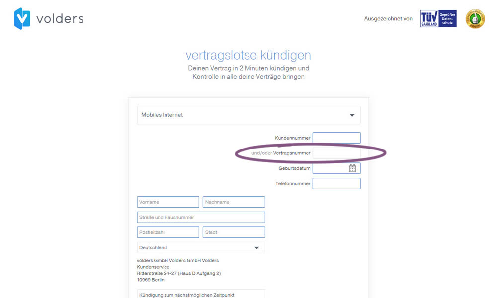
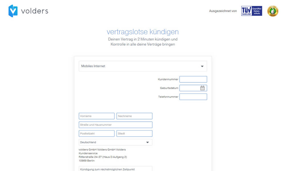
In this experiment on a contract cancellation funnel, one field was removed - a secondary contract ID. The control and variation both had a primary "customer ID" with which to identify and cancel someone's contract with.
Test #279 on
Umbraco.com
by  Lars Skjold Iversen
Jan 16, 2020
Desktop
Mobile
Home & Landing
X.X%
Progression
Lars Tested Pattern #79: Product Highlights On Umbraco.com
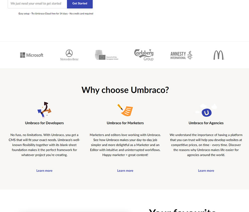
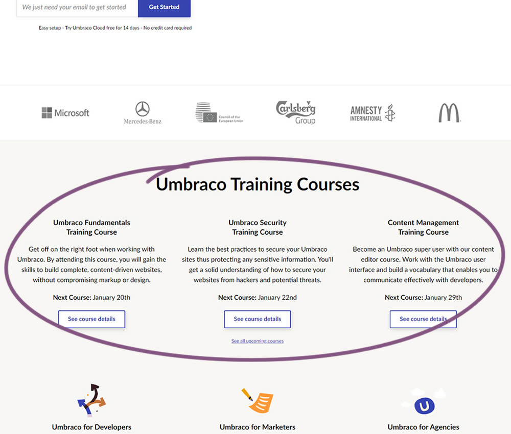
In this experiment, 3 additional course links with descriptions were added to the homepage. The idea was to increase course sales aside of the Saas subscription signups.
Test #278 on
by  Someone
Jan 15, 2020
Mobile
Shopping Cart
X.X%
Progression
Someone Tested Pattern #64: Tunnel
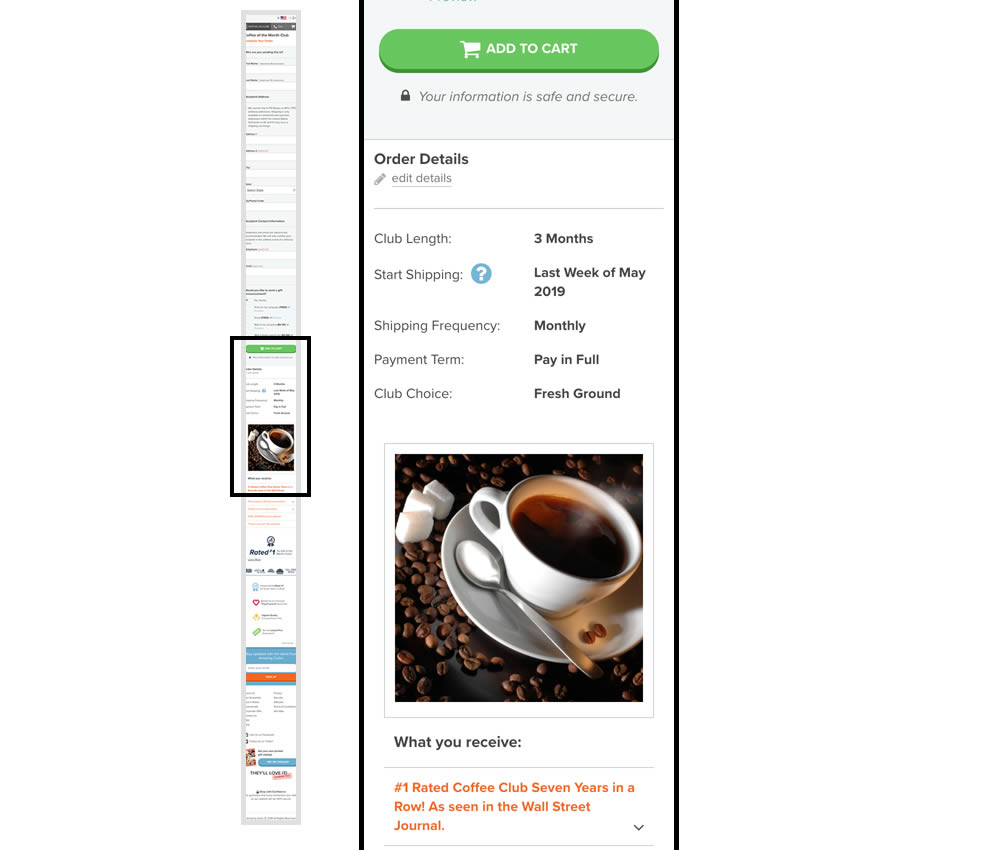
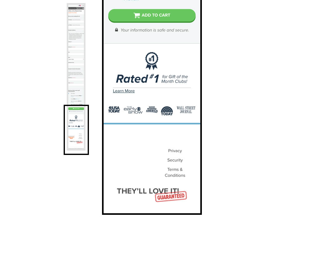
In this experiment, multiple elemenets were removed from the bottom of the cart page. This was done to see if they were potential distractions that hindered the purchase process. The elements included such things as: Order details (visible on other pages), large product photo, a "what you receive" section with selling points, more reassurances, and a newsletter subscribe box.
Test #270 on
Dentalplans.com
by  J.R. Hernandez
Nov 19, 2019
Desktop
Listing
X.X%
Progression
J.R. Tested Pattern #37: List Or Grid View On Dentalplans.com
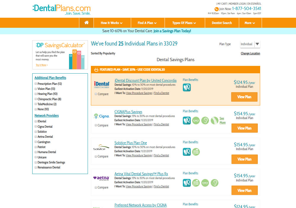
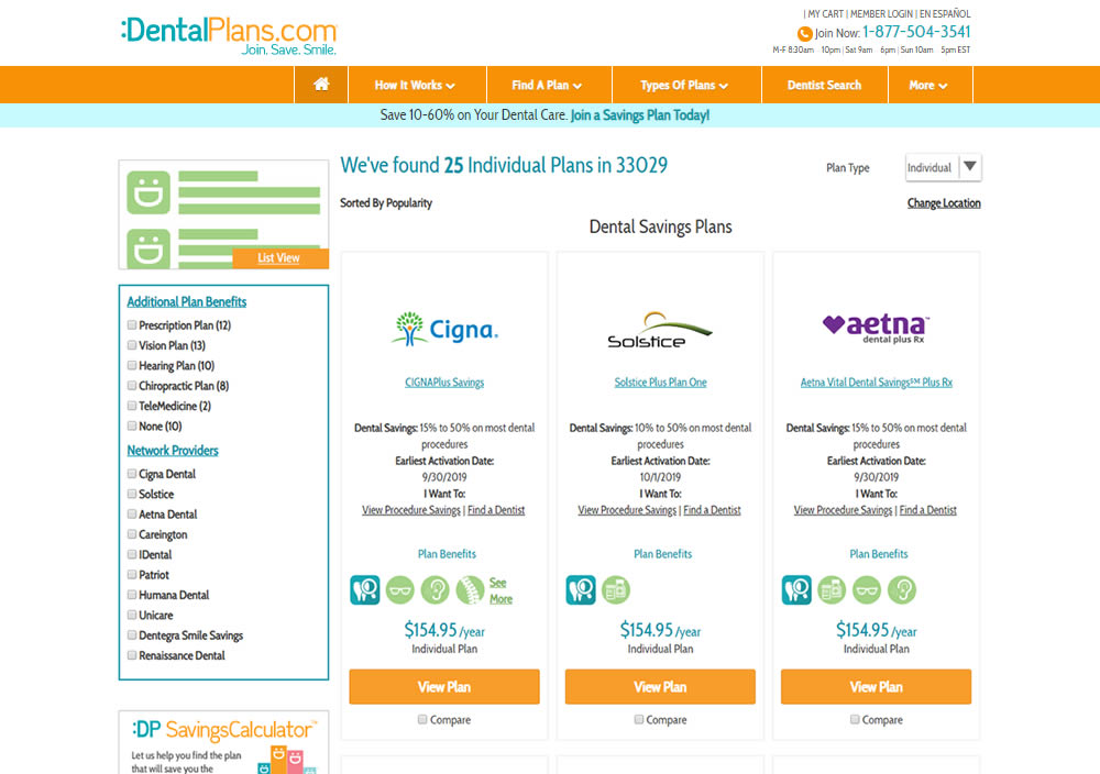
In this experiment, a list view was tested against a grid view.
Test #269 on
Thomasnet.com
by  Julian Gaviria
Nov 15, 2019
Desktop
Home & Landing
X.X%
Progression
Julian Tested Pattern #14: Exposed Menu Options On Thomasnet.com


In this experiment, the variation exposed 6 of the options from the pulldown menu as tabs.
Test #268 on
Backstage.com
by  Stanley Zuo
Nov 08, 2019
Mobile
Listing
X.X%
Progression
Stanley Tested Pattern #14: Exposed Menu Options On Backstage.com
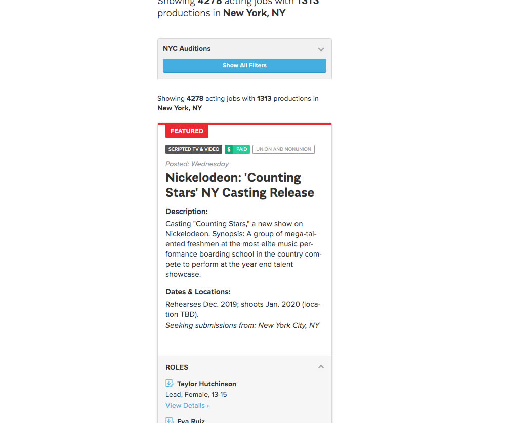
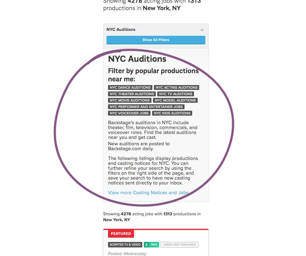
The change in this experiment was an exposed SEO panel (B) with a number of clickable filter options.
Test #267 on
Backstage.com
by  Stanley Zuo
Nov 05, 2019
Mobile
Checkout
X.X%
Progression
Stanley Tested Pattern #99: Progress Bar On Backstage.com
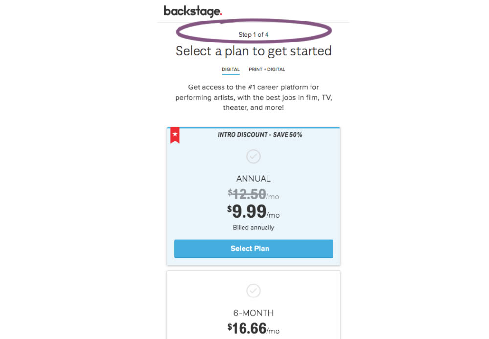
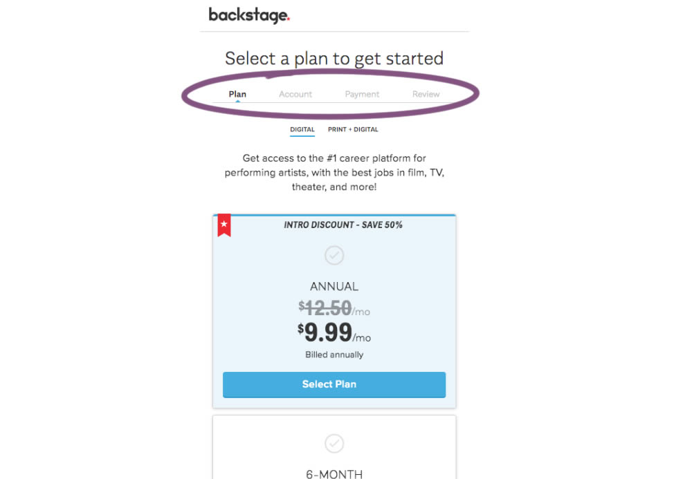
A "Step X of 4" progress bar was tested against a fully visible one that was also clickable.
Test #266 on
by  Someone
Oct 25, 2019
Desktop
Mobile
Product
X.X%
Progression
Someone Tested Pattern #4: Testimonials
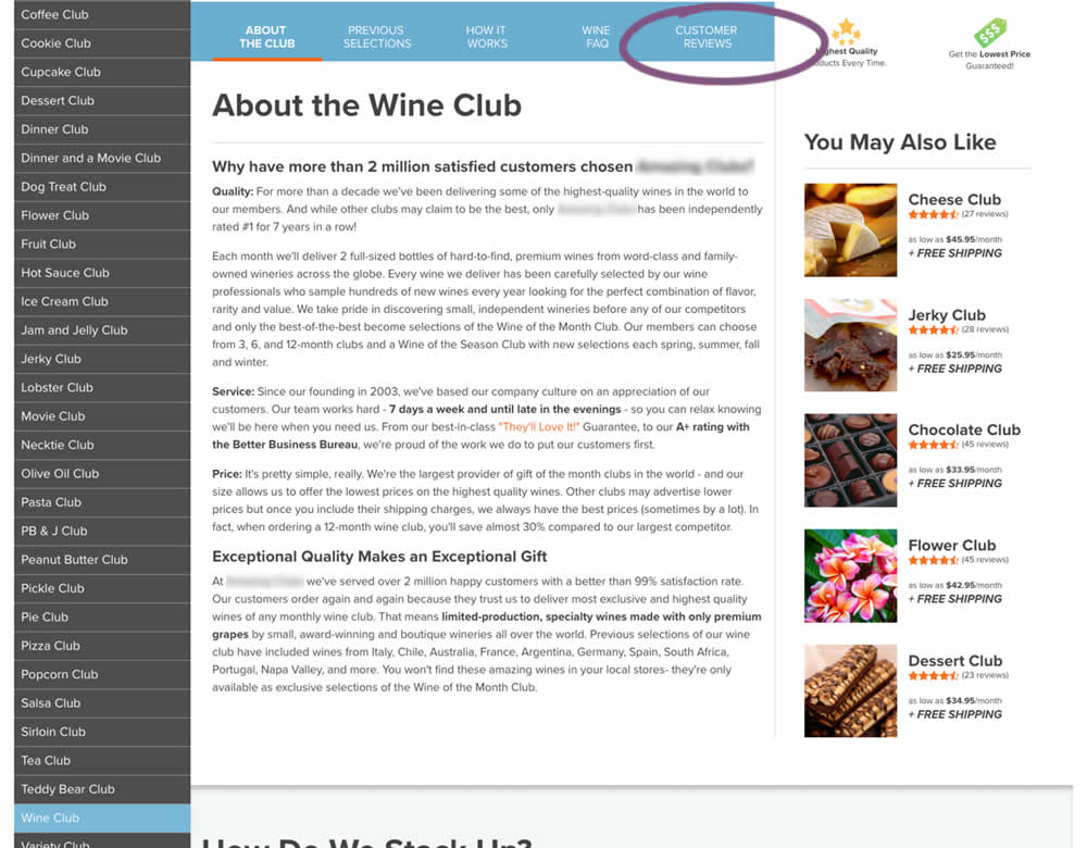
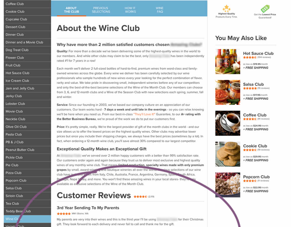
In this experiment, a product page showed customer reviews at the bottom of the page (B) instead of hiding them under a tab (A).
Test #264 on
Kenhub.com
by  Niels Hapke
Oct 05, 2019
Desktop
Mobile
Global
X.X%
Progression
Niels Tested Pattern #41: Sticky Call To Action On Kenhub.com
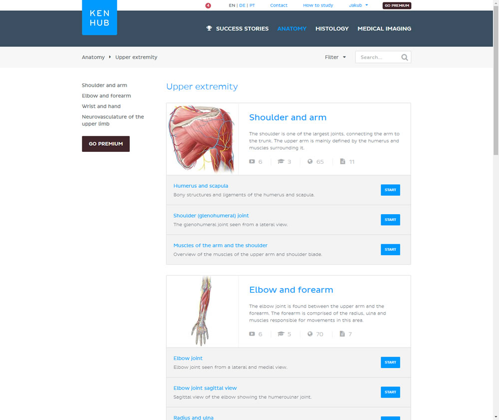
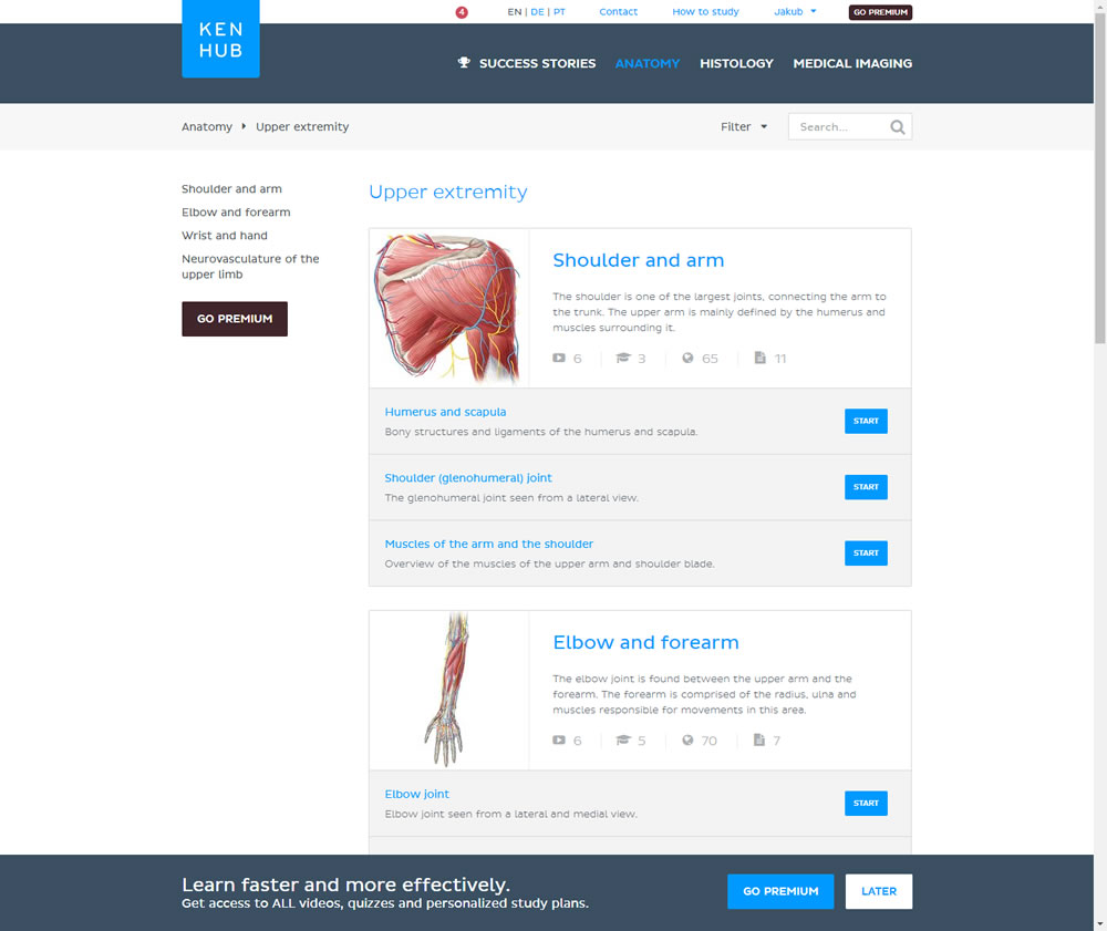
In this experiment users saw a sticky bar advertising the benefits of a Premium account across the bottom of the website, wherever they navigate. The sticky call to action appeared with a 4 second delay and was floating.
Test #262 on
Thomasnet.com
by  Julian Gaviria
Oct 03, 2019
Desktop
Mobile
Listing
X.X%
Progression
Julian Tested Pattern #32: Condensed List On Thomasnet.com
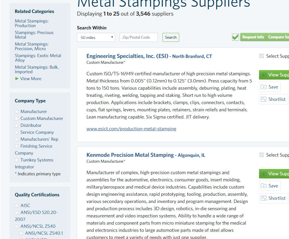
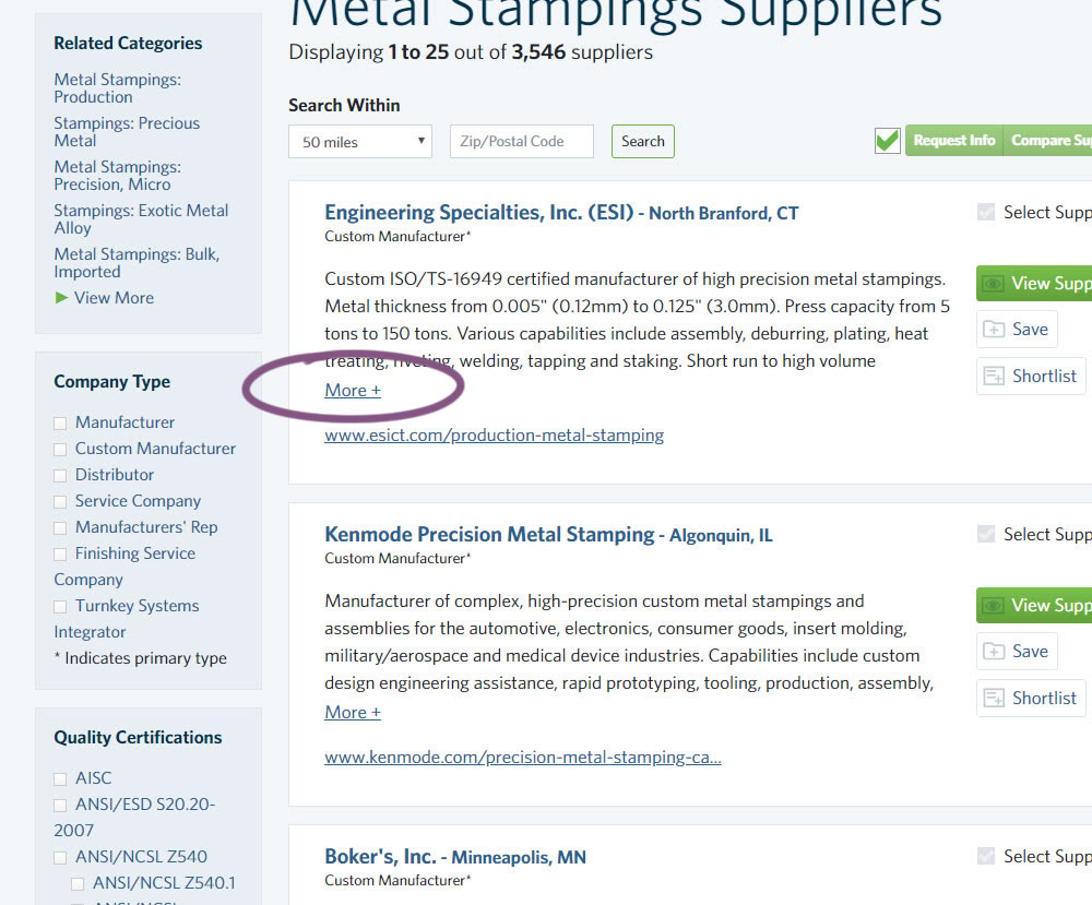
In this experiment, the B version condensed the company listings. This was done by showing less of the description and introducing a "more" and "less" dynamic links that would expand and collapse the description.
Test #261 on
Valkexclusief.nl
by  Online Dialogue
Sep 20, 2019
Desktop
Checkout
X.X%
Progression
Online Tested Pattern #111: Field Explanations On Valkexclusief.nl
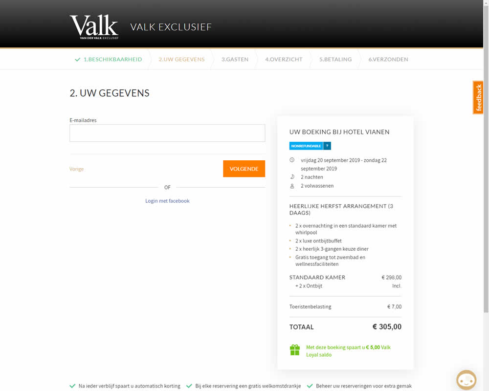
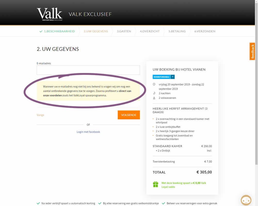
In this experiment on Valk Exclusief's web site, a reason was provided for why the e-mail address is being collected. Google translation of the added text is as follows: "If your e-mail address is not yet known to us, we will ask you to add some missing information. Then you immediately benefit from our benefits such as the ValkLoyal savings program."
Test #40 on
Adoramapix.com
by  Herman Klein
Aug 13, 2019
Desktop
Product
X.X%
Progression
Herman Tested Pattern #85: Benefit Button On Adoramapix.com
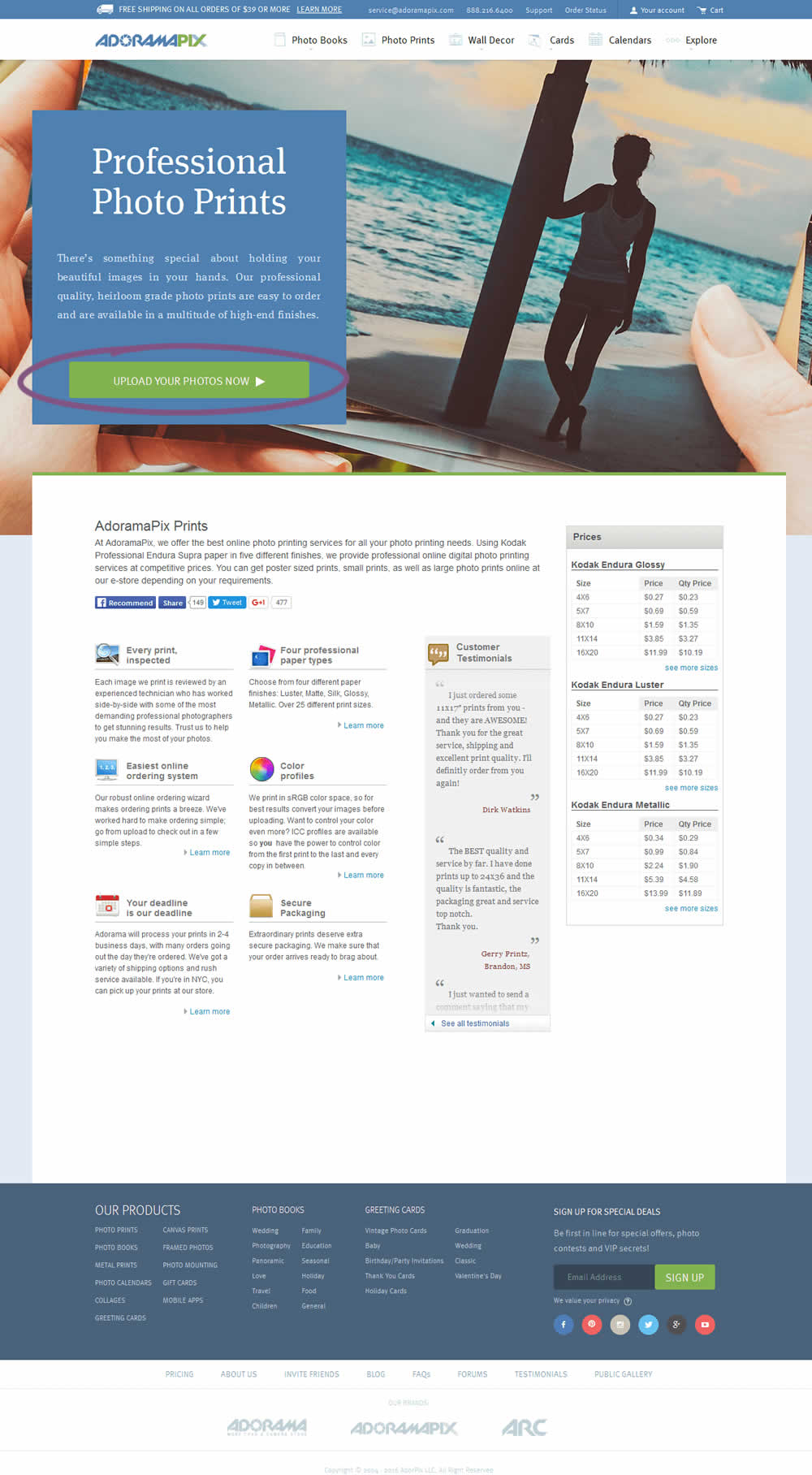
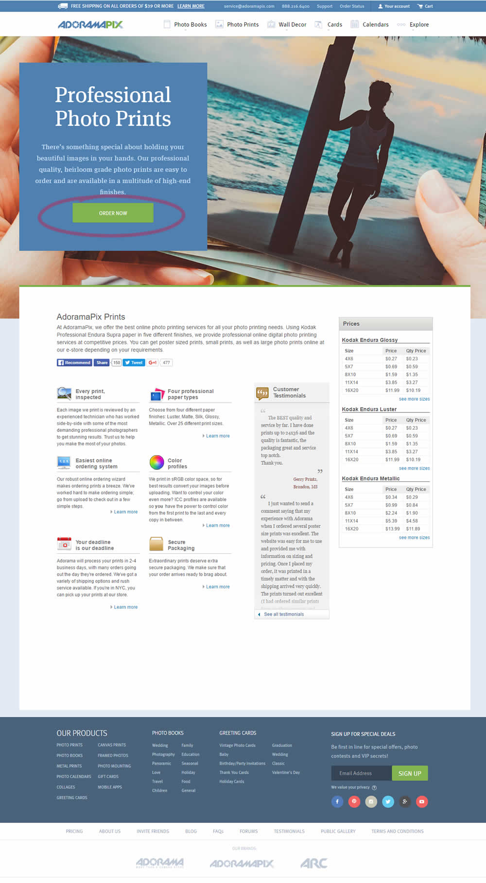
In this experiment only the button label changed. The control had a more immediate (next step-oriented) button label of "Upload Your Photos Now". The variation tried a more benefit-oriented button of "Order Now" (hinting at paying and obtaining the product).
Test #246 on
Thomasnet.com
by  Julian Gaviria
Jun 12, 2019
Desktop
Mobile
Home & Landing
X.X%
Progression
Julian Tested Pattern #88: Action Button On Thomasnet.com
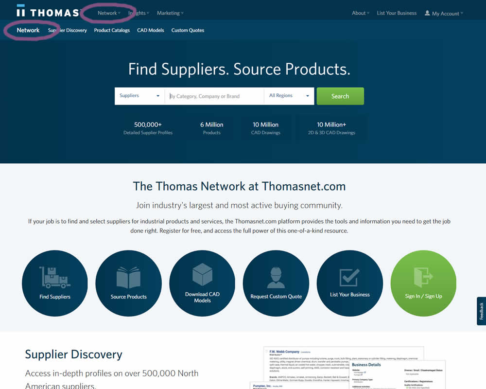
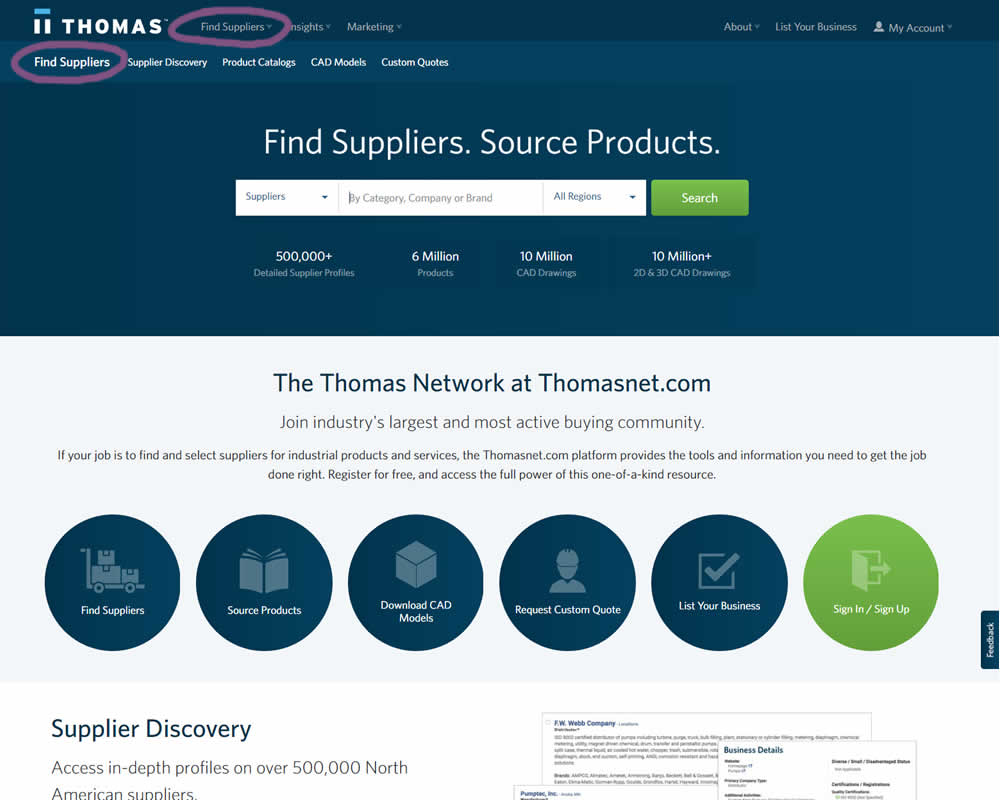
In this experiment, the navigation label was changed from "Network" to "Find Suppliers". The idea was to make use of an action label with a clearer benefit.
Test #244 on
Mt.com
by  Vito Mediavilla
Jun 06, 2019
Desktop
Product
X.X%
Progression
Vito Tested Pattern #49: Above The Fold Call To Action On Mt.com

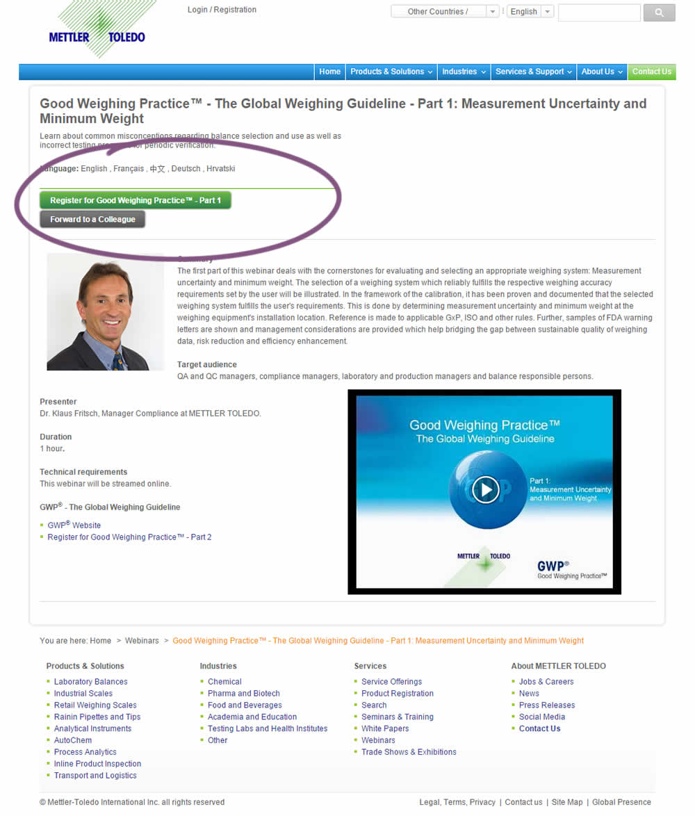
A product landing page with an image was tested against one without - raising the call to action above the fold.
Test #243 on
Goodui.org
by  Jakub Linowski
Jun 05, 2019
Desktop
Mobile
Home & Landing
X.X%
Progression
Jakub Tested Pattern #77: Filled Or Ghost Buttons On Goodui.org
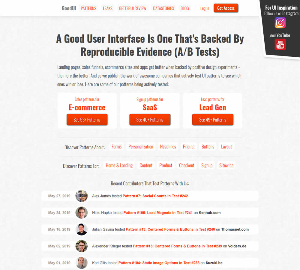
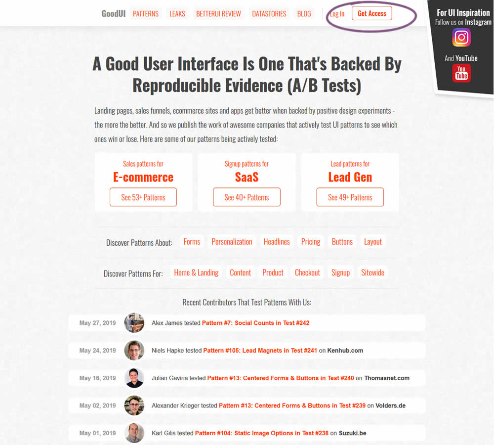
In this experiment, full red background buttons were changed to ghost buttons (red outline and transparent fill)
Test #239 on
Volders.de
by  Alexander Krieger
May 02, 2019
Desktop
Home & Landing
X.X%
Progression
Alexander Tested Pattern #13: Centered Forms & Buttons On Volders.de
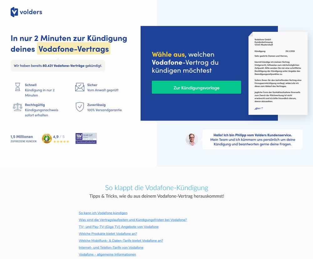
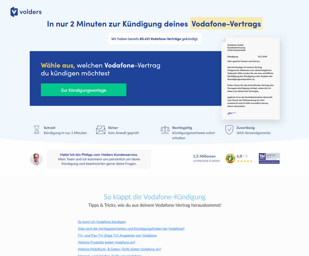
A contract cancellation landing page was tested for the effect of a single (wider CTA area with a left aligned button) vs two column layout (narrow CTA area with a right aligned button).