All Latest 620 A/B Tests
Test #490 on
by  Jakub Linowski
Aug 17, 2023
Desktop
Mobile
X.X%
Progression
Jakub Tested Pattern #9: Multiple Steps
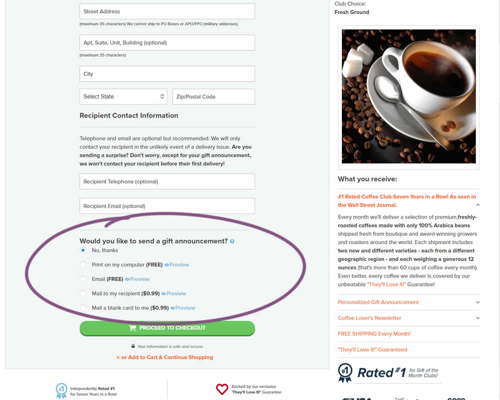
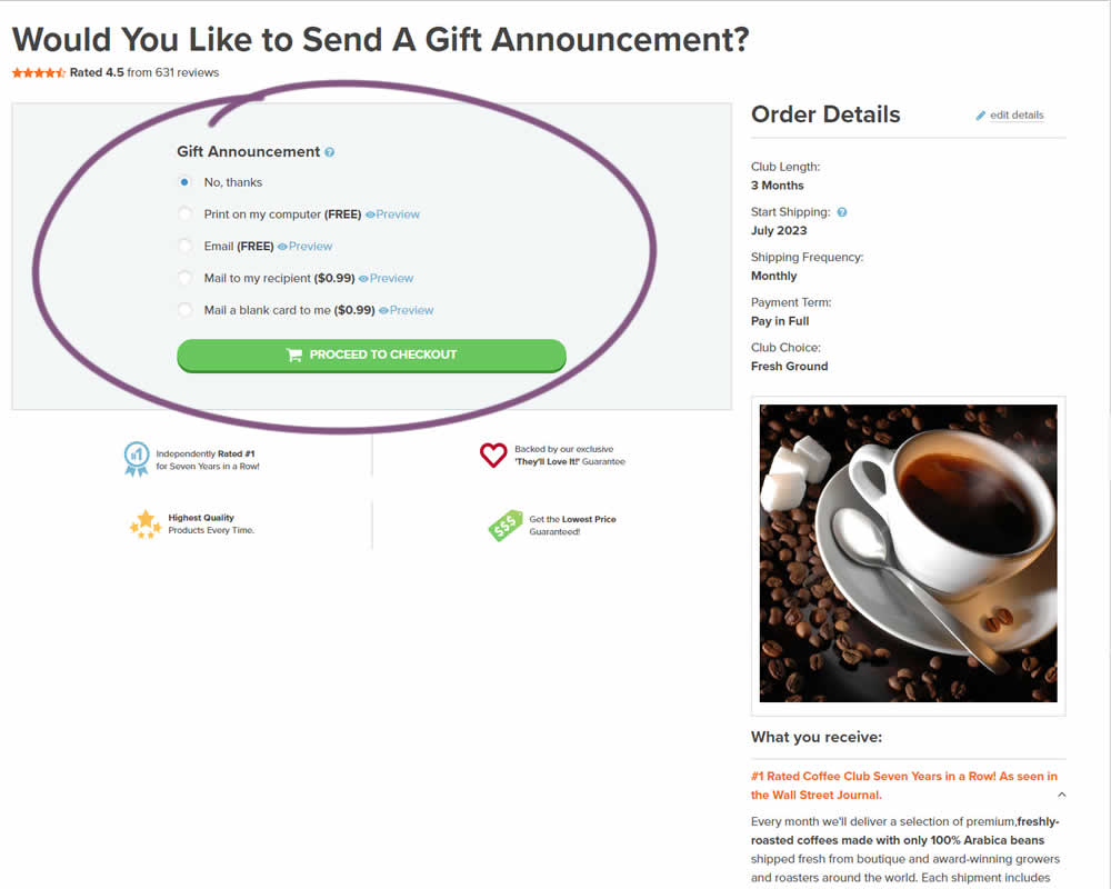
In this experiment, a section dedicated to choosing gift messages was taken out and separated into its own individial step. The change happened on the first step of a checkout flow and increased the flow by an additional step. Impact on checkouts and total sales was measured.
Which A Or B Actually Wins? Find Out Before You Test.
Members see every test result — the winners, the flat ones, and the losers — along with exact effects and sample sizes. Use it to estimate your tests and prioritize by probability, not gut feel. Start every experiment with the odds on your side.
Test #489 on
by  Jakub Linowski
Aug 14, 2023
Desktop
Mobile
Product
X.X%
Progression
Jakub Tested Pattern #78: Tags, Badges And Structured Information
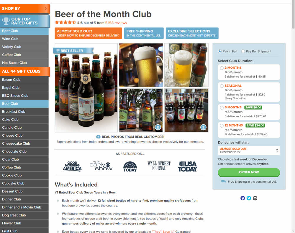
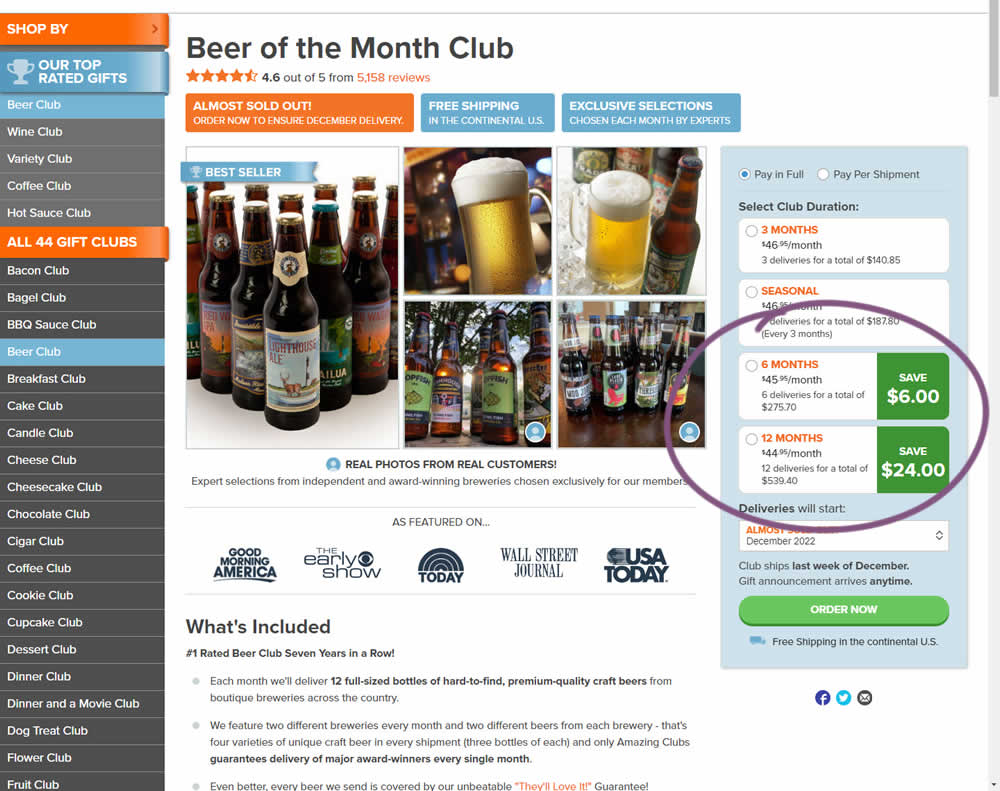
In this experiment, the size of a saving amount badge was enlarged. Instead of typical badge, the variation stretched the height of the saving information to the full height of the duration selector. The font size was also increased. Impact on overall sales was measured.
Test #488 on
Metro-cc.ru
by  Andrey Andreev
Aug 11, 2023
Mobile
Product
X.X%
Progression
Andrey Tested Pattern #4: Testimonials On Metro-cc.ru
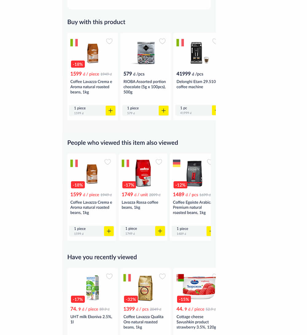
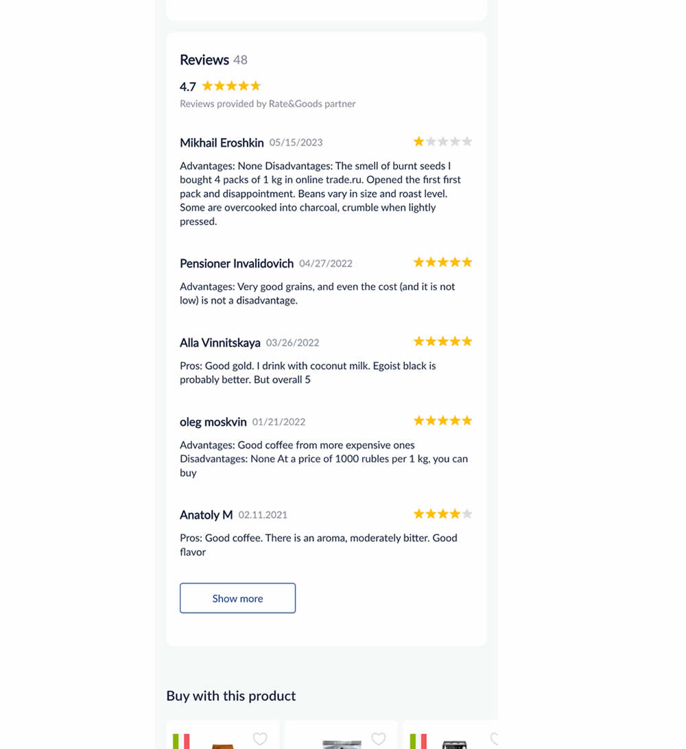
In this experiment, customer reviews were shown on product detail pages. Impact on adds to cart and sales was measured.
Test #481 on
Backstage.com
by  Stanley Zuo
Jul 14, 2023
Desktop
Mobile
Checkout
X.X%
Progression
Stanley Tested Pattern #15: Bulleted Reassurances On Backstage.com
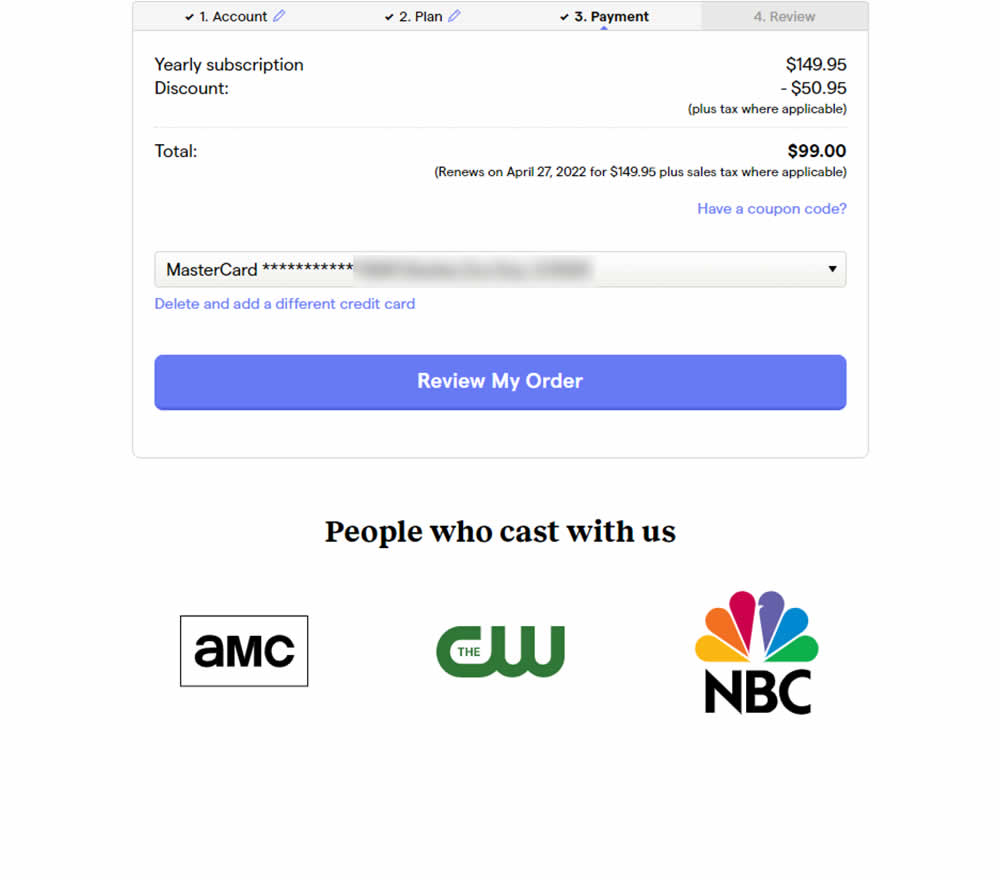
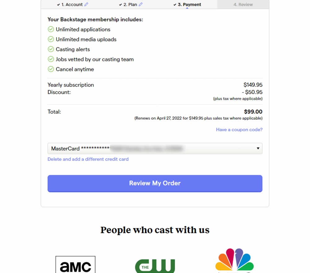
In this experiment, selling points and benefits of a subscription were placed as bullets at the top of a checkout page. The benefits highlighted things such as: unlimited applications, access to vetted jobs and the ability to cancel anytime. Impact on sales was measured.
Test #482 on
by  Jakub Linowski
Jul 13, 2023
Desktop
Mobile
Checkout
X.X%
Progression
Jakub Tested Pattern #124: Confirmed Selection
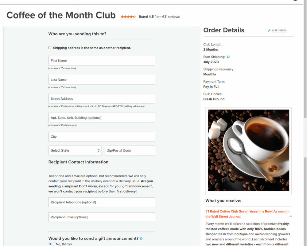
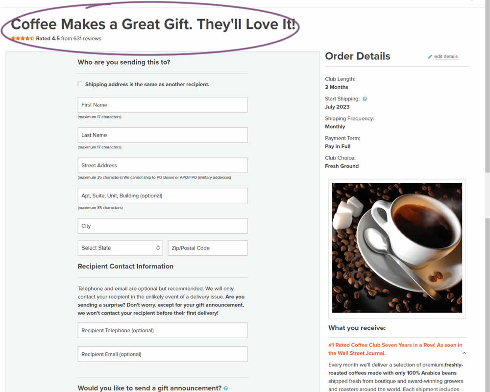
In this experiment, the choice of adding a product to cart was confirmed with a further positive message in the header of the next step (on the add to cart page). Once users left the product detail page, instead of simply stating the product name, the title was rephrased as "Product [X] Makes a Great Gift. They'll Love It!". I view this as a higher "intensity" experiment, given that the add-to-cart page was in some way already confirming the choice. Impact on sales was measured.
Test #474 on
Rollbar.com
by  Mike Smith
May 27, 2023
Desktop
Mobile
Home & Landing
X.X%
Progression
Mike Tested Pattern #4: Testimonials On Rollbar.com
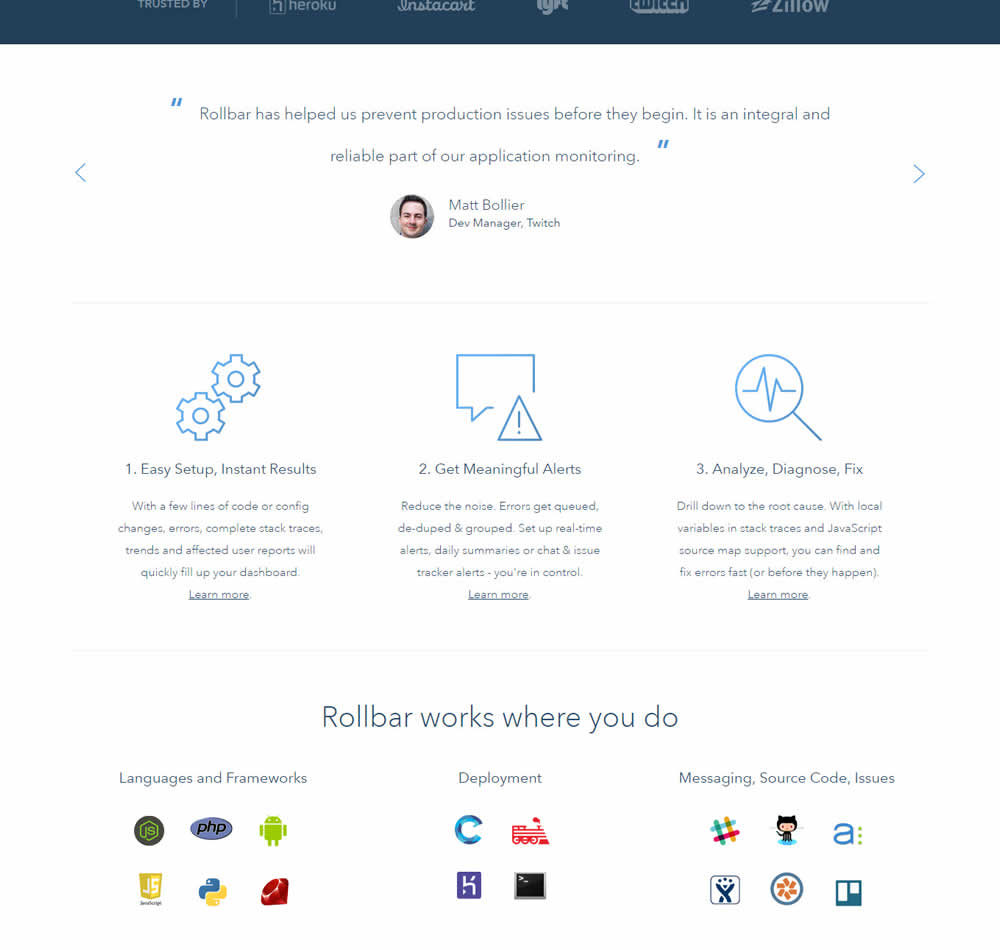
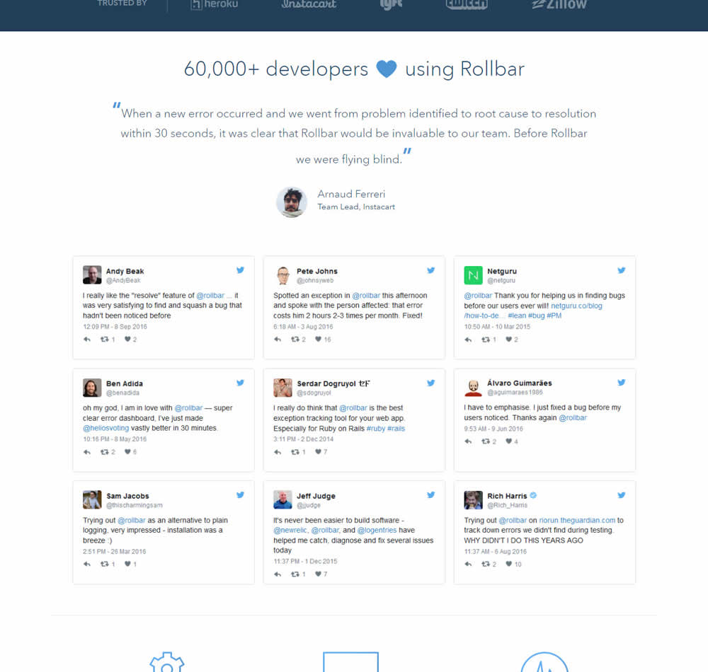
In this experiment, 9 Twitter card style testimonials were appended onto the homepage of Rollbar. These were image / screenshots recreations without links to the actual tweets.
Test #473 on
by  Jakub Linowski
May 26, 2023
Desktop
Home & Landing
X.X%
Progression
Jakub Tested Pattern #19: Benefit Testimonials
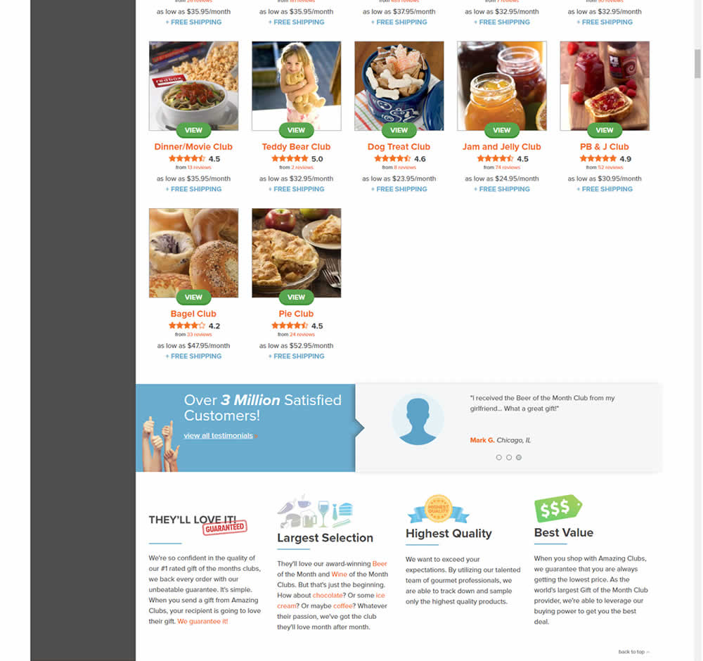
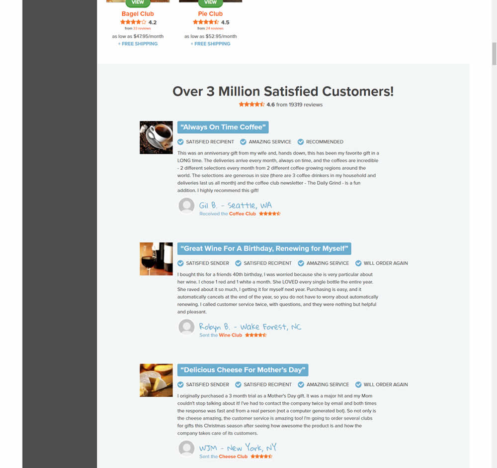
In this experiment, very short form testimonials (with a reference to over 3 million customers) were replaced with 3 more elaborate ones. These elaborate or benefit testimonials contained: highlighted statements, star reviews, emphasized location, tag summaries and photos of the purchased product. The control also contained a 3 testimonial carousel interaction.
This test appeared at the bottom of a longer homepage with additional product listings above.
Test #471 on
Expertinstitute.com
by  Ardit Veliu
May 25, 2023
Desktop
Mobile
Home & Landing
X.X%
Progression
Ardit Tested Pattern #48: Video Testimonials On Expertinstitute.com

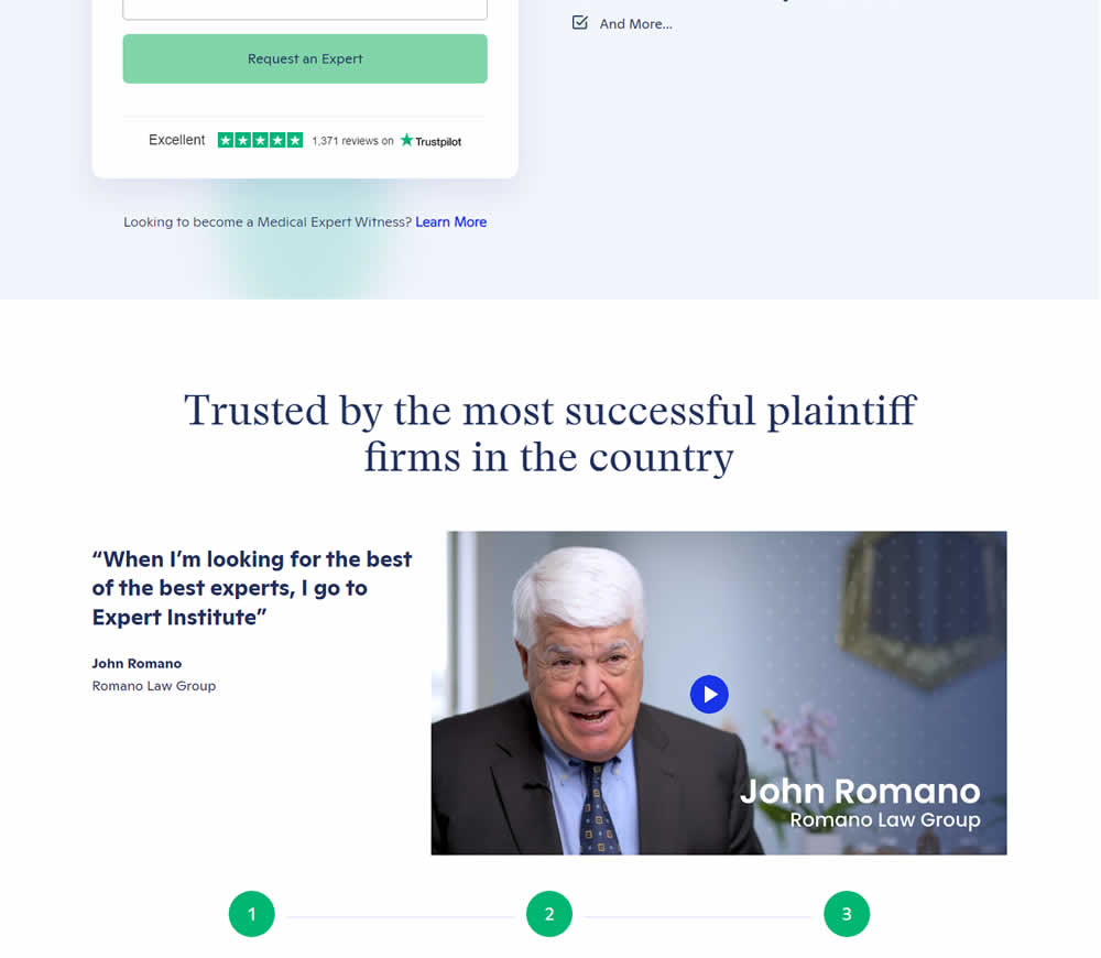
In this experiment, a video testimonial was added mid page onto a signup / lead form page.
Test #472 on
Expertinstitute.com
by  Ardit Veliu
May 25, 2023
Desktop
Mobile
Home & Landing
X.X%
Progression
Ardit Tested Pattern #48: Video Testimonials On Expertinstitute.com
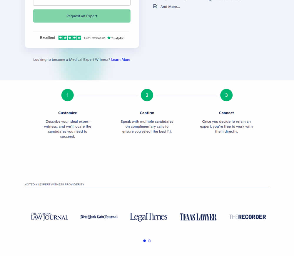
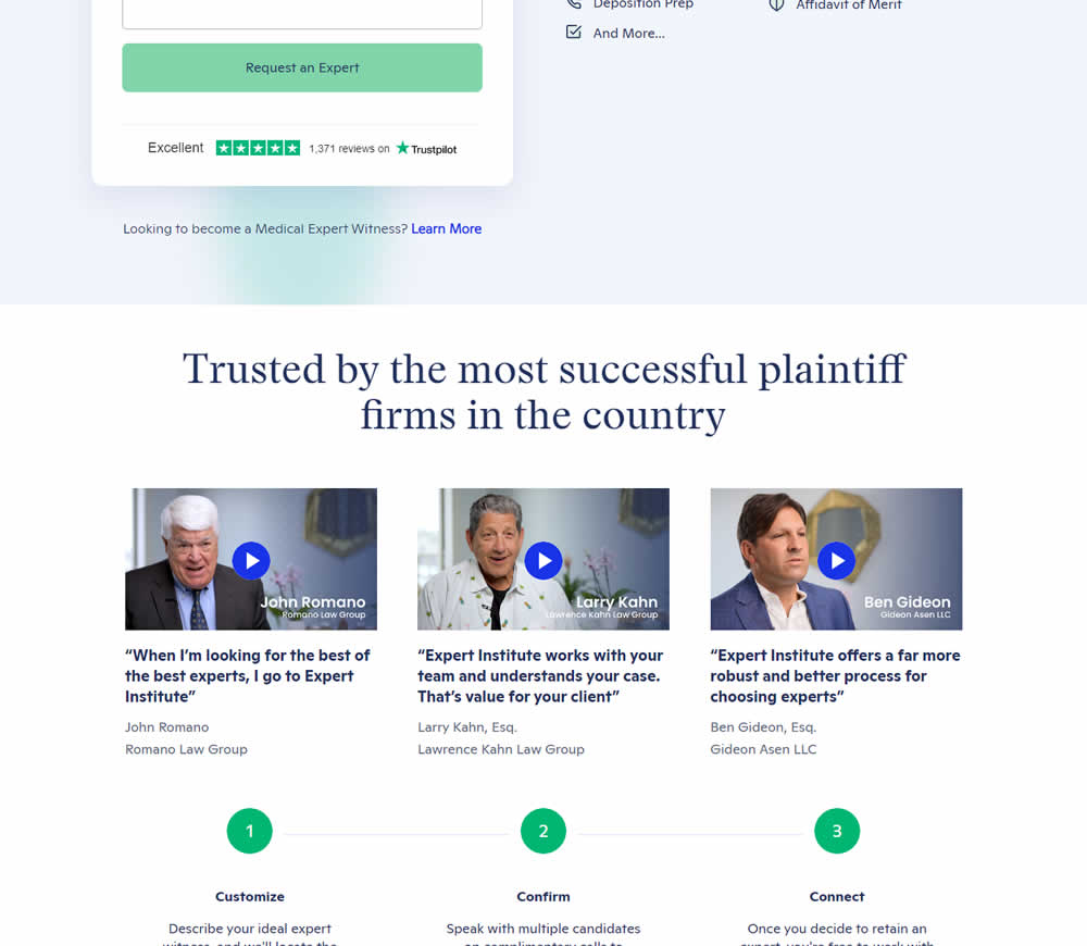
In this experiment, three video testimonials were added mid page onto a signup / lead form page.
Test #468 on
Umbraco.com
by  Lars Skjold Iversen
Apr 28, 2023
Desktop
Mobile
Home & Landing
X.X%
Progression
Lars Tested Pattern #6: Customer Star Ratings On Umbraco.com
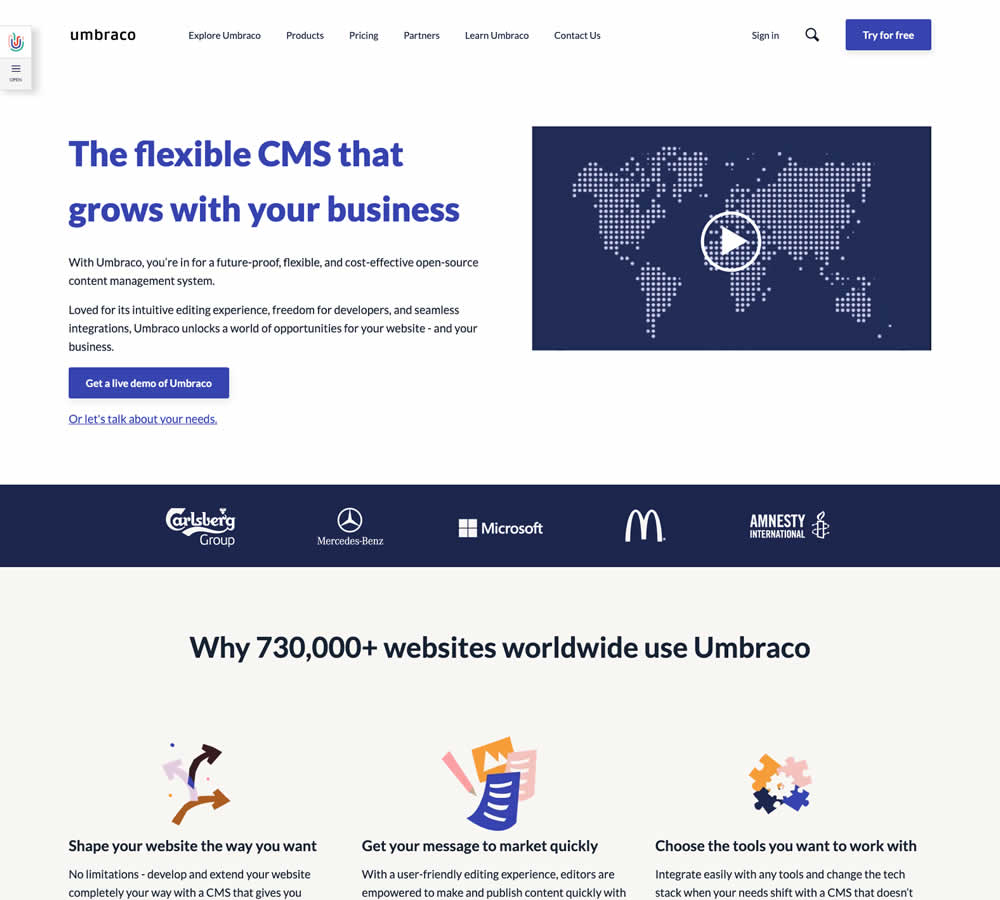
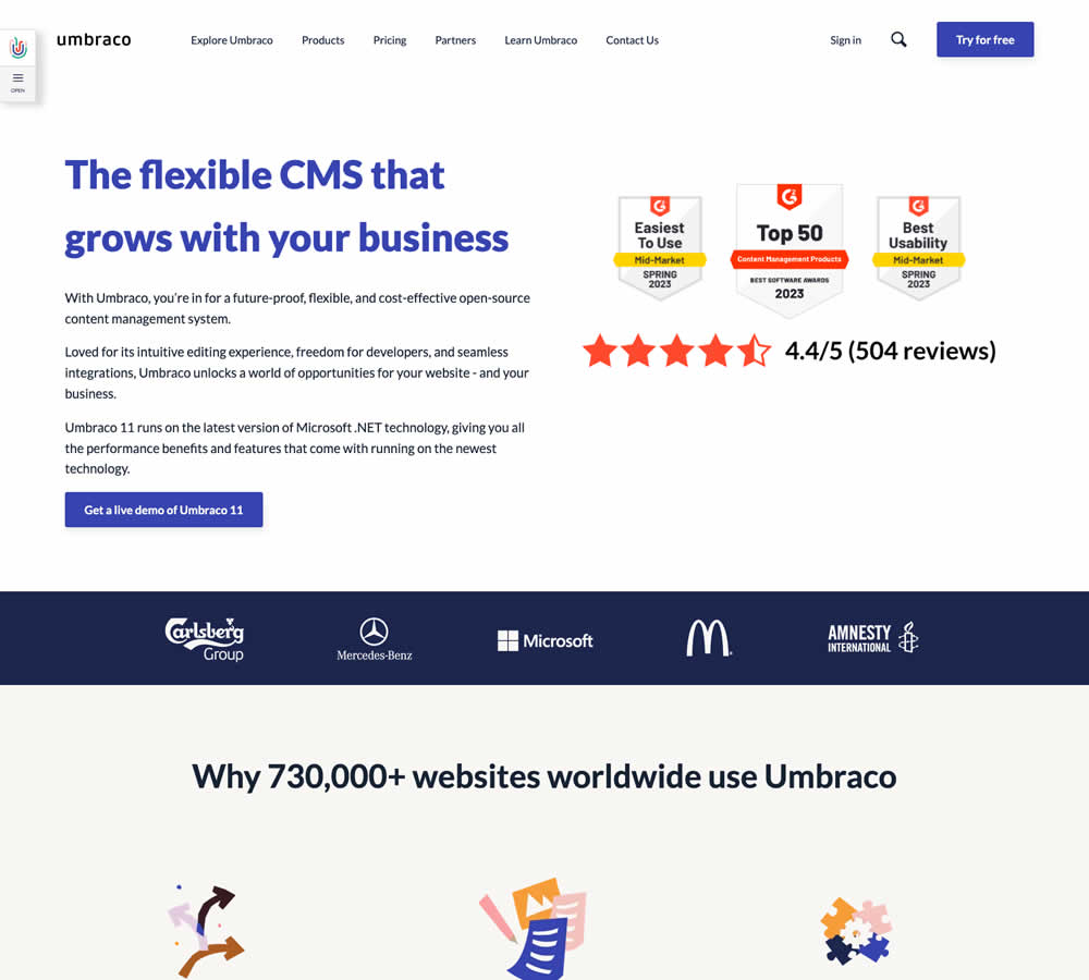
In this homepage experiment a number of changes were introduced - with perhaps the most prominent one being the replacement of a video component with customer review badges. Additional copy changes included reinforcement of the latest version number (v11) throughout the page, as well as a dedicated (v11) section in the middle of the page. Impact on demo signups was measured.
Test #467 on
by  Jakub Linowski
Apr 27, 2023
Desktop
Mobile
Product
X.X%
Progression
Jakub Tested Pattern #108: Frequently Asked Questions

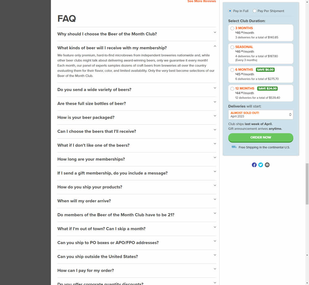
In this experiment, an FAQ section was added near the bottom of a long product page. The reviews were collapsed by default, but expandable upon clicking. Impact on adds-to-cart and sales was measured.
Test #464 on
Expertinstitute.com
by  Ardit Veliu
Mar 31, 2023
Desktop
Mobile
Home & Landing
X.X%
Progression
Ardit Tested Pattern #7: Social Counts On Expertinstitute.com
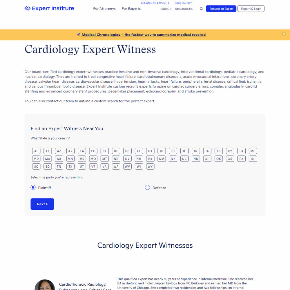
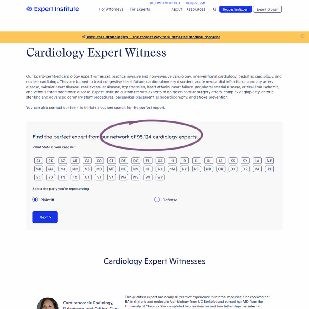
In this experiment, copy was added which showed the number of experts (in a given category) a person may gain access to after filling out a lead form. The context of this is a lead-gen landing page where people are seeking experts for legal purposes. Impact on initial progression (of a multi step form) and completed leads was measured.
Test #462 on
by  Jakub Linowski
Mar 24, 2023
Desktop
Mobile
Product
X.X%
Progression
Jakub Tested Pattern #128: Standard Or Superscript Price Format
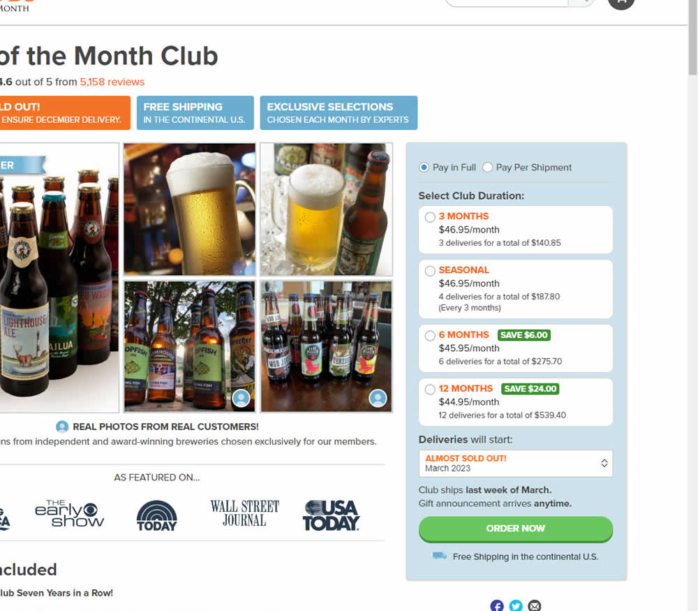
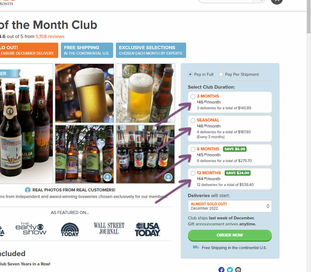
In this experiment, standard $ signs and cents were formatted into a smaller superscript. Impact on add-to-cart and sales was measured.
Test #460 on
Backstage.com
by  Stanley Zuo
Mar 21, 2023
Mobile
Listing
X.X%
Progression
Stanley Tested Pattern #41: Sticky Call To Action On Backstage.com
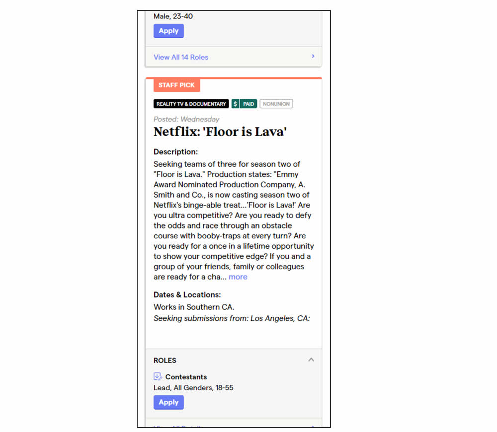
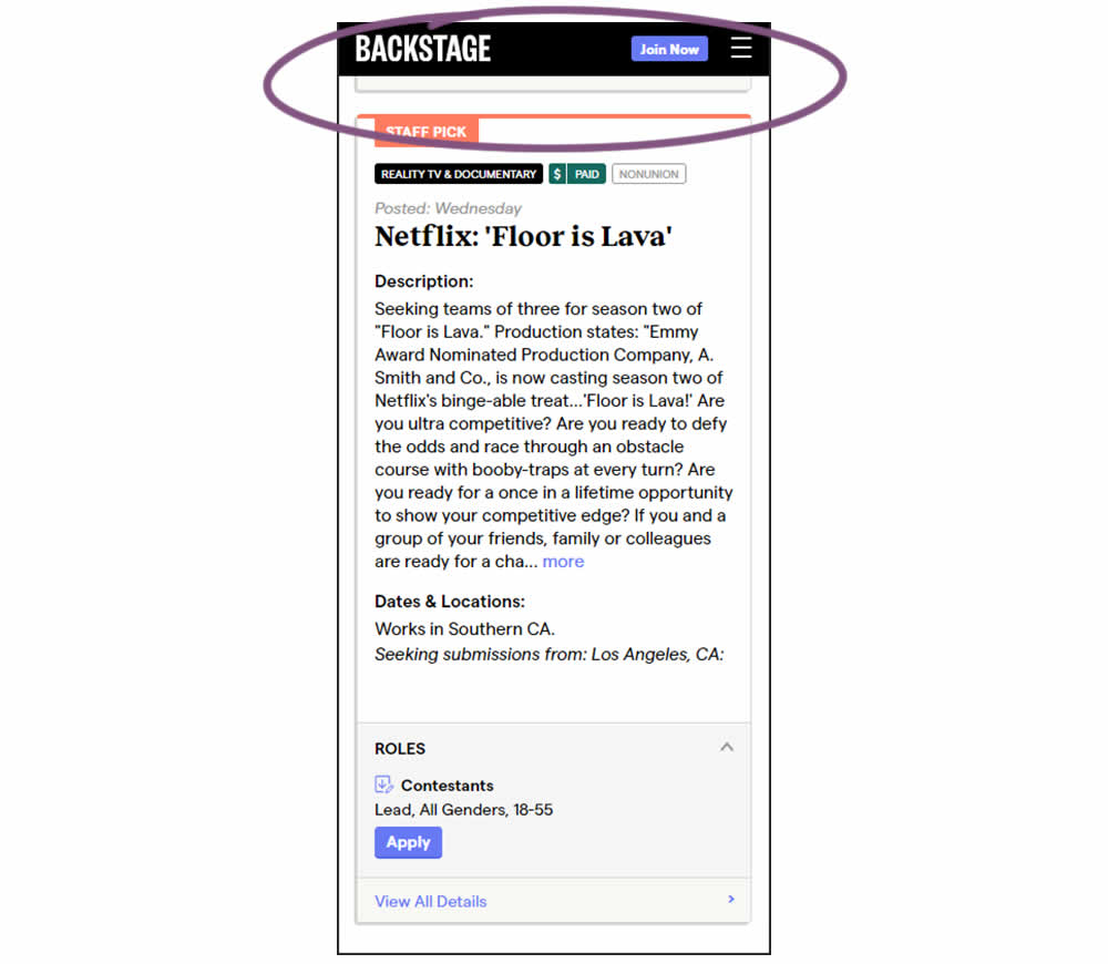
In this experiment, a floating top navigation was shown with a "Join" button. In the control, the navigation was only visible at the top of the page. Also keep in mind that signup starts were also triggered throughout multiple CTAs throughout the page and from particular job detail pages. The a/b test ran on a listing page of Backstage - a casting call job site. Impact on signups and checkouts was measured.
Test #458 on
Volders.de
by  Daria Kurchinskaia
Feb 27, 2023
Desktop
Mobile
Checkout
X.X%
Progression
Daria Tested Pattern #103: Money Back Guarantee On Volders.de
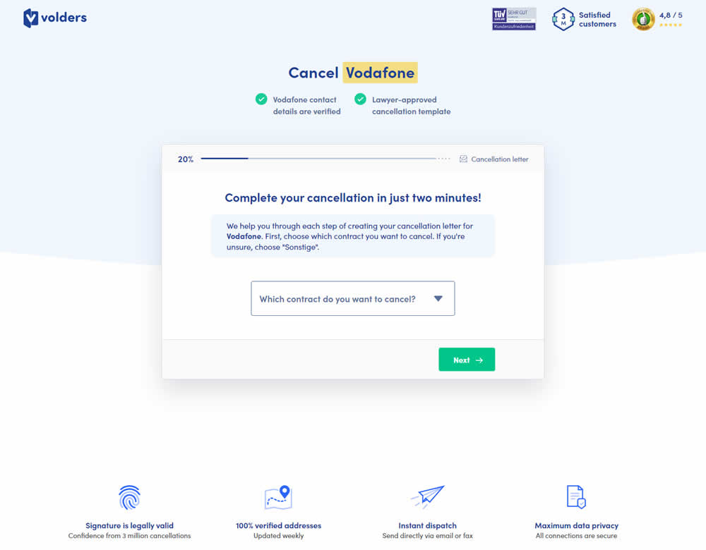
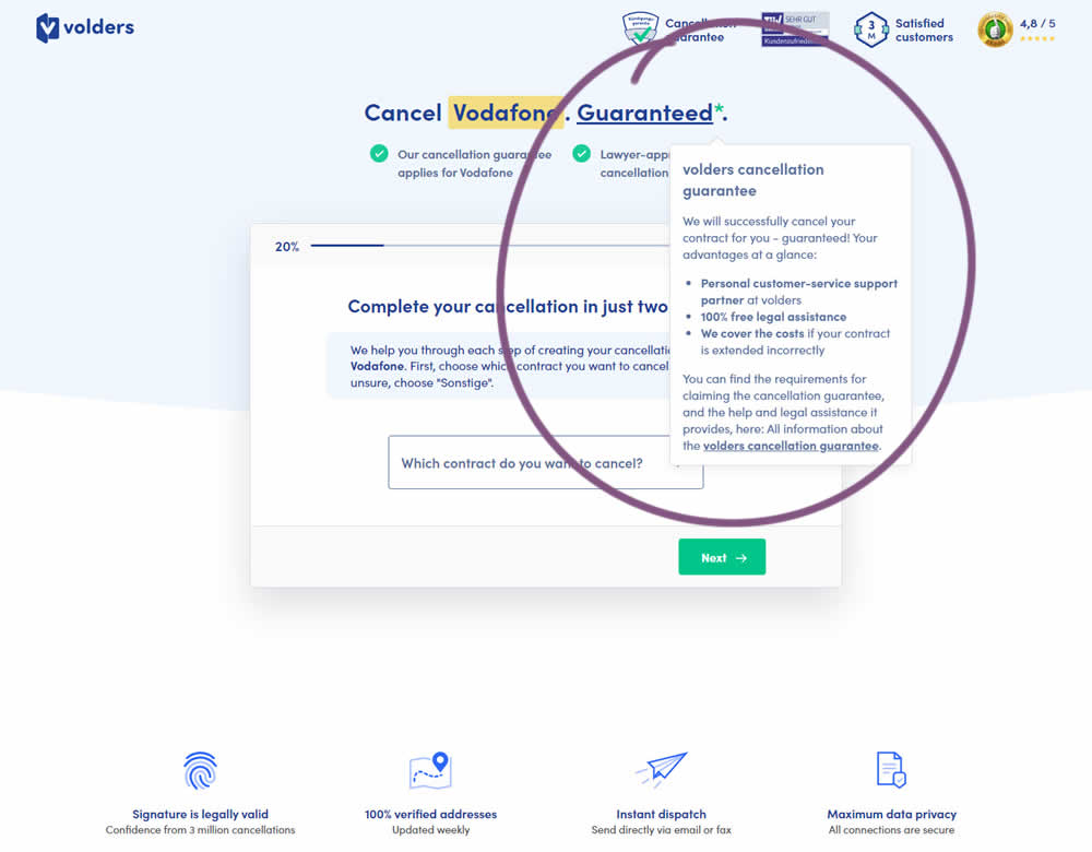
In this experiment, a cancelation guarantee was added believing it would make users feel safer while canceling their contracts with Volders (the paid service being offered). The variation appended a Guarantee in the headline as a hyperlink with an explanatory tooltip shown on hover. This variation change was added to multiple screens throughout the checkout flow (a 5 step process).
Test #453 on
by  Jakub Linowski
Jan 31, 2023
Desktop
Mobile
Shopping Cart
X.X%
Progression
Jakub Tested Pattern #64: Tunnel
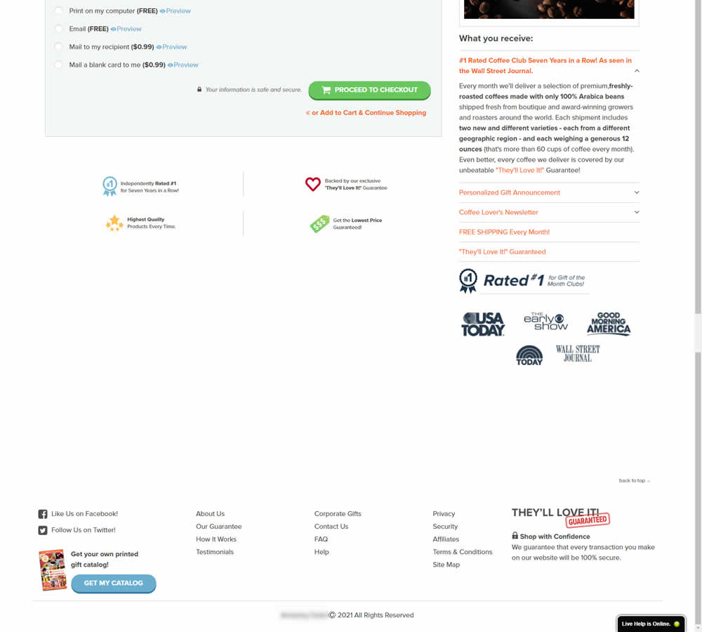
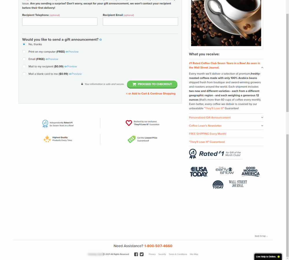
In this experiment, the footer was simplified with multiple elements being removed (catalog request, secondary links, and a guarantee). Additionally, a more prominent phone number was also displayed.
Test #451 on
Fluke.com
by  Marika Francisco
Jan 25, 2023
Desktop
Product
X.X%
Progression
Marika Tested Pattern #115: Pricing Comparison Table On Fluke.com
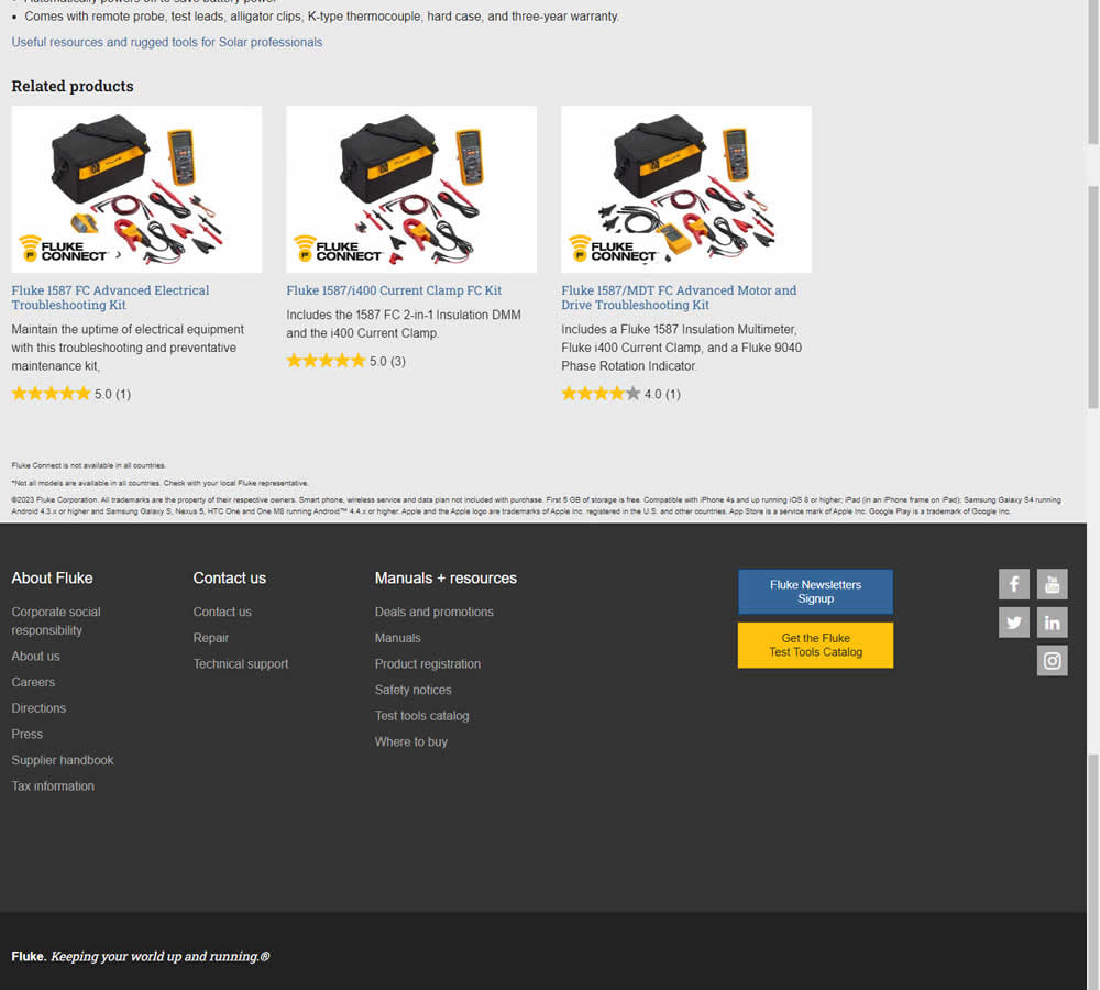
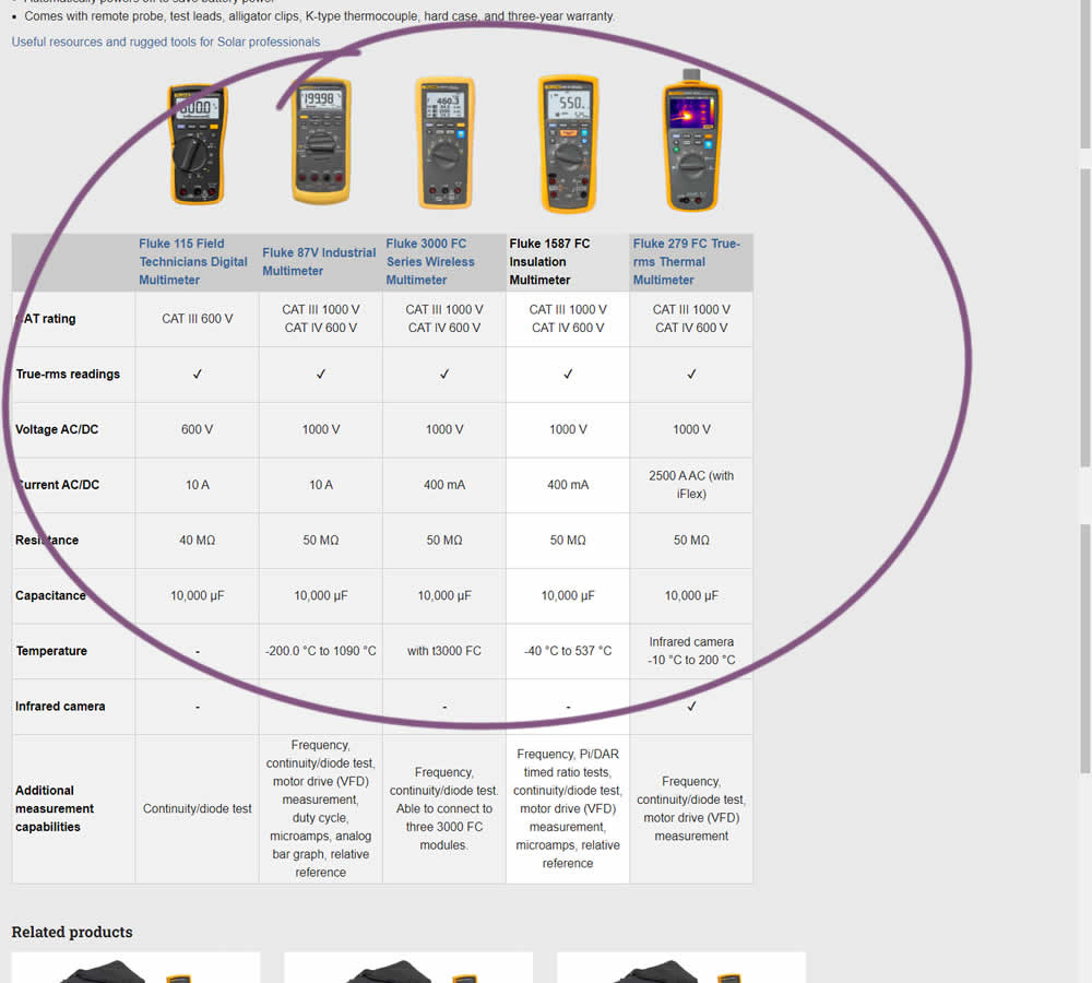
In this experiment, a product comparison table was added in the middle of a product detail page. The comparison table contained products from the same class or family of products. Clicking on the photo thumbnails also allowed customers to visit the specific detail page. Impact on adds to cart and transactions was measured.
Test #447 on
Vivareal.com.br
by  Vinicius Barros Peixoto
Dec 23, 2022
Mobile
Listing
X.X%
Progression
Vinicius Tested Pattern #18: Single Or Alternative Buttons On Vivareal.com.br
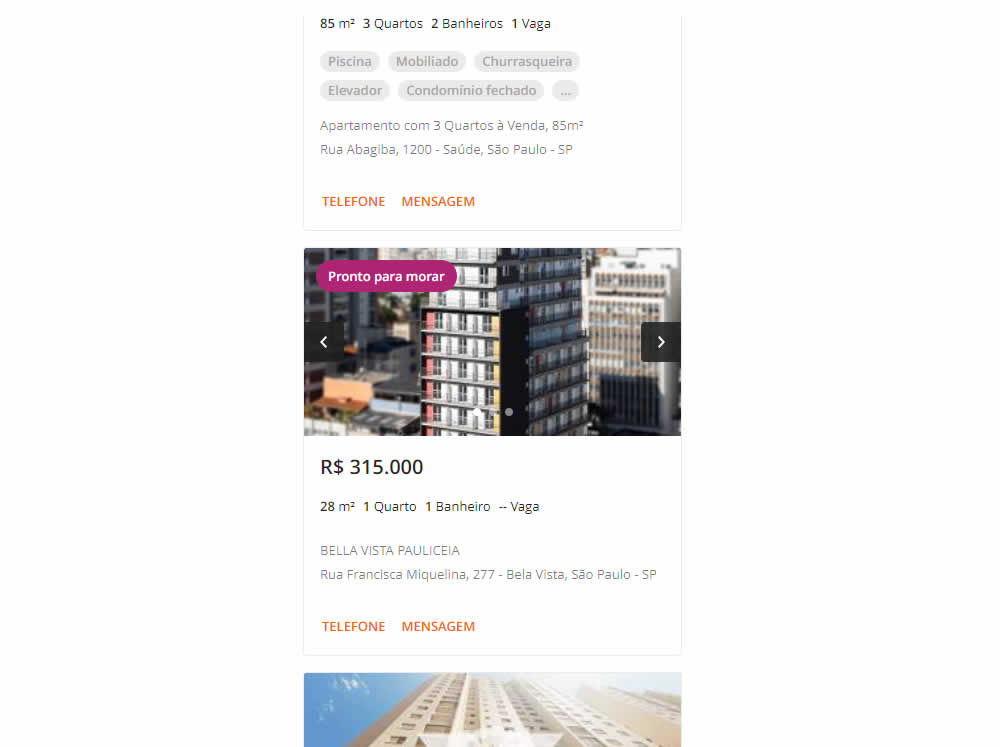
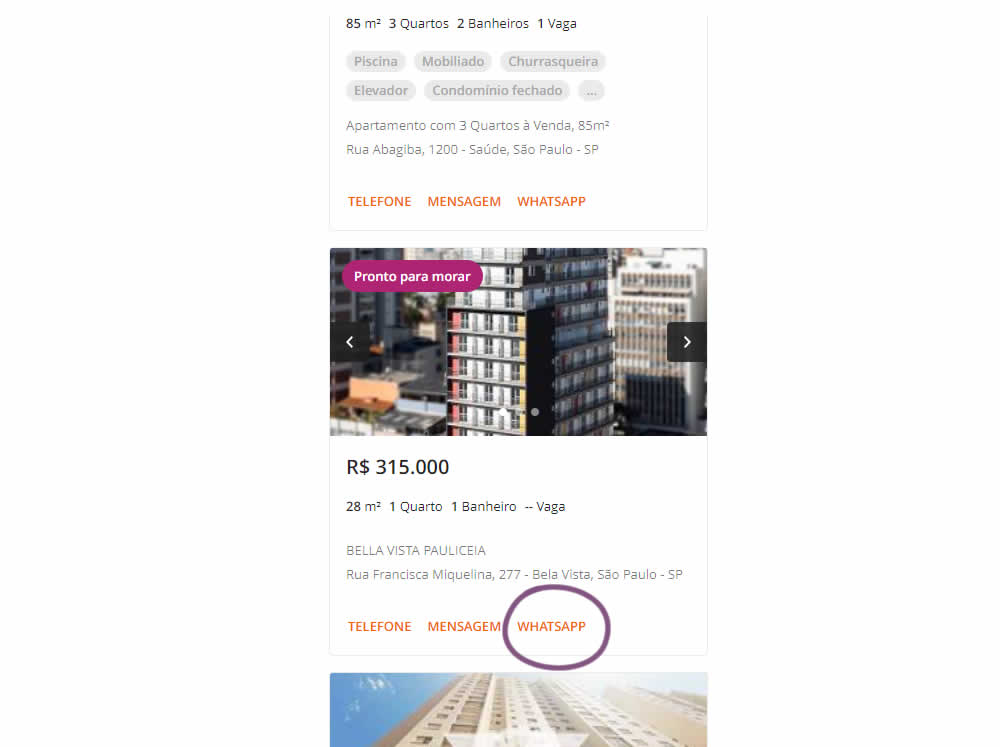
In this experiment, an additional call to action (Whatsapp link) was added on a listing page of one of Brazil's largest real estate sites.In the variation the 3 calls to action include: a link that launched the phone interaction, a general contact lead form, and finally the Whatsapp link (added in the variant). Impact on total lead starts and completions was measured.
Test #446 on
by  Jakub Linowski
Dec 15, 2022
Desktop
Mobile
Product
X.X%
Progression
Jakub Tested Pattern #18: Single Or Alternative Buttons
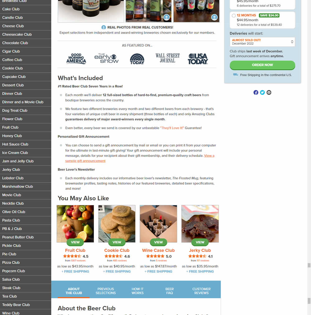
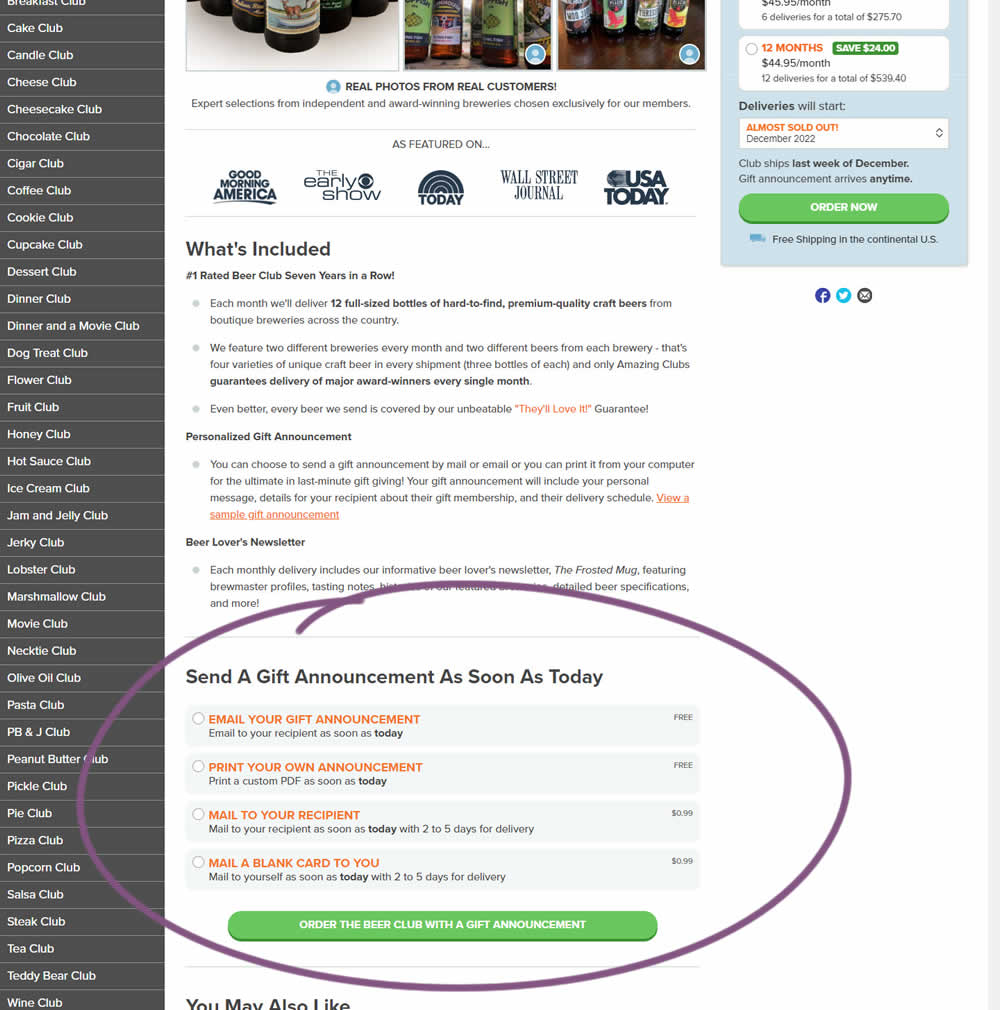
In this experiment, an additional purchase trigger was added - the ability to start by chosing a gift announcement option. In the control, this same question was asked further in the purchase funnel (after adding to cart). In the variation, this question was surfaced earlier as an alternative way of starting the purchase. Impact on total sales was measured.
Test #442 on
Volders.de
by  Daria Kurchinskaia
Nov 27, 2022
Desktop
Mobile
Home & Landing
X.X%
Progression
Daria Tested Pattern #4: Testimonials On Volders.de
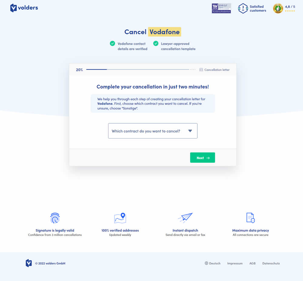
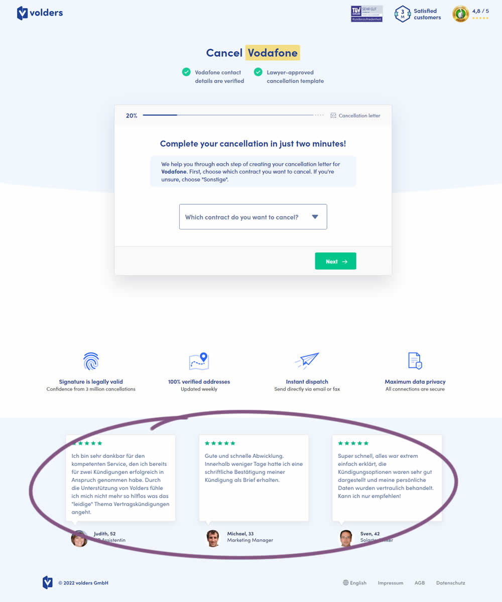
In this experiment, three testimonials were appended at the bottom of landing pages of a contract cancelation service (paid). These testimonials were also shown throughout the complete signup funnel (4 more steps). Impact on progression (step 2) and final completed purchases were measured.