All Latest 620 A/B Tests
Test #520 on
Asics.com
by  Andrey Prokhorov
Feb 29, 2024
Mobile
Product
X.X%
Progression
Andrey Tested Pattern #51: Shortcut Buttons On Asics.com
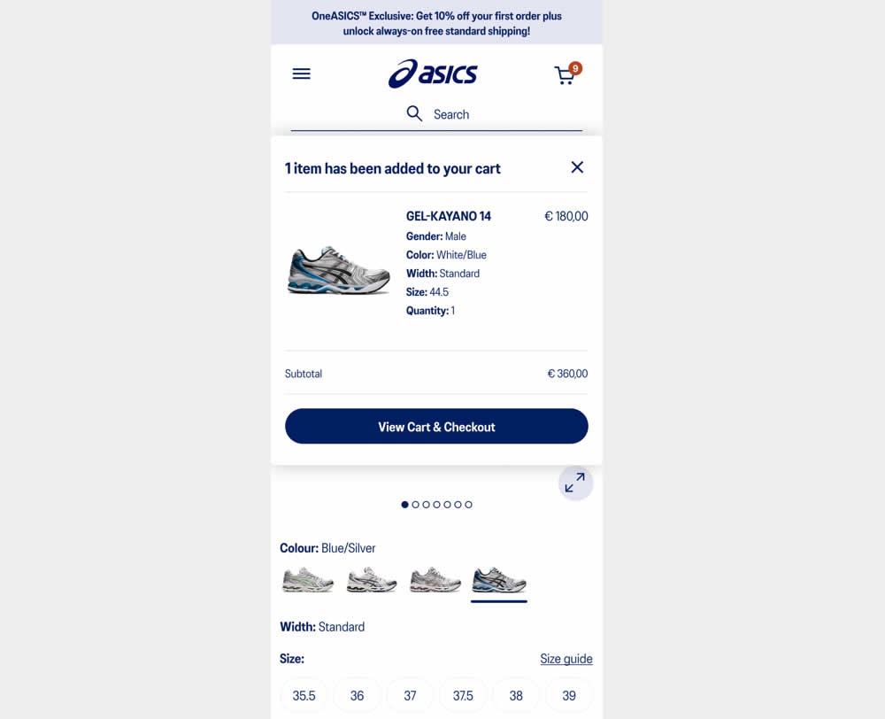
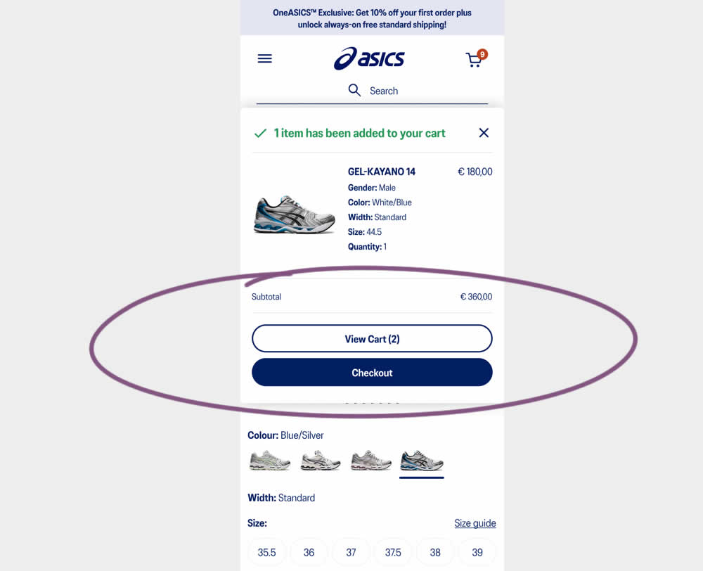
This experiment started when users would click add-to-cart on product detail pages. In both the control and variation, a modal would appear. In the control the modal contained a "View Cart and Checkout" button that lead users to the cart page. In the variation the modal showed separate "View Cart" and "Checkout" buttons. The a/b test variation also introduced a green confirmation message about the product being added to cart. Impact on transactions and revenue was measured.
Which A Or B Actually Wins? Find Out Before You Test.
Members see every test result — the winners, the flat ones, and the losers — along with exact effects and sample sizes. Use it to estimate your tests and prioritize by probability, not gut feel. Start every experiment with the odds on your side.
Test #518 on
by  Jakub Linowski
Feb 14, 2024
Mobile
Checkout
X.X%
Progression
Jakub Tested Pattern #64: Tunnel
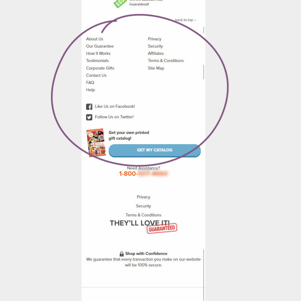
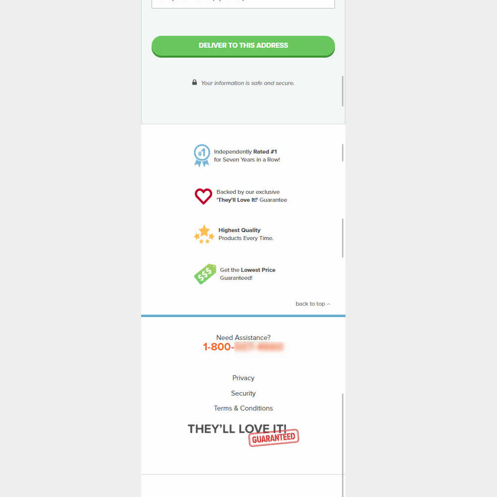
This was an experiment on the first checkout step where users would enter shipping information. The control had a longer footer with more additional sitewide links and a call to action to a newsletter. The variation removed these elements and kept the focus on the shipping information task. Impact on progression to next step and sales was measured.
Test #515 on
by  Jakub Linowski
Jan 31, 2024
Desktop
Mobile
Home & Landing
X.X%
Progression
Jakub Tested Pattern #69: Autodiscounting
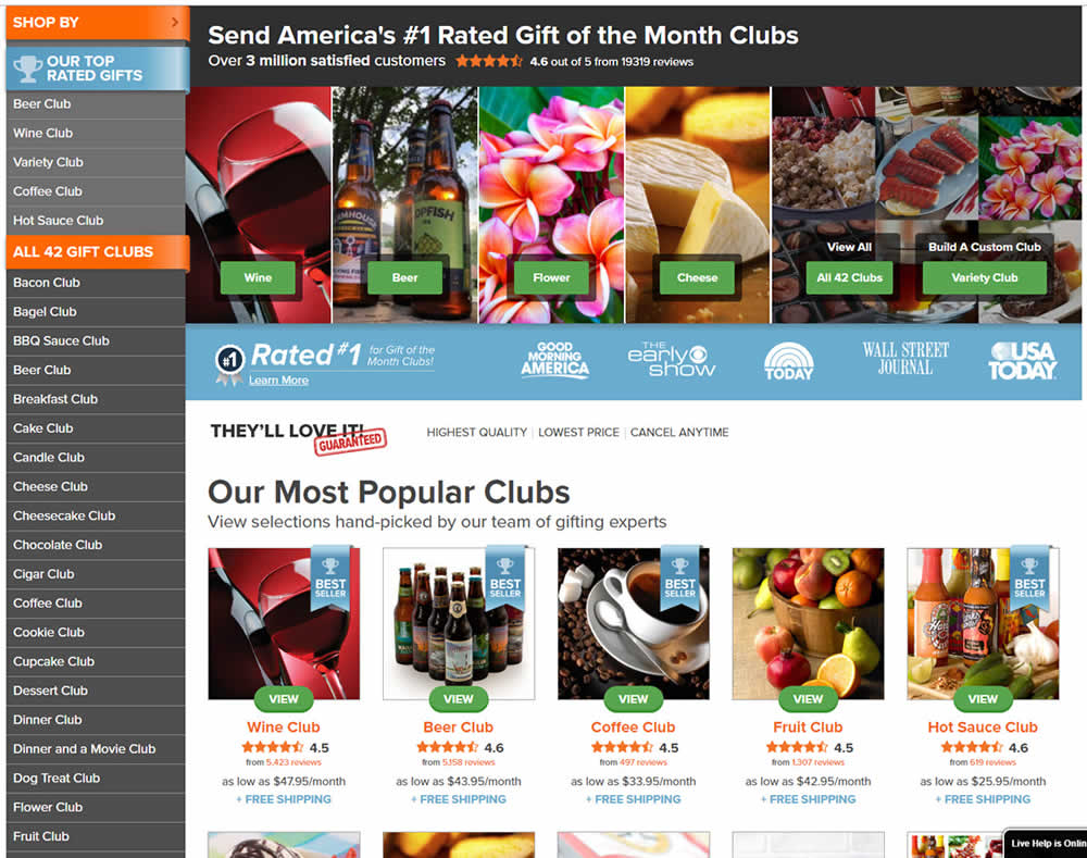
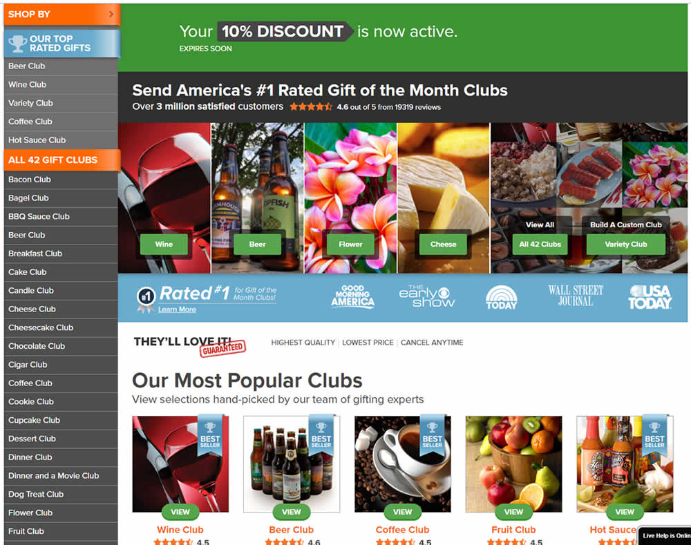
In this experiment, people who saw an offer (in an email or popup) would see a more visible site wide reinforcement of their earned discount being active. In the control, the discount was only shown during checkout. In the variation, it was shown throughout the web site on the homepage and product detail pages.
Test #514 on
Backstage.com
by  Stanley Zuo
Jan 24, 2024
Desktop
Listing
X.X%
Progression
Stanley Tested Pattern #97: Bigger Form Fields On Backstage.com
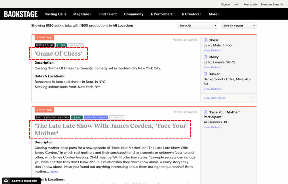
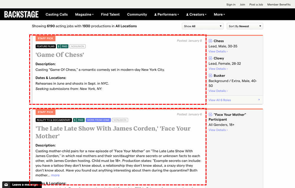
In this experiment, the click area of job listing tiles was expanded to the size of the full job tile. In the control, the click area was smaller - mostly only the job headline, along with additional "view more" links on the right hand column. Clicking the tile or headline would open up a new job details page in both control and variation. Impact on progression and membership sales was measured.
Test #513 on
Dripl.de
by  Jona Eisenberger
Jan 23, 2024
Mobile
Desktop
Product
X.X%
Progression
Jona Tested Pattern #15: Bulleted Reassurances On Dripl.de
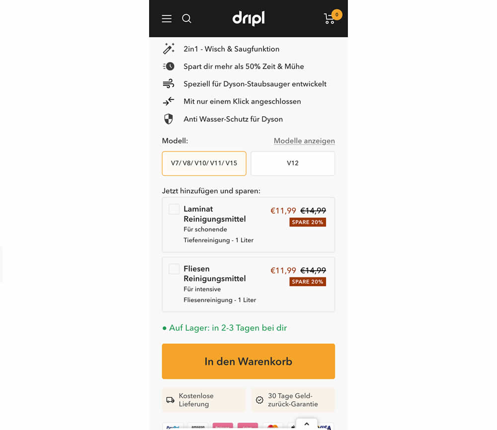
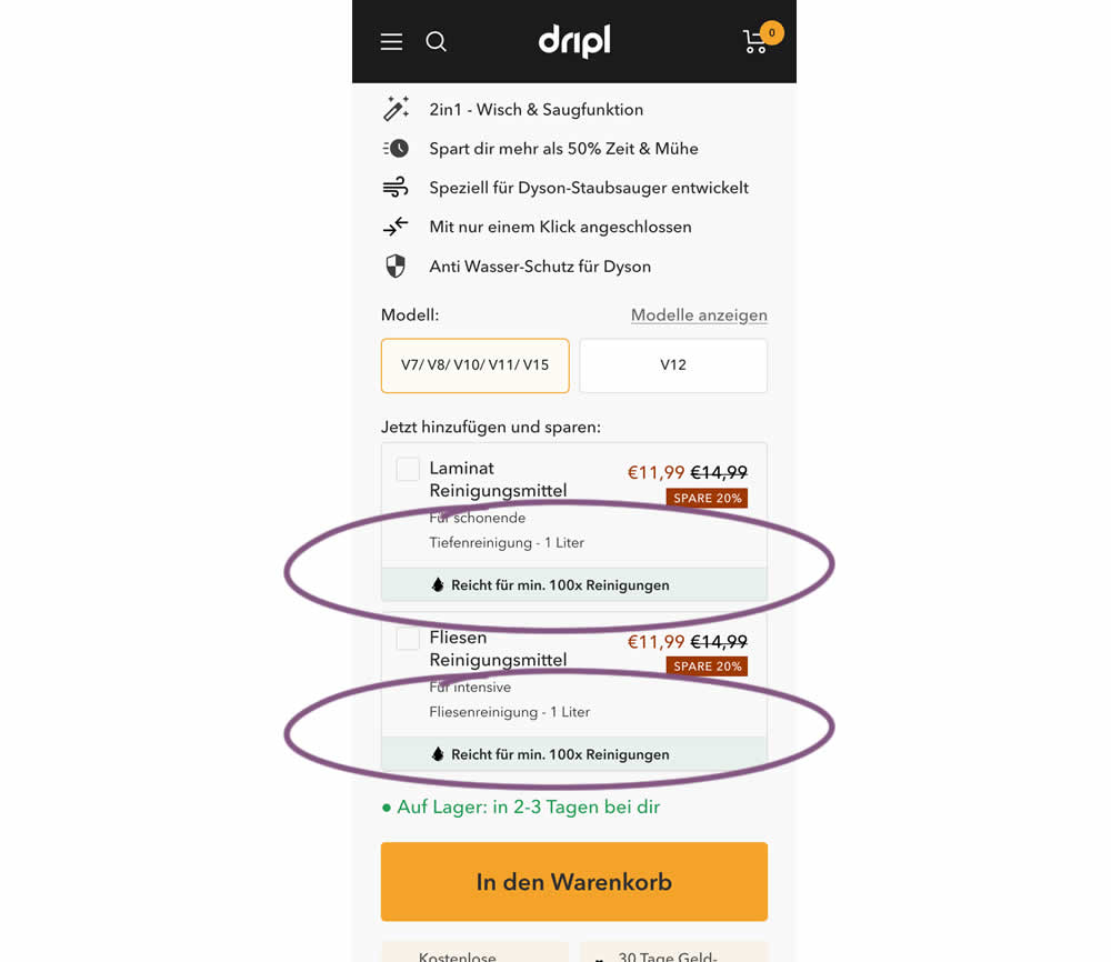
In this experiment of a floor cleaning product, a reassurance about product uses was appended to two cleaning agent upsells. In the control users saw the 2 standard upsells for laminate and tiles. And in the variation the copy "Right for me. 100x Cleanings" (uses) was appended.
Test #512 on
Snocks.com
by  Melina Hess
Jan 17, 2024
Mobile
Product
X.X%
Progression
Melina Tested Pattern #65: Add More For Extra Incentive On Snocks.com
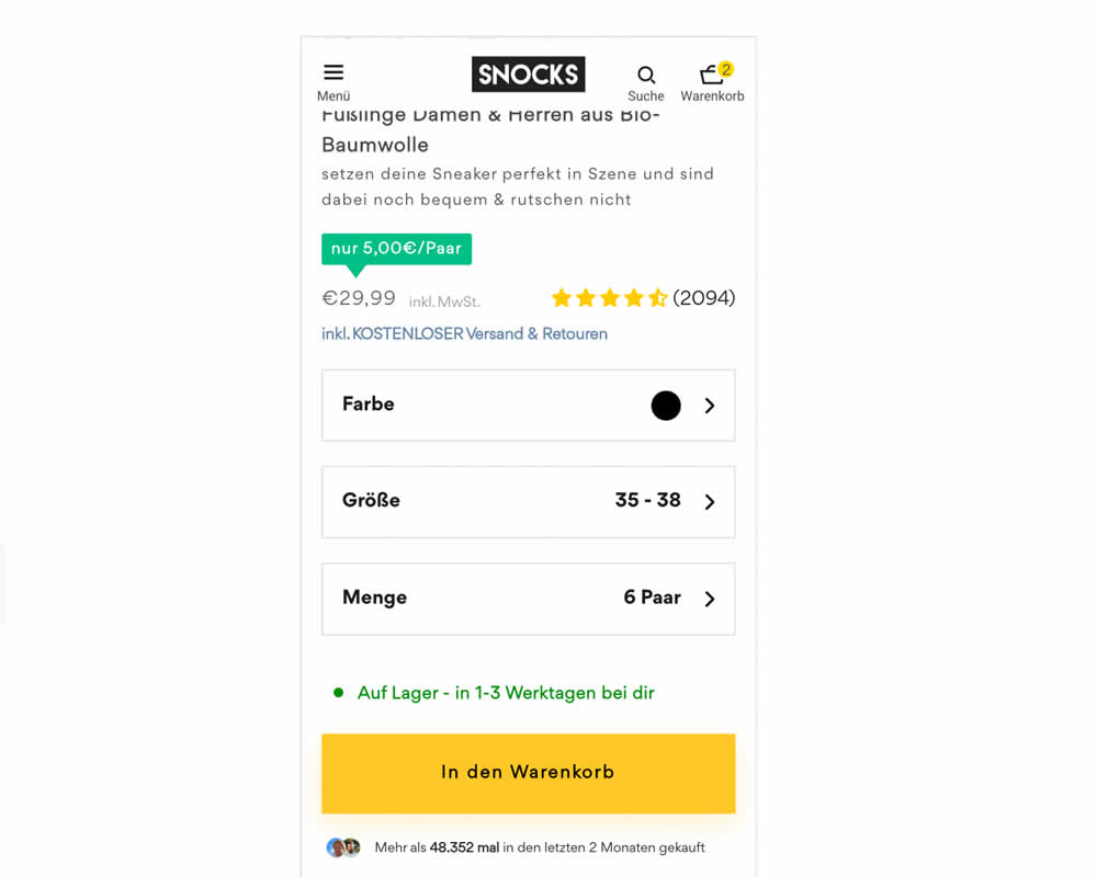
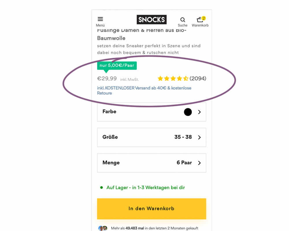
In this experiment, free shipping was a/b tested against free shipping with a 40€ purchase or higher. Hence, in the variation, customers needed to reach a cart amount total in order to be eligible for the free shipping.
Test #511 on
Online.metro-cc.ru
by  Andrey Andreev
Jan 09, 2024
Desktop
Home & Landing
X.X%
Progression
Andrey Tested Pattern #79: Product Highlights On Online.metro-cc.ru
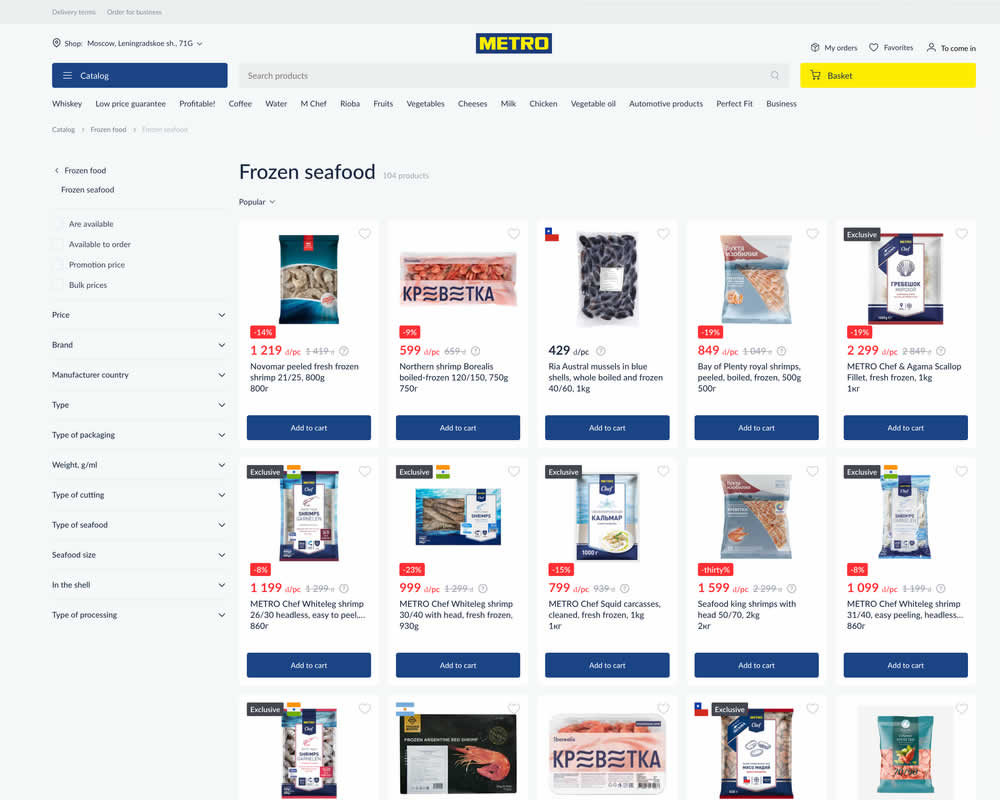
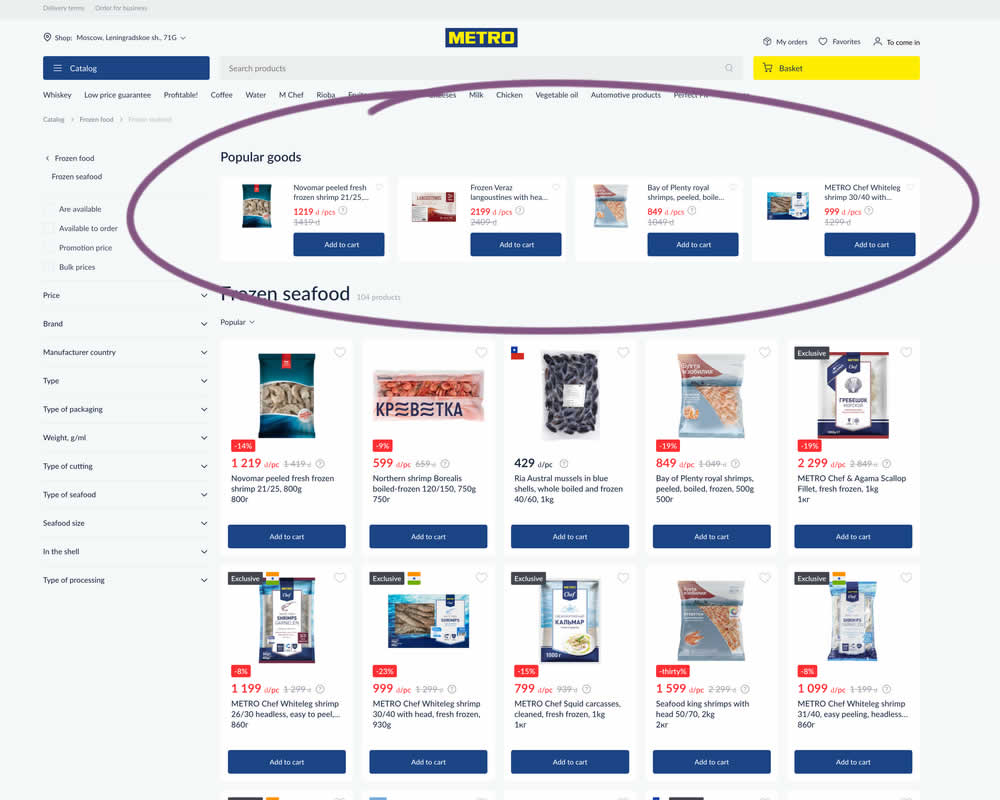
In this experiment, popular products were shown at the top of the homepage. Impact to sale was measured.
Test #509 on
Jared.com
by  Craig Kistler
Dec 18, 2023
Desktop
Product
X.X%
Progression
Craig Tested Pattern #66: Complementary Upsell On Jared.com
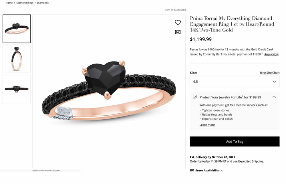
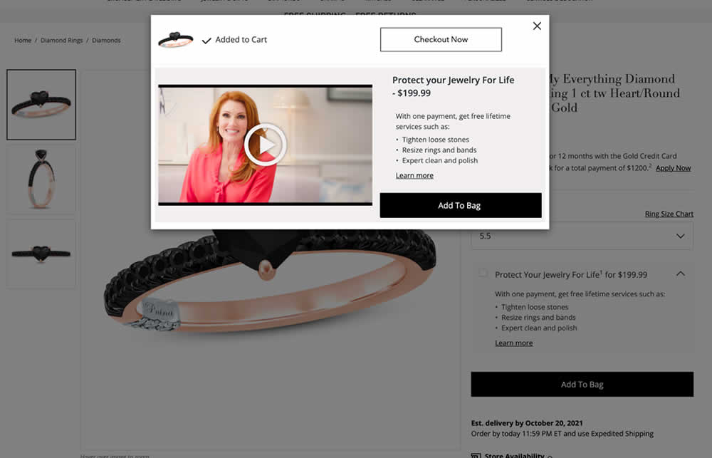
In this experiment, a protection plan was launched as a modal for customers that clicked add-to-cart without choosing the upsell. Impact on adds-to-cart and sales was measured.
Test #508 on
Online.metro-cc.ru
by  Andrey Andreev
Dec 15, 2023
Mobile
Product
X.X%
Progression
Andrey Tested Pattern #93: Auto Next On Online.metro-cc.ru
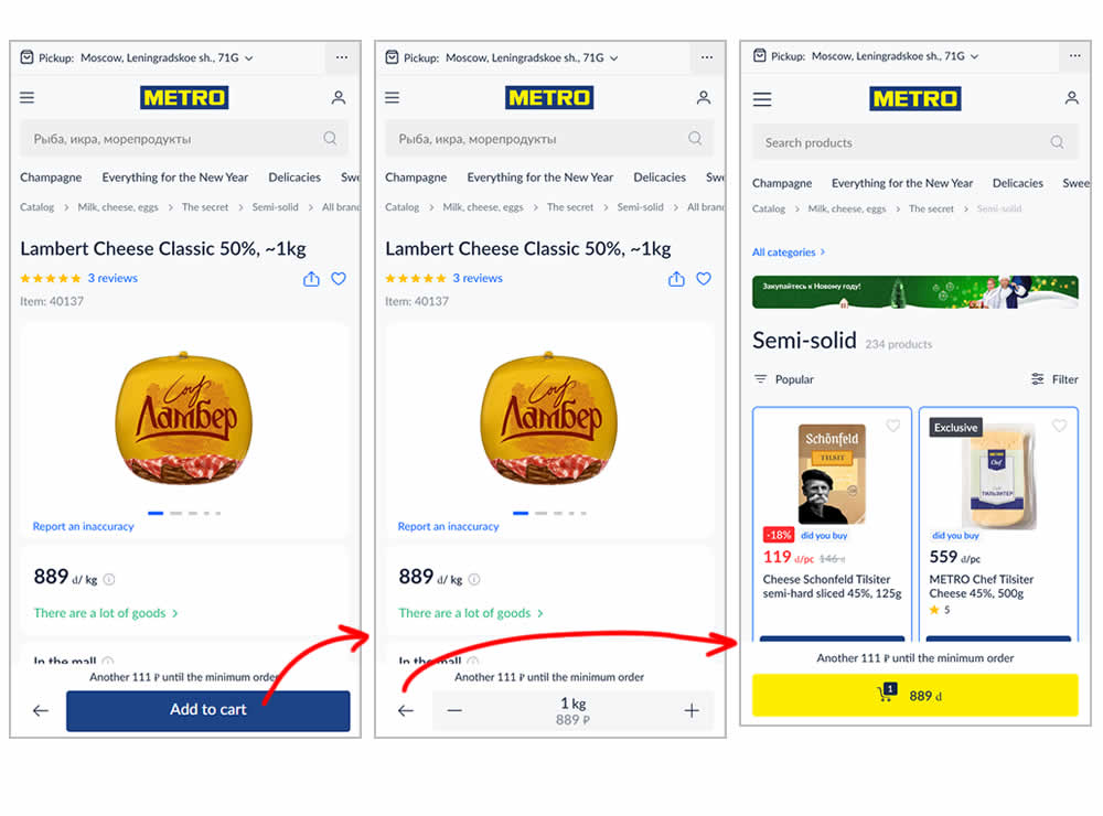
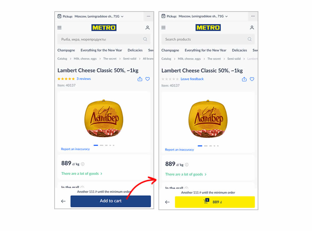
In this experiment, the variation transformed an add-to-cart button into a shopping cart one (making it a two step process). The control had an interaction where an add-to-cart button would become a quantity selection and then a shopping cart action (a three step process). In a way, the control kept users in a "dead-end" quantity selection middle state that required clicking the back button to continue the sale. Whereas the variation automatically moved users into the next step (closer towards being able to make a purchase). Impact on sales was measured.
Test #507 on
Fairment.de
by  Jona Eisenberger
Dec 11, 2023
Mobile
Listing
X.X%
Progression
Jona Tested Pattern #133: Product Availability On Fairment.de
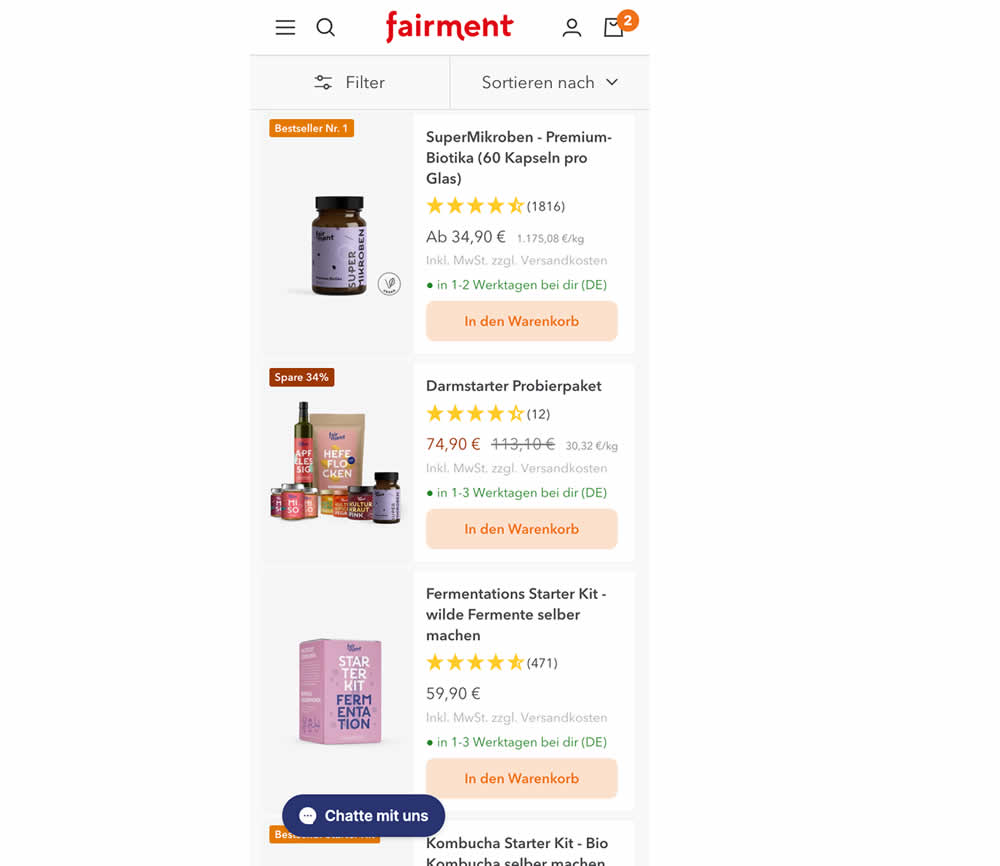
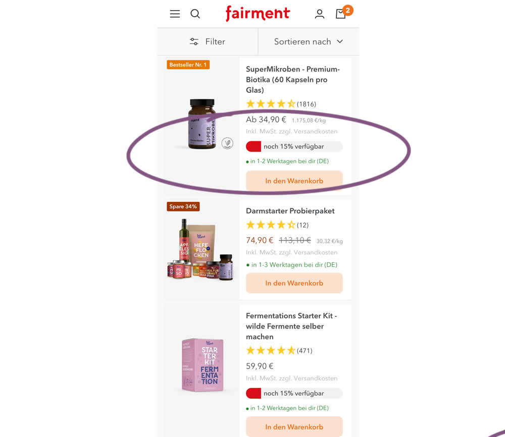
In this experiment, product availabiltiy bars were shown on products with low stock. This was shown on listing pages. Impact on adds to cart and sales was measured.
Test #506 on
by  Jakub Linowski
Dec 07, 2023
Desktop
Mobile
Product
X.X%
Progression
Jakub Tested Pattern #4: Testimonials
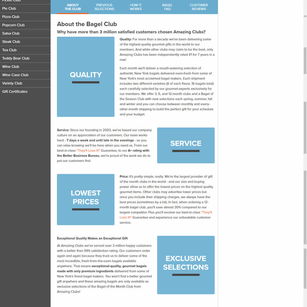
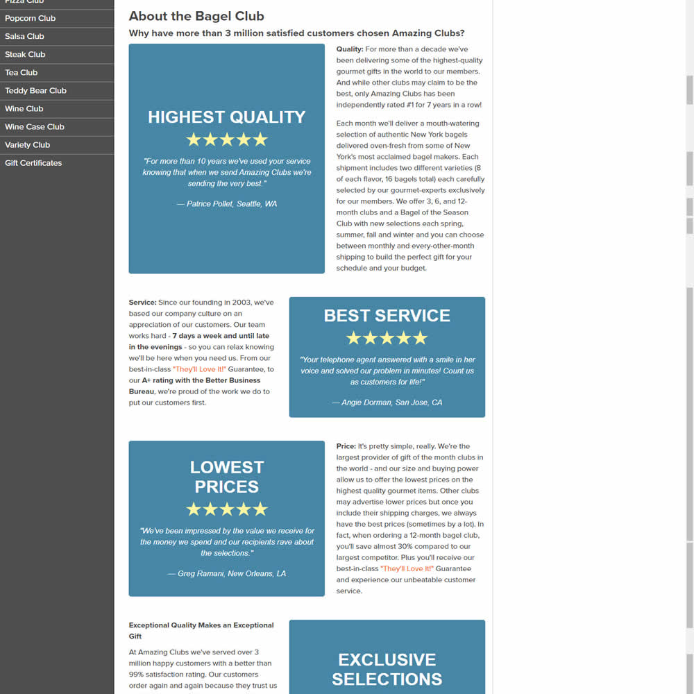
In this experiments, reinforcing section tiles were replaced with additional customer testimonials. Impact on adds to cart and sales was measured.
Test #502 on
Fairment.de
by  Jona Eisenberger
Nov 06, 2023
Mobile
Listing
X.X%
Progression
Jona Tested Pattern #37: List Or Grid View On Fairment.de
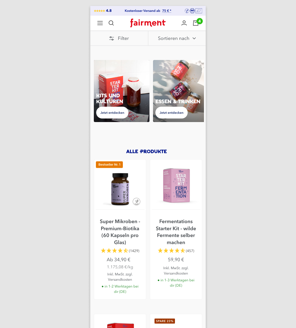
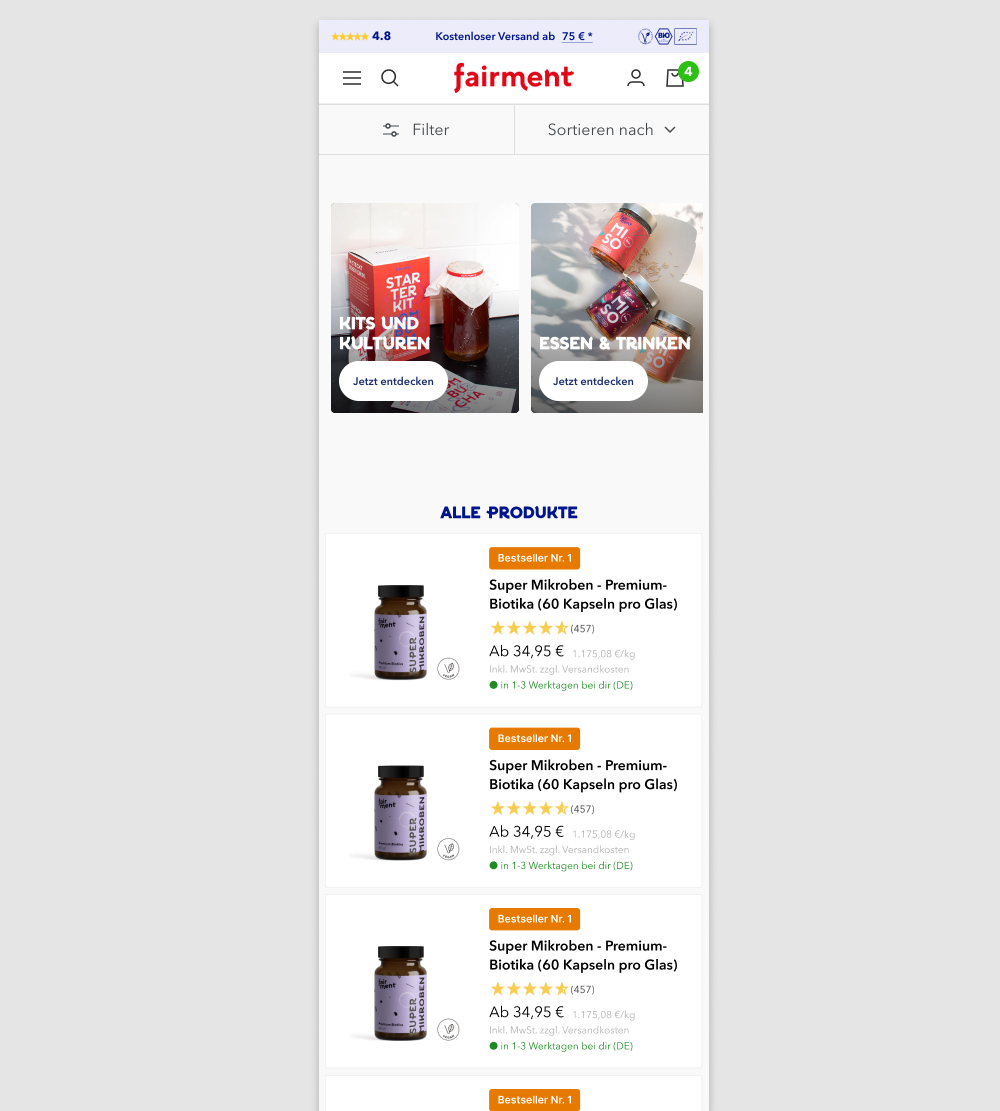
In this experiment, a two column grid layout (control) was tested against single column layout (variation) with the product information shown to the right. Please note that the screenshot shows repeated products only because it's been sourced from a Figma design file. In reality, the products in the variation were equally diverse as in the control.
(We've also flipped the A and B to match up with our grid pattern.)
Test #503 on
by  Jakub Linowski
Nov 05, 2023
Desktop
Mobile
Home & Landing
X.X%
Progression
Jakub Tested Pattern #36: Fewer Or More Results
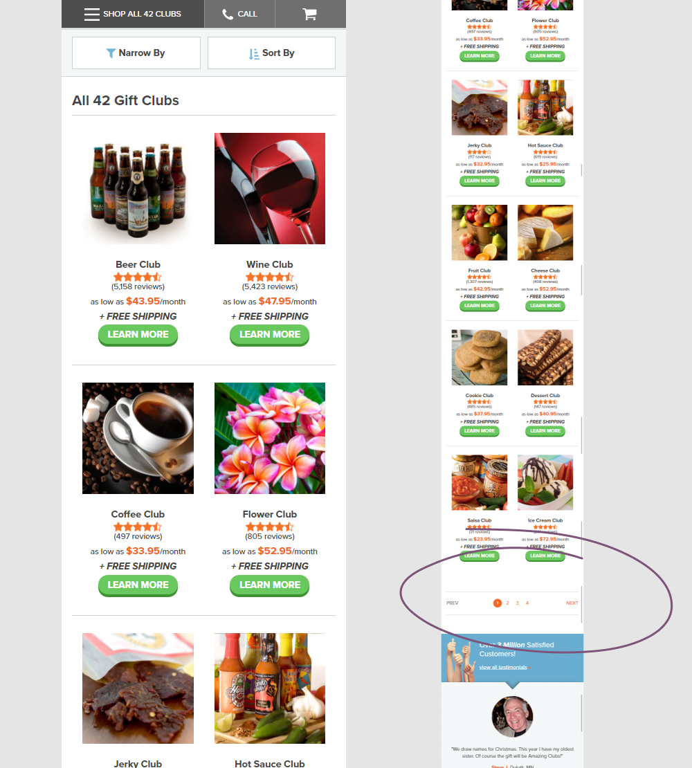
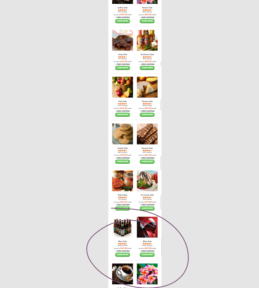
In this experiment, instead of showing 12 products per screen (with pagination), the variation showed all 42 products on a single screen. Impact on adds to cart and completed orders was measured.
Test #500 on
Kayoutlet.com
by  Craig Kistler
Oct 25, 2023
Mobile
Product
X.X%
Progression
Craig Tested Pattern #7: Social Counts On Kayoutlet.com
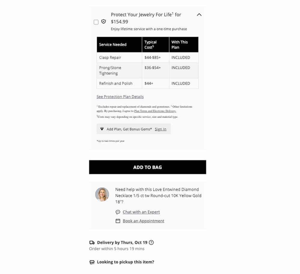
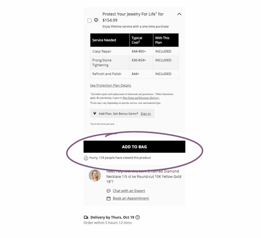
This was a replication attempt similar to experiment 497. A social proof message was added below add to cart buttons on product detail pages. Impact on adds to cart and transactions was measured.
Test #499 on
Shmoodyapp.com
by  Michael McSweeney
Oct 20, 2023
Mobile
Signup
X.X%
Progression
Michael Tested Pattern #99: Progress Bar On Shmoodyapp.com
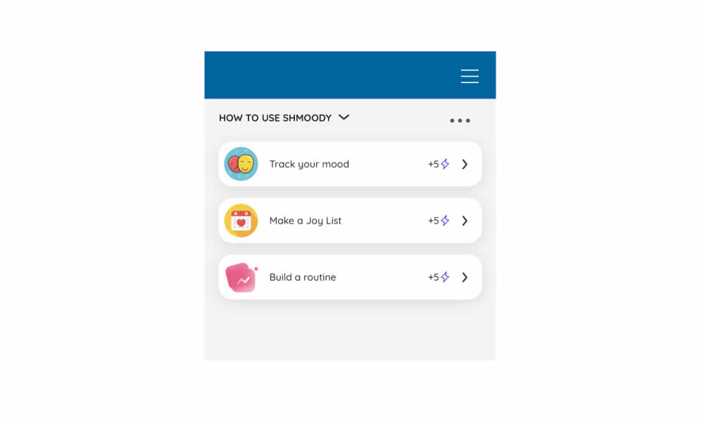
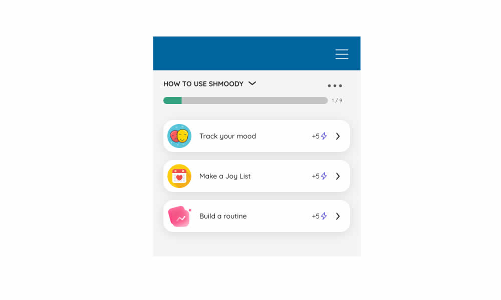
In this experiment, a progress bar was added to a signup flow of a mental health app. It appeared on numerous steps of a onboarding flow. Impact on signup completions and checkouts was measured.
Test #498 on
by  Jakub Linowski
Oct 19, 2023
Desktop
Mobile
Product
X.X%
Progression
Jakub Tested Pattern #7: Social Counts
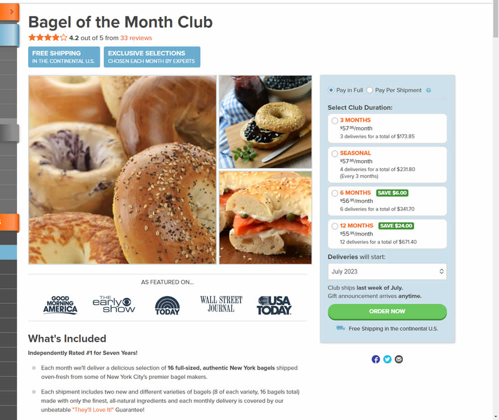
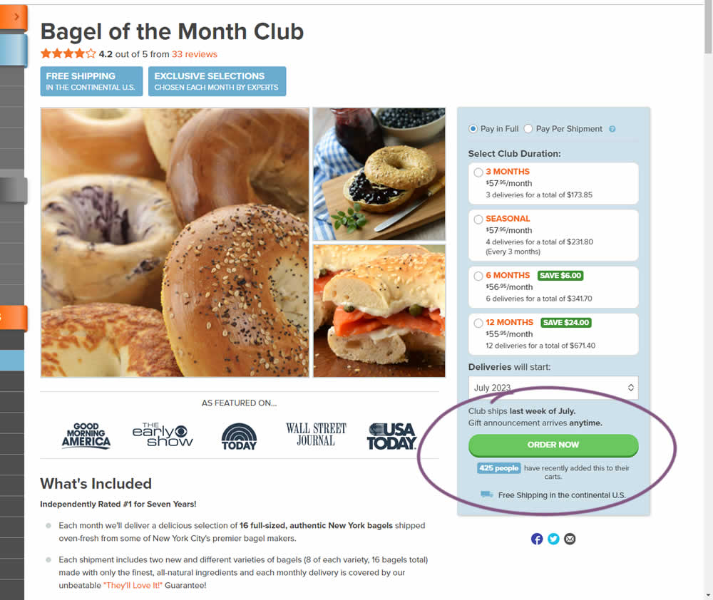
In this experiment, the variation tracked how many people would add something to cart over the last 24 hours and display that just below the add to cart button. Impact on adds to cart and transactions was measured.
Test #497 on
Jared.com
by  Craig Kistler
Oct 16, 2023
Mobile
Product
X.X%
Progression
Craig Tested Pattern #7: Social Counts On Jared.com
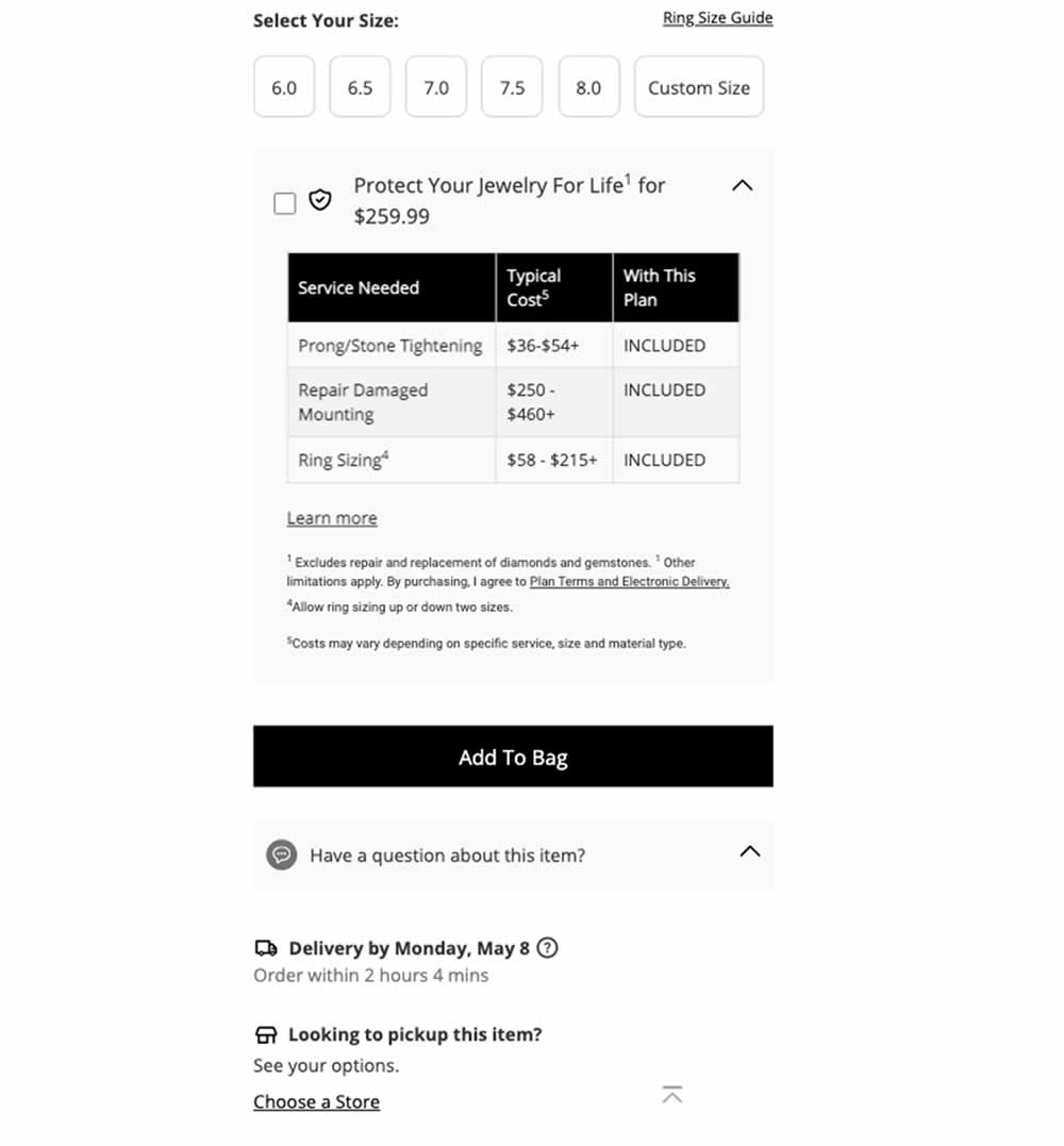
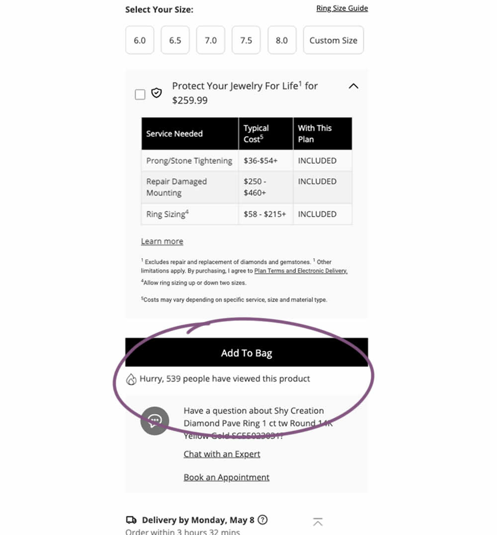
In this experiment, a social proof message was added below add to cart buttons on product detail pages. The copy read "Hurry, X people have viewed this product". Impact on adds to cart and transactions was measured.
Test #495 on
Formelskin.de
by  Alexander Krieger
Sep 25, 2023
Mobile
Signup
X.X%
Progression
Alexander Tested Pattern #9: Multiple Steps On Formelskin.de
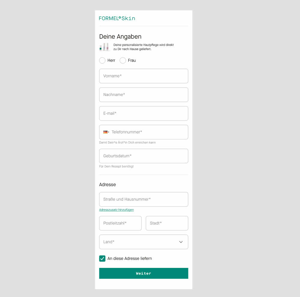
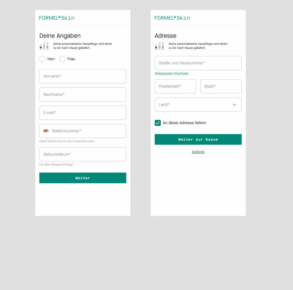
In this experiment two sections of a form on a single page (control) were broken out into 2 separate steps (variation). The two sections included personal details and shipping information. This step appeared after having received a product recommendation when filling out a questionnaire for a skin care product. Impact on next step progression and purchases was measured.
Test #494 on
Online.Metro-cc.ru
by  Andrey Andreev
Sep 20, 2023
Desktop
Mobile
Home & Landing
X.X%
Progression
Andrey Tested Pattern #26: Cart Reminder And Recently Viewed On Online.Metro-cc.ru
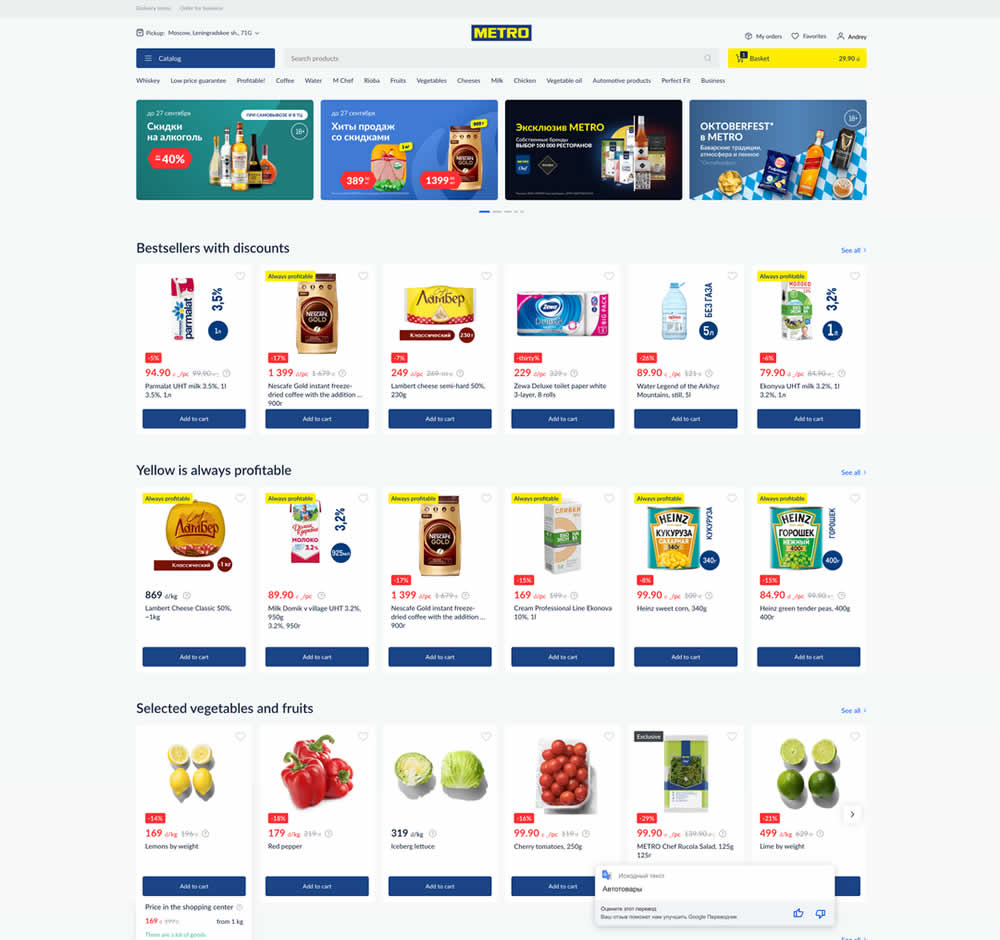
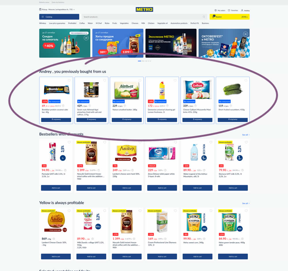
In this experiment, recently purchased products were appended at the top of the homepage. The test ran for loggedin users only. Impact on add-to-cart, sales and revenue was measured.
Test #493 on
by  Jakub Linowski
Sep 19, 2023
Desktop
Mobile
Product
X.X%
Progression
Jakub Tested Pattern #69: Autodiscounting
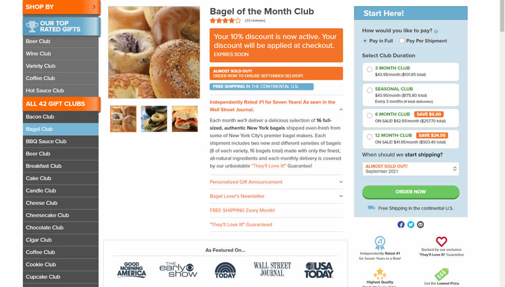
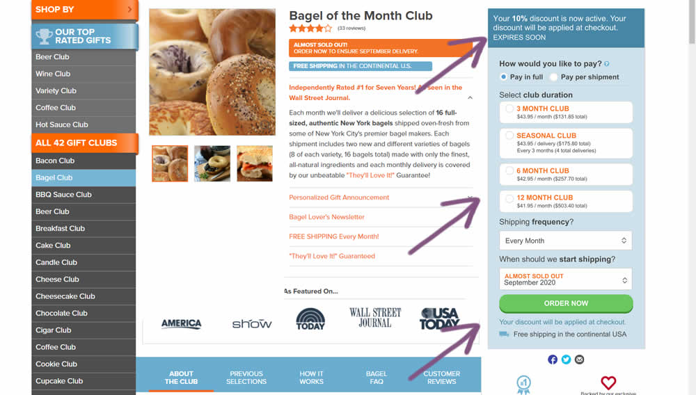
This experiment was technically a larger multi-change one that ran on product detail pages. The control showed an automatically applied coupon (for people opening up targeted emails with the discount). The variation attempted to make this better with the following changes:
- The discount message shifted closer towards the price / product selection (above the buy box)
- Removal of sale discount amounts and messages tied to longer durations (6 and 12 month duration)
- Reinforcing that the actual discount will be calculated further on checkout