All Latest 620 A/B Tests
MOST RECENT TESTS
Test #241 on
Kenhub.com
by  Niels Hapke
May 24, 2019
Desktop
Mobile
Signup
X.X%
Signups
Niels Tested Pattern #105: Lead Magnets On Kenhub.com
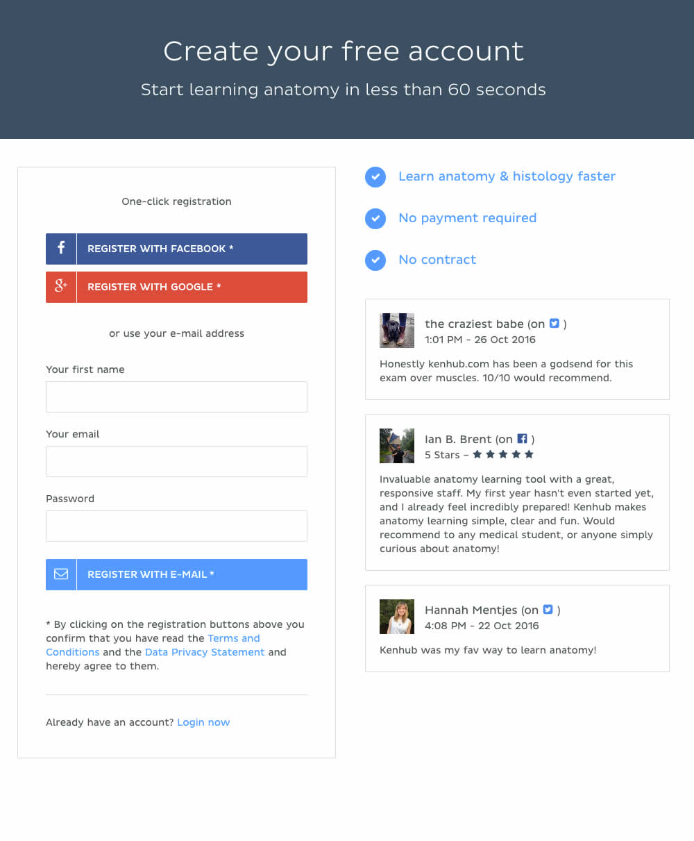
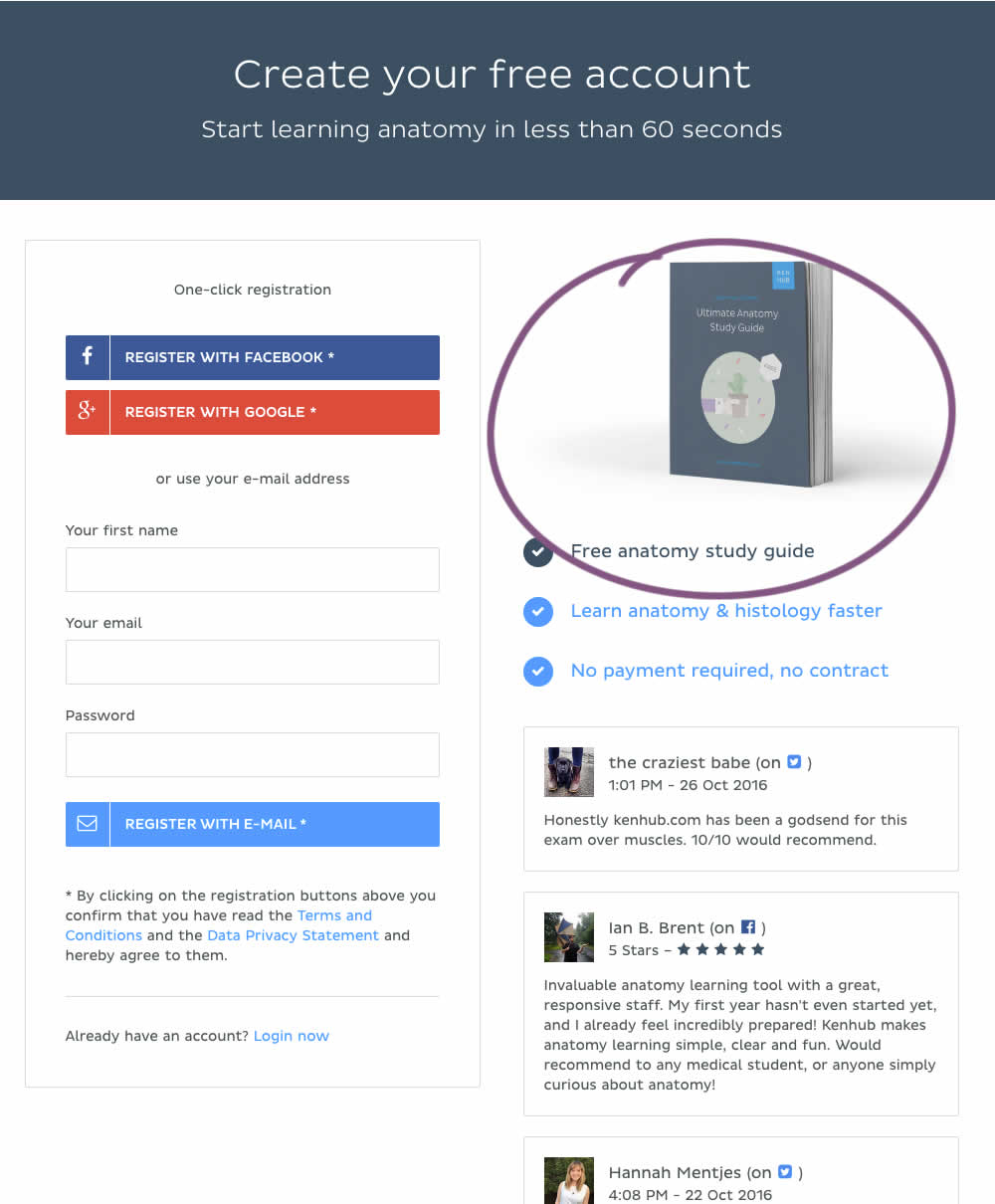
In this experiment, a free study guide ebook was promoted on a registration page.
Which A Or B Actually Wins? Find Out Before You Test.
Members see every test result — the winners, the flat ones, and the losers — along with exact effects and sample sizes. Use it to estimate your tests and prioritize by probability, not gut feel. Start every experiment with the odds on your side.
Test #240 on
Thomasnet.com
by  Julian Gaviria
May 16, 2019
Desktop
Listing
X.X%
Engagement
Julian Tested Pattern #13: Centered Forms & Buttons On Thomasnet.com
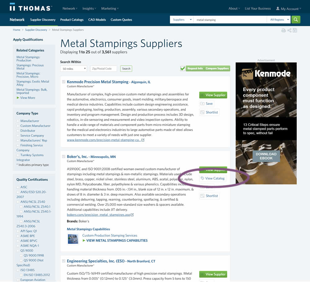
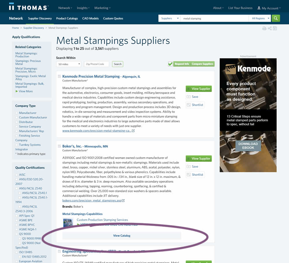
In this experiment, two different positions of the View Catalog button were compared. In version A the button was smaller and on the right. In version B the button was wider and more central. (The actual test was inverted before publishing to match the A-B of the pattern.)
Test #239 on
Volders.de
by  Alexander Krieger
May 02, 2019
Desktop
Home & Landing
X.X%
Progression
Alexander Tested Pattern #13: Centered Forms & Buttons On Volders.de
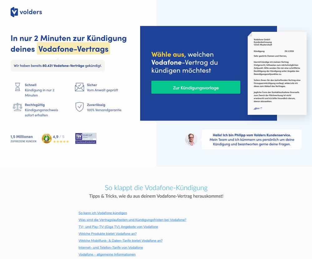
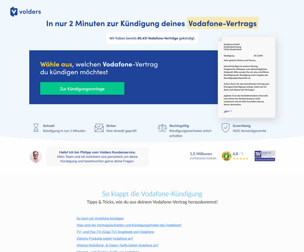
A contract cancellation landing page was tested for the effect of a single (wider CTA area with a left aligned button) vs two column layout (narrow CTA area with a right aligned button).
Test #238 on
Suzuki.be
by  Karl Gilis
May 01, 2019
Desktop
Home & Landing
X.X%
Progression
Karl Tested Pattern #104: Carousel Vs Static Grid Images On Suzuki.be
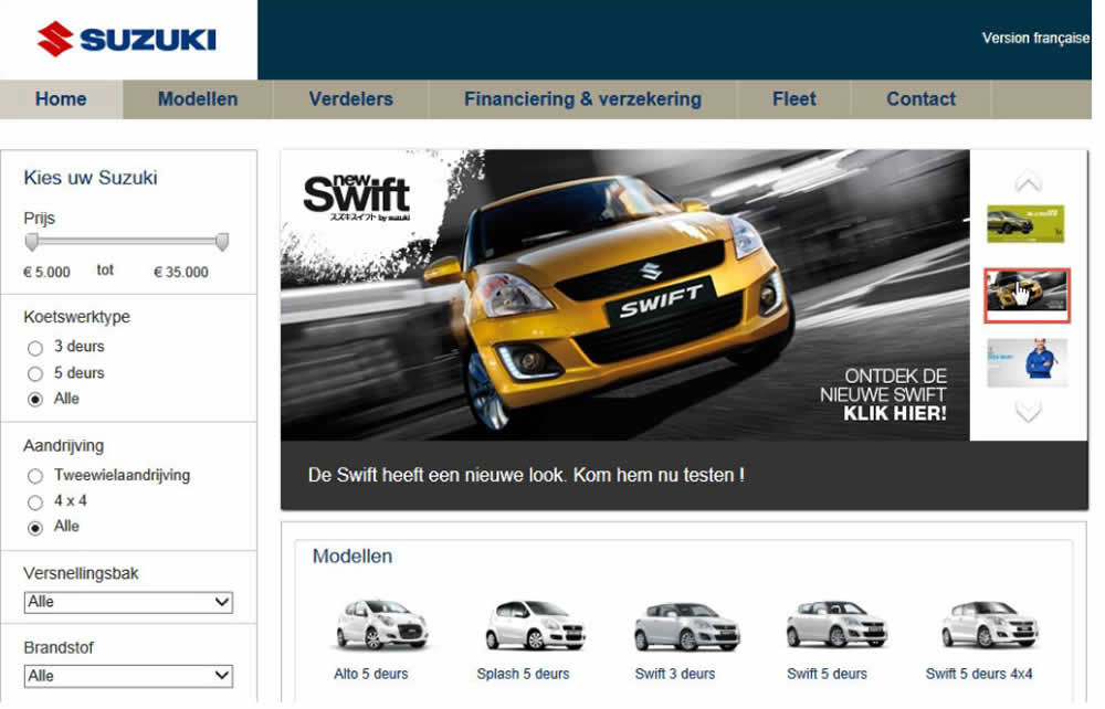
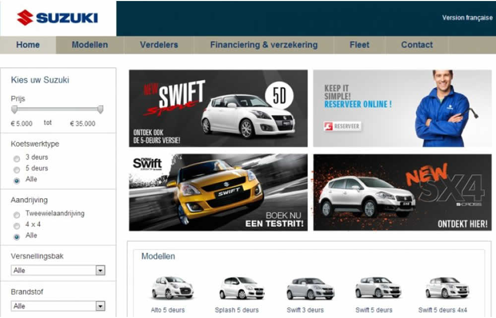
In this homepage experiment with a 4-slide carousel, the slides changed every 3.5 seconds and users could also choose another slide manually. In the variations, instead of the 4 slides in the carousel, static images were used to take up the same amount of space.
Test #237 on
Goodui.org
by  Jakub Linowski
Apr 29, 2019
Desktop
Mobile
Listing
X.X%
Sales
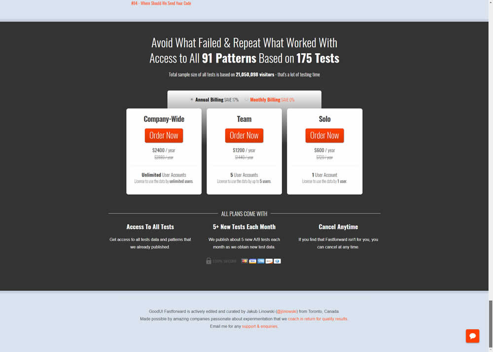
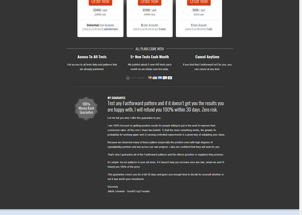
Jakub Tested Pattern #103: Money Back Guarantee On Goodui.org
Test #236 on
by  Alex James
Apr 04, 2019
Desktop
Signup
X.X%
Signups
Alex Tested Pattern #9: Multiple Steps
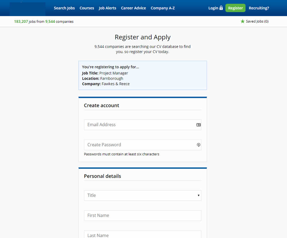
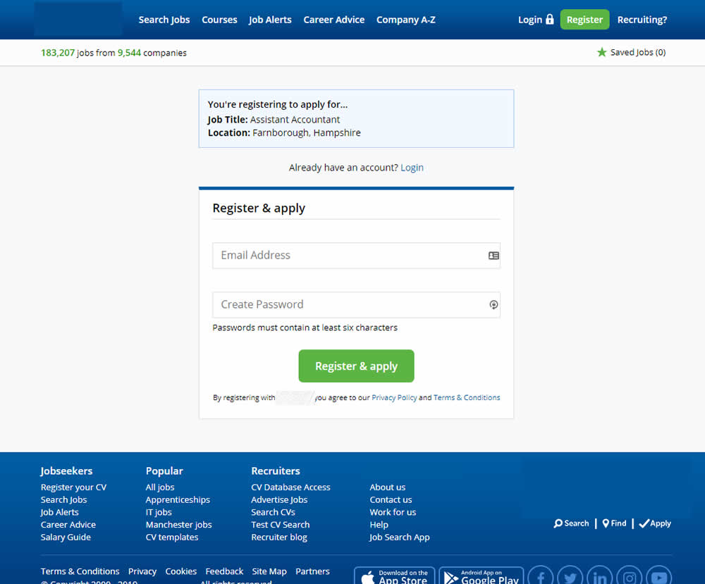
In this experiment a single screen signup process was broken into 2 separate steps: account creation & details.
Test #235 on
Thomasnet.com
by  Julian Gaviria
Apr 02, 2019
Desktop
Mobile
Home & Landing
X.X%
Leads
Julian Tested Pattern #102: Expanded Or Condensed Layout On Thomasnet.com
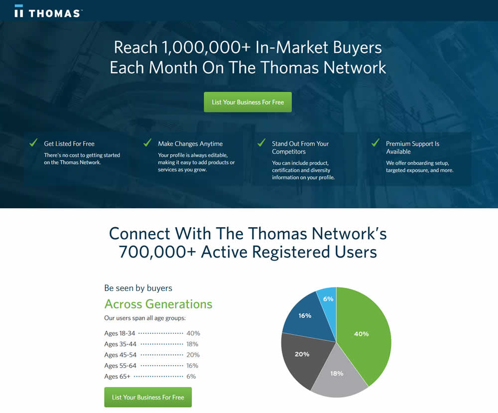
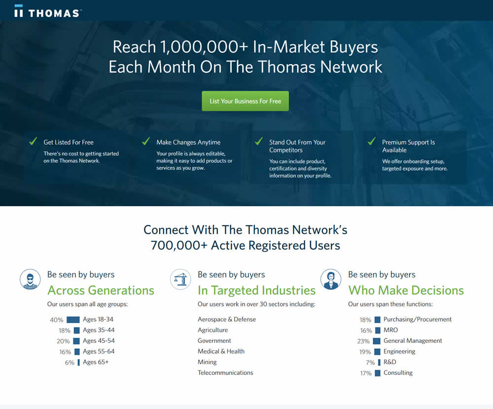
In this experiment, the layout was condensed from a taller to a shorter one.
Test #234 on
by  Alex James
Apr 01, 2019
Desktop
Listing
X.X%
Leads
Alex Tested Pattern #101: Search Keyword Highlighting

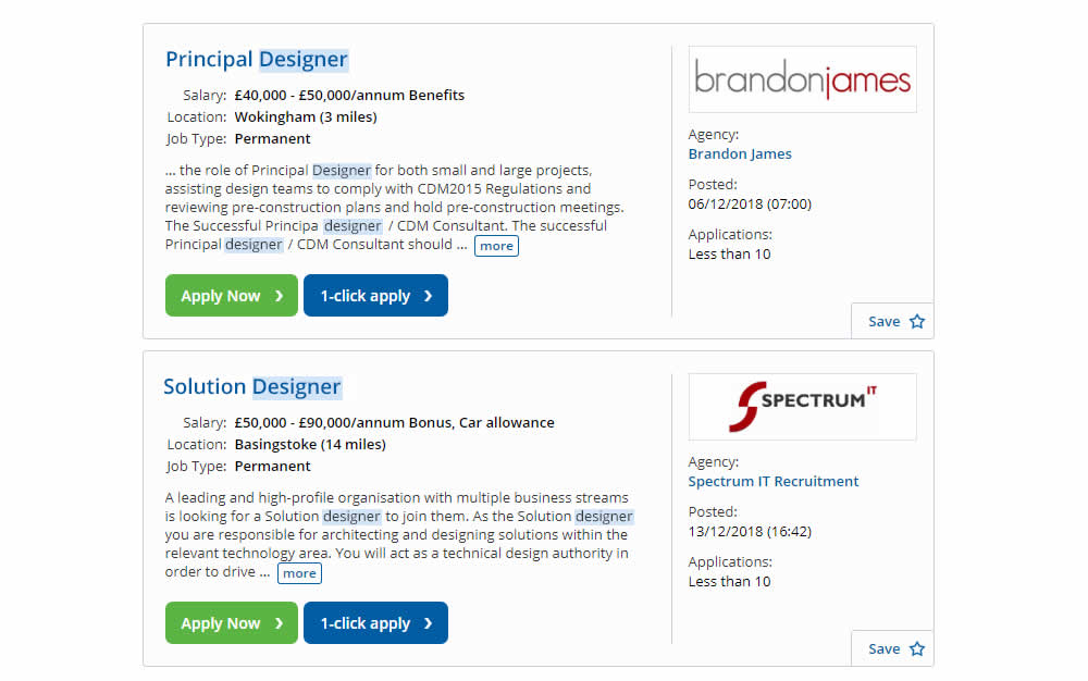
In this experiment, a different style for keyword highlighting was used.
Test #233 on
Annonce.cz
by  Ondřej Ilinčev
Apr 01, 2019
Desktop
Signup
X.X%
Sales
Ondřej Tested Pattern #100: Postponed Registration On Annonce.cz
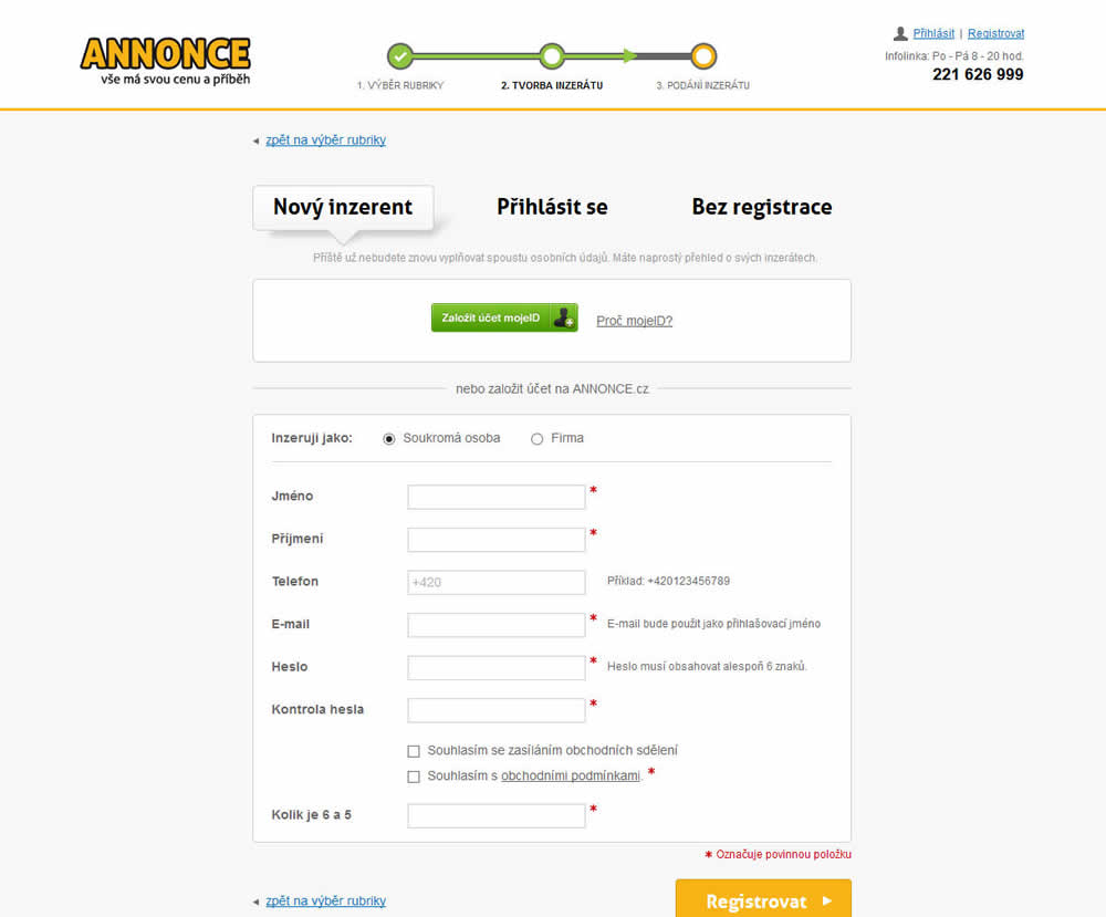
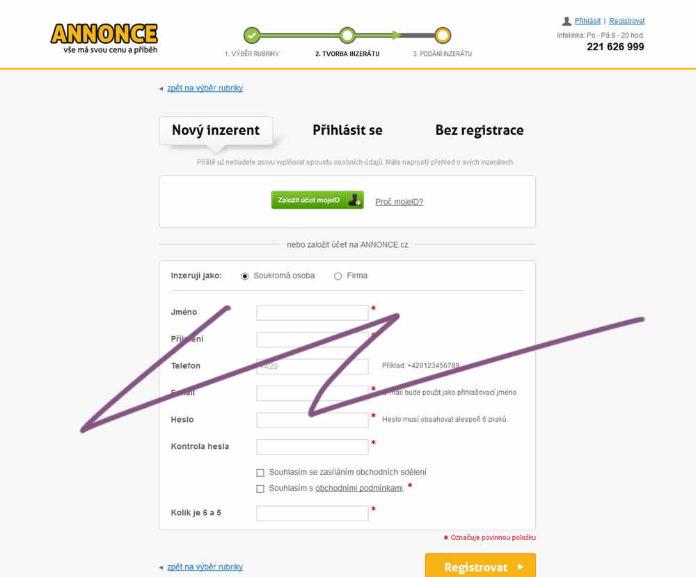
In this experiment, the old flow had a login / register / guest checkout as a second step. The variant B flow removed this step and treated everyone as a guest (and later offered to login / register). In the B version guests had a voluntary registration on the thank you page and in a confirmation email.
Test #232 on
Yoast.com
by  Sjardo Janssen
Mar 15, 2019
Desktop
Mobile
Checkout
X.X%
Sales
Sjardo Tested Pattern #6: Customer Star Ratings On Yoast.com
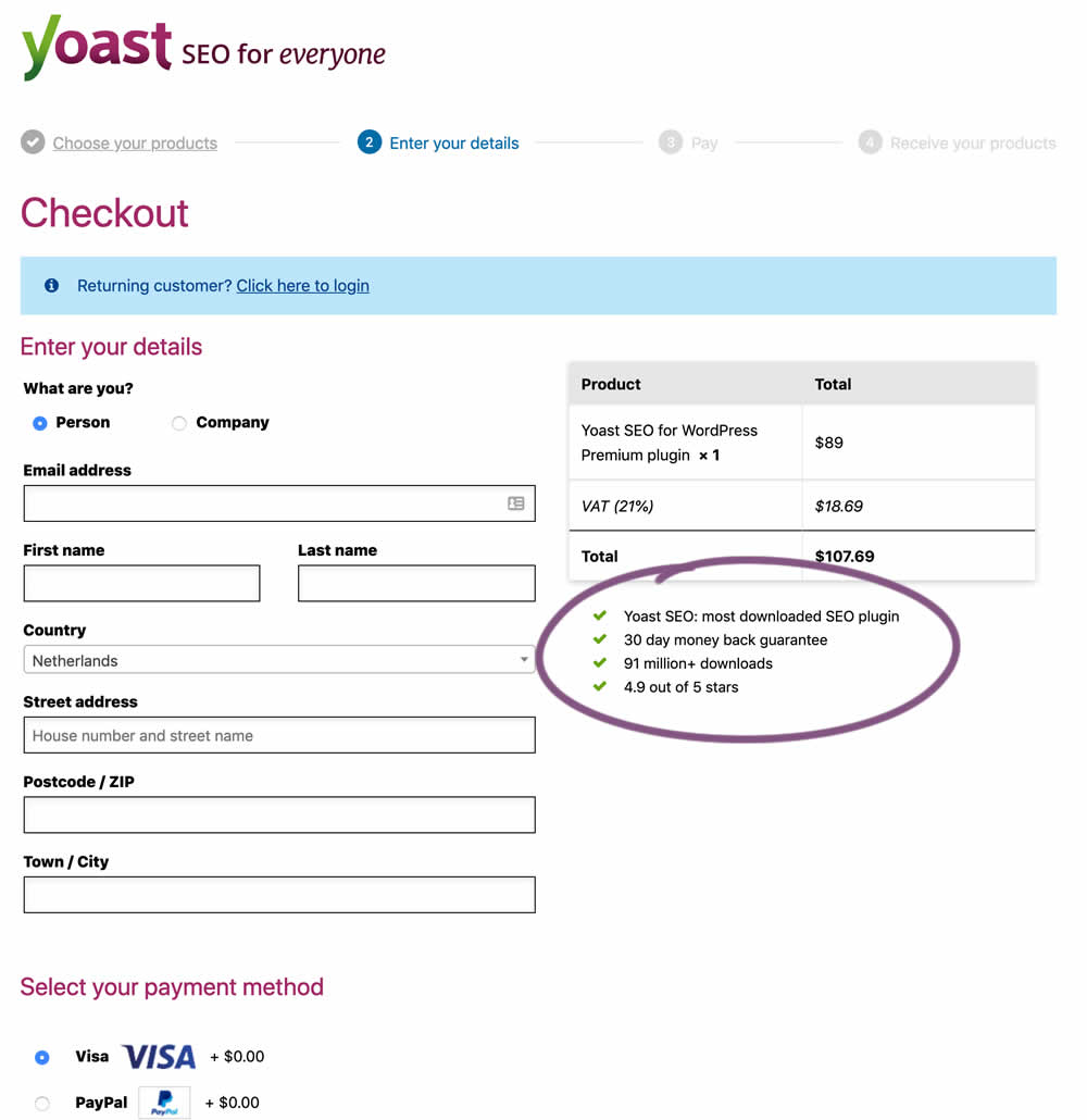
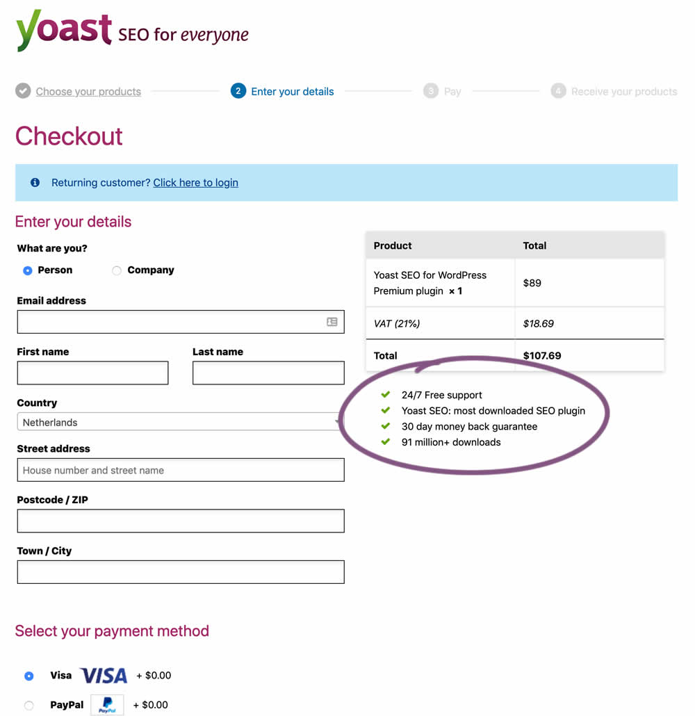
In this experiment, the Yoast team replaced one of the bulleted reassurances on their checkout page ("4.9 out of 5 stars" vs "24/7 Free support"). Raising the question - is free support or high reviews valued more? - Thanks Sjardo & Meike for sharing!
Test #231 on
Glass.net
by  Mark Freedle
Mar 14, 2019
Desktop
Mobile
Signup
X.X%
Leads
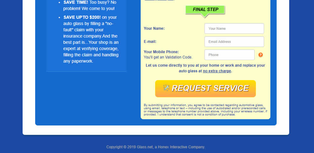
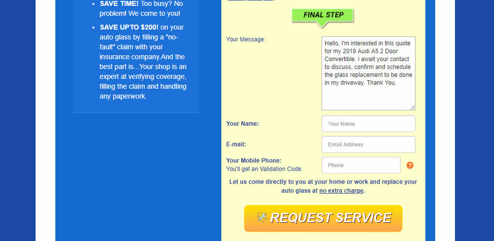
Mark Tested Pattern #20: Canned Response On Glass.net
Test #230 on
Goodui.org
by  Jakub Linowski
Mar 09, 2019
Desktop
Mobile
Listing
X.X%
Engagement
Jakub Tested Pattern #56: Hover Button On Goodui.org
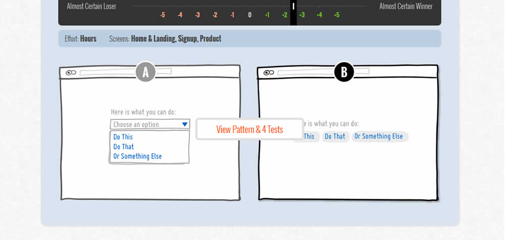
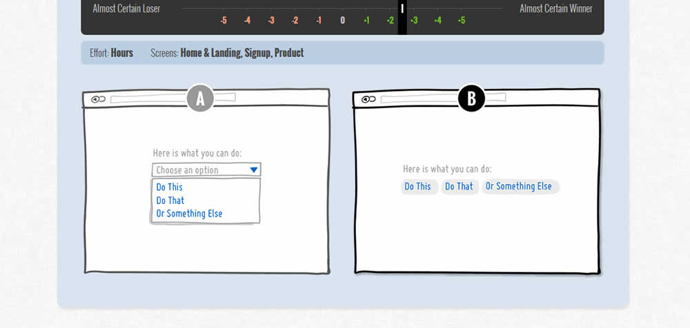
In this test we tested onhover buttons (variant) versus more traditional always exposed and visible ones.
Test #229 on
by  Jakub Linowski
Mar 08, 2019
Desktop
Mobile
Checkout
X.X%
Sales
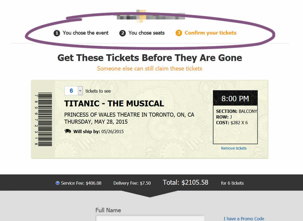
Jakub Tested Pattern #99: Progress Bar
Test #228 on
by  Jakub Linowski
Mar 05, 2019
Desktop
Mobile
Checkout
X.X%
Sales
Jakub Tested Pattern #99: Progress Bar

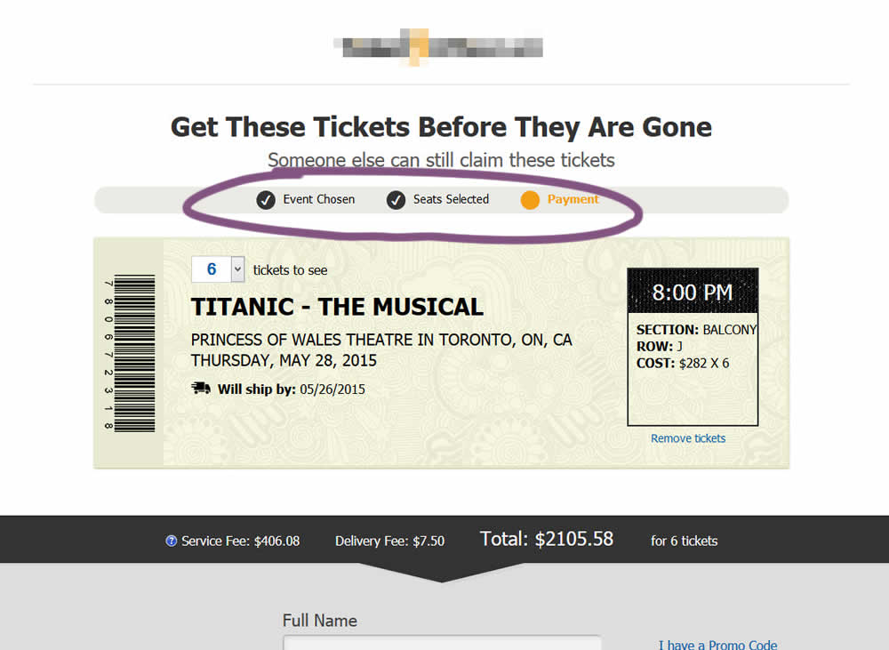
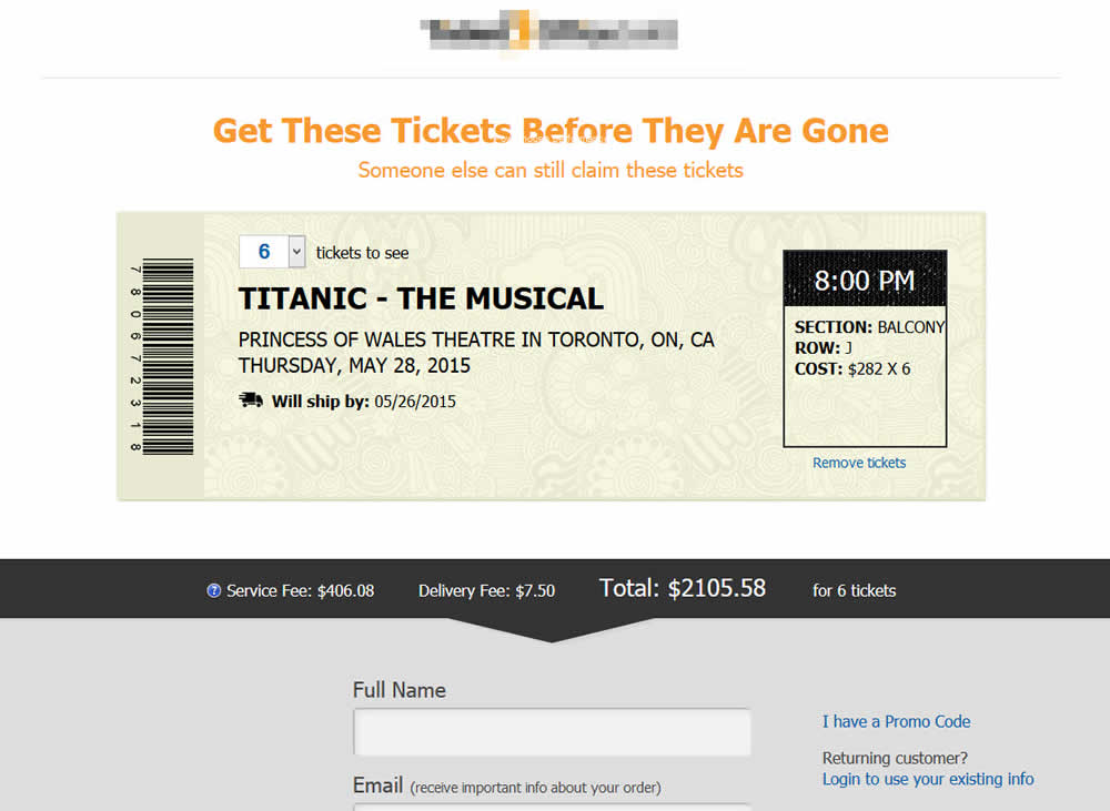
The variation added a progress bar to one of the checkout steps for a ticket ordering site.
Test #227 on
Volders.de
by  Alexander Krieger
Mar 04, 2019
Desktop
Signup
X.X%
Leads
Alexander Tested Pattern #99: Progress Bar On Volders.de

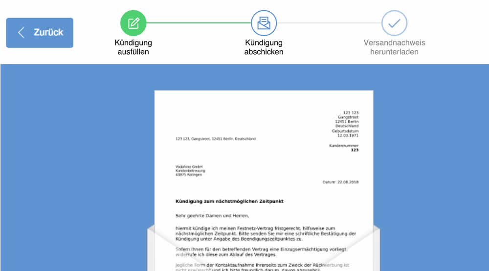
In this experiment, a simple progress bar was added to a 2nd step of contract cancellation funnel. The progress bar used separate styles to show which steps were completed, what the current step was, as well as the future step.
Translation of the 3 steps from German are as follows:
- Fill out the termination
- Send termination
- Proof of termination
Test #226 on
Microsoft.com
by  Ronny Kohavi
Feb 18, 2019
Desktop
Product
X.X%
Sales
Ronny Tested Pattern #96: Single Focus Photos On Microsoft.com
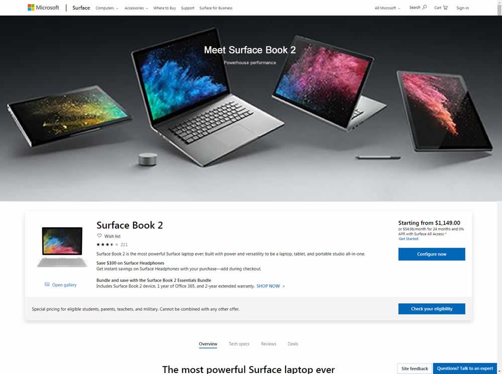
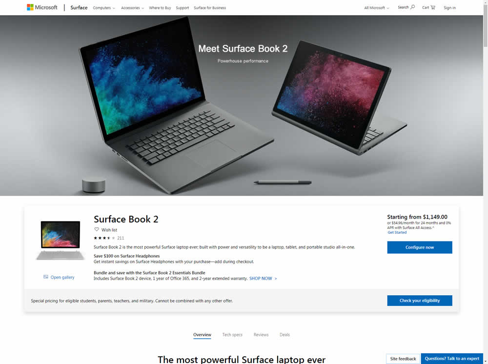
Microsoft Store ran an experiment on the Surface Book 2 product page. The treatment showed a hero image with fewer, yet larger product photos
Test #225 on
by  Devesh Khanal
Feb 17, 2019
Desktop
Product
X.X%
Sales
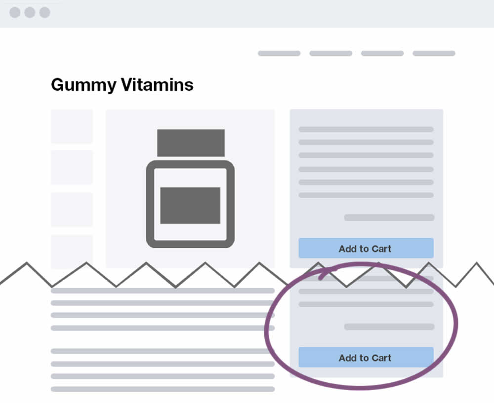
Devesh Tested Pattern #41: Sticky Call To Action

Test #224 on
by  Alex James
Feb 11, 2019
Desktop
Home & Landing
X.X%
Progression
Alex Tested Pattern #3: Fewer Form Fields
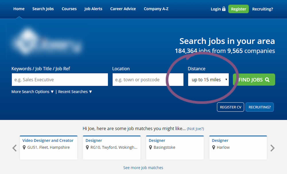
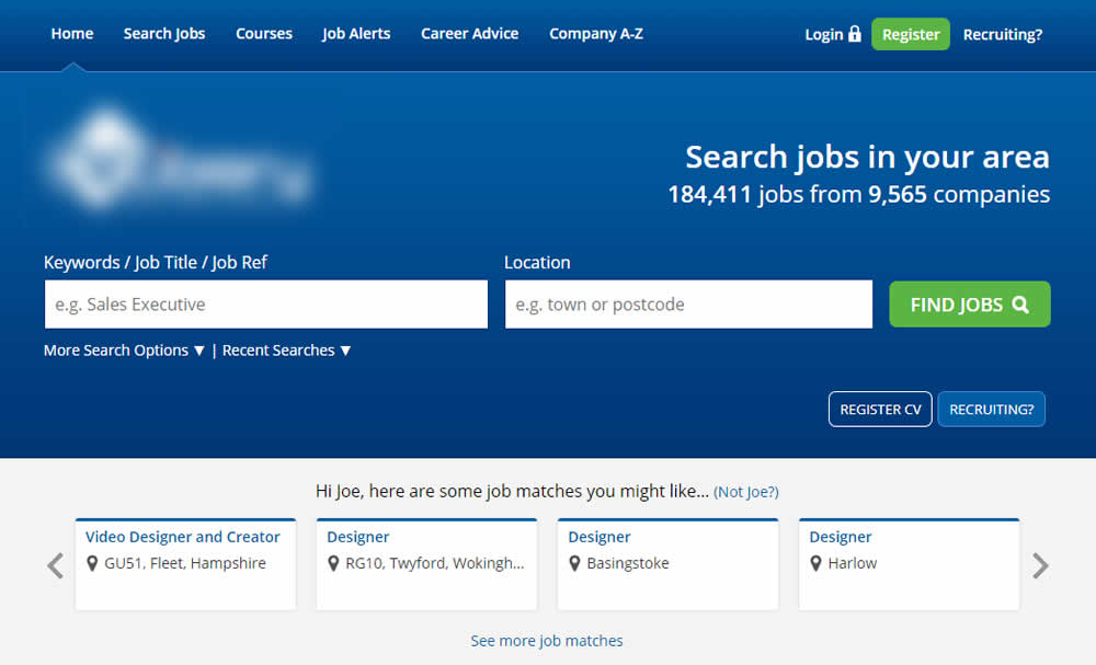
This experiment reduced the search form by removing the distance field.
Test #222 on
Thomasnet.com
by  Julian Gaviria
Feb 01, 2019
Desktop
Listing
X.X%
Leads
Julian Tested Pattern #7: Social Counts On Thomasnet.com

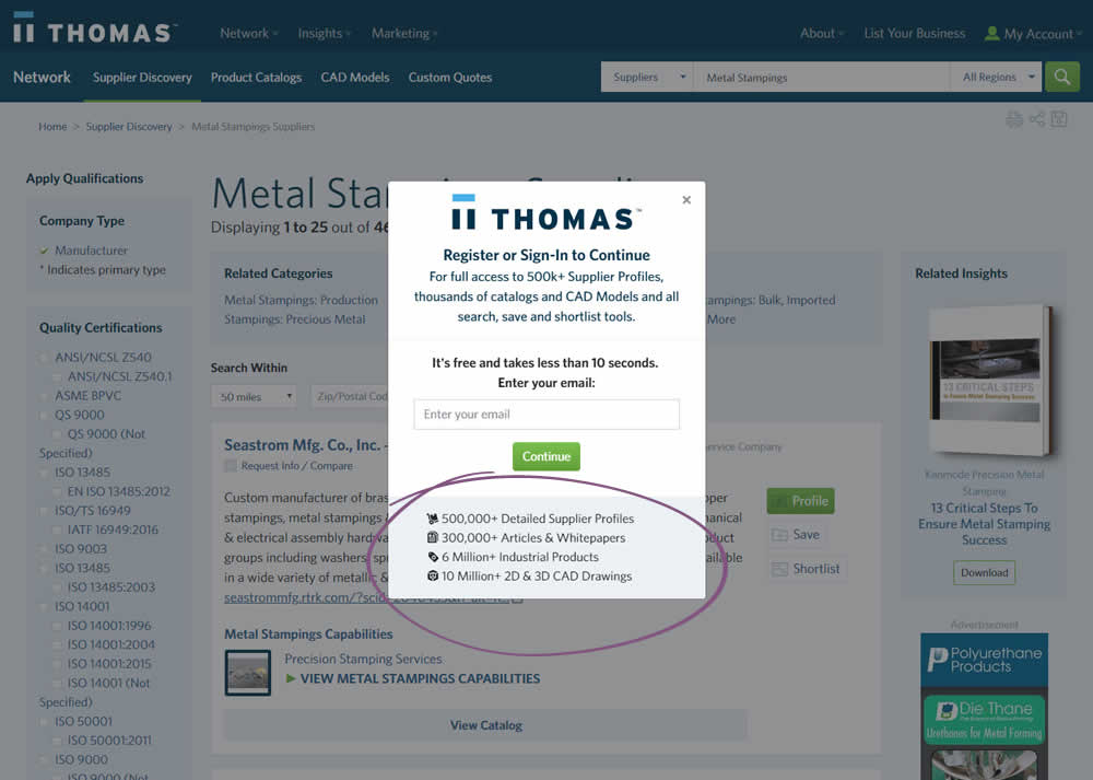
In this variation, a number of social proof references were added to a signup modal.
Test #223 on
Volders.de
by  Alexander Krieger
Feb 01, 2019
Desktop
Mobile
Signup
X.X%
Revenue
Alexander Tested Pattern #12: Payment First On Volders.de
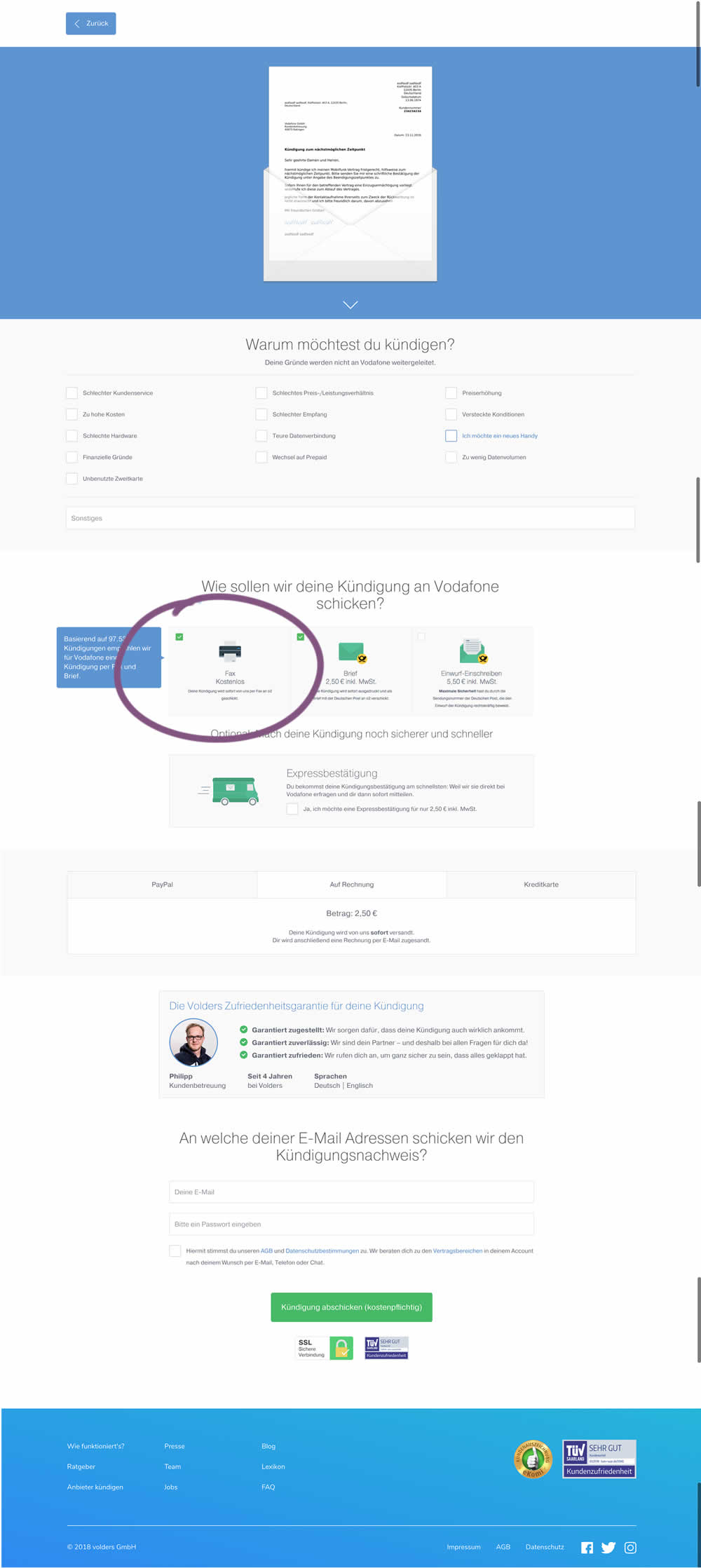
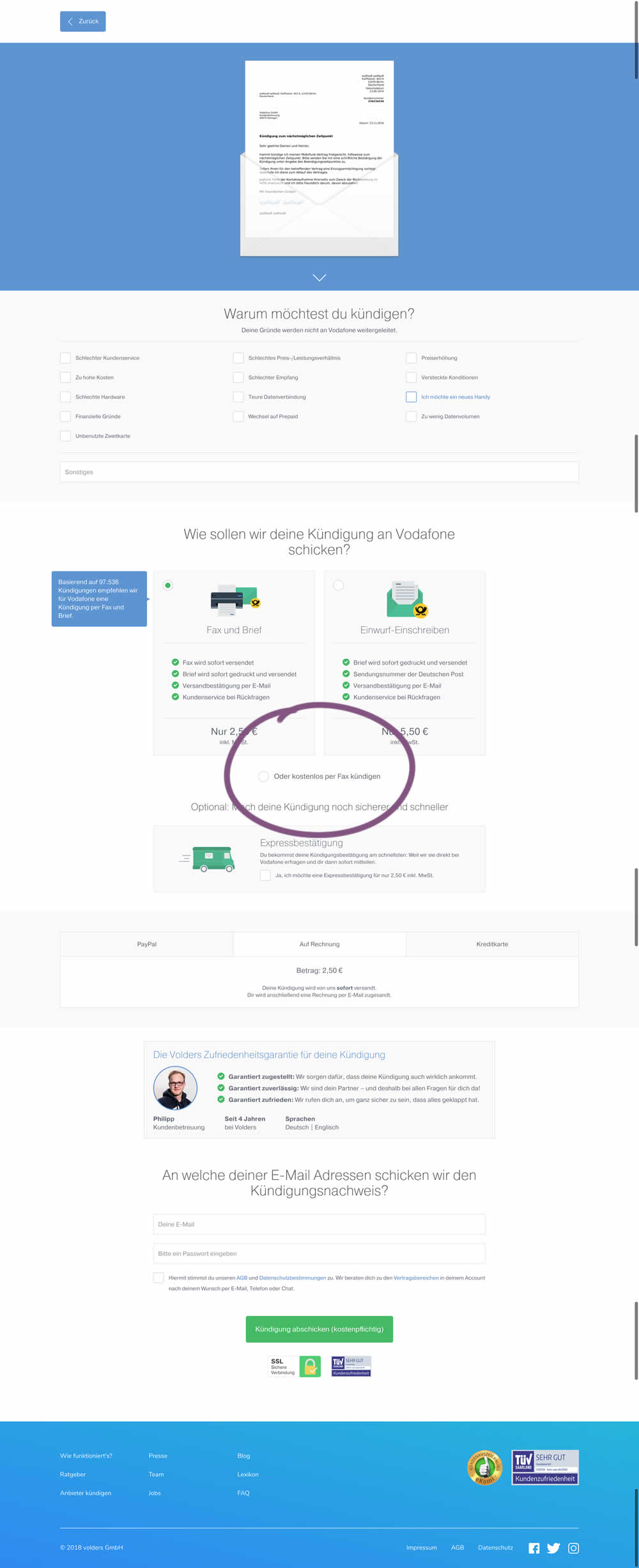
This test deprioritized the free option (kostenlos) of cancelling a contract. It did so by placing it under the paid options as small text link / radio option.