All Latest 620 A/B Tests
MOST RECENT TESTS
Test #316 on
Trydesignlab.com
by  Daniel Shapiro
Sep 24, 2020
Desktop
Mobile
Home & Landing
X.X%
Signups
Daniel Tested Pattern #22: Empowering Headline On Trydesignlab.com


In this experiment, the headline was changed to focus more on the end-goal of the UX Academy program - that of landing your first UI/UX role.
Which A Or B Actually Wins? Find Out Before You Test.
Members see every test result — the winners, the flat ones, and the losers — along with exact effects and sample sizes. Use it to estimate your tests and prioritize by probability, not gut feel. Start every experiment with the odds on your side.
Test #99 on
Vivareal.com.br
by  Rodrigo Maués
Sep 23, 2020
Desktop
Mobile
Product
X.X%
Leads
Rodrigo Tested Pattern #24: Visible Availability On Vivareal.com.br
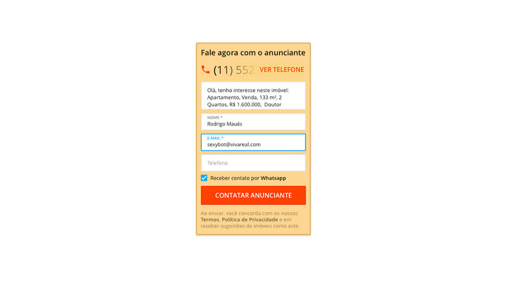
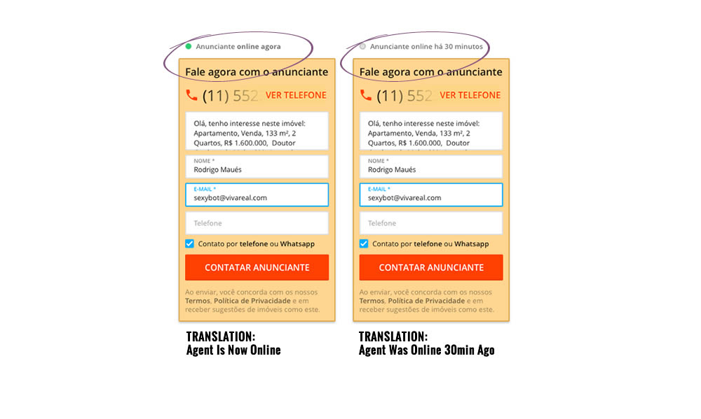
In this experiment, a lead form on a listing page showed whether an agent was recently online or not. The diplayed had two statuses: either indicating that someone is online now, or the most recent time they were online in minutes.
Test #315 on
Backstage.com
by  Stanley Zuo
Aug 22, 2020
Mobile
Signup
X.X%
Sales
Stanley Tested Pattern #7: Social Counts On Backstage.com
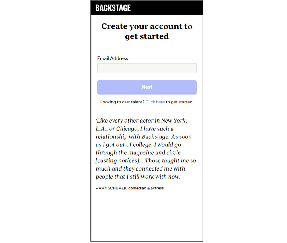
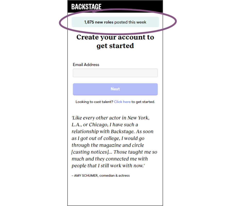
In this experiment, a dynamic number of job postings was displayed during the signup process - reinforcing the value of signing up for membership access.
Test #314 on
Zapimoveis.com.br
by  Vinicius Barros Peixoto
Aug 21, 2020
Desktop
Mobile
Product
X.X%
Leads
Vinicius Tested Pattern #43: Long Titles On Zapimoveis.com.br
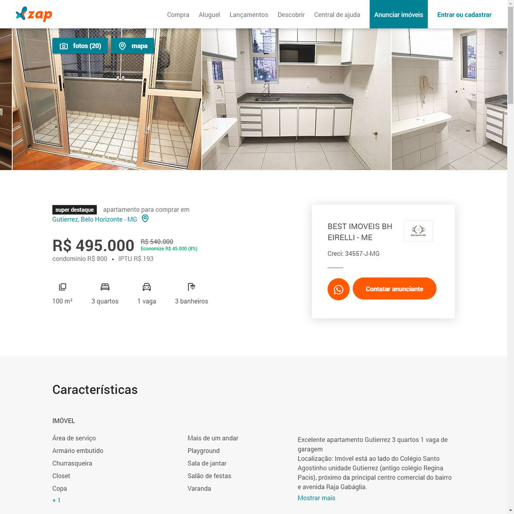
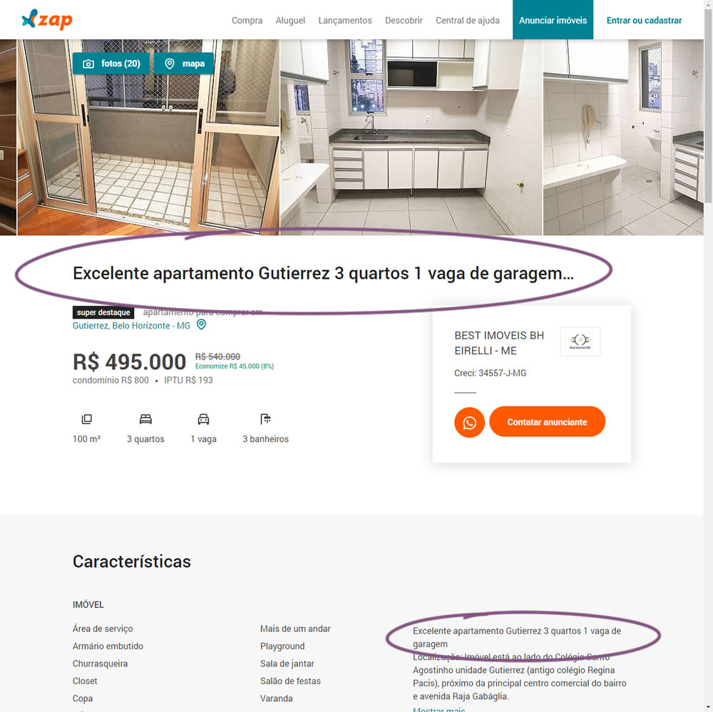
In this experiment, a dynamic page title was generated and added at the top of the screen. The first few words from a property description were used to dynamically generate these titles. The effect on leads was measured.
Test #313 on
Trydesignlab.com
by  Daniel Shapiro
Aug 19, 2020
Desktop
Mobile
Home & Landing
X.X%
Leads
Daniel Tested Pattern #11: Gradual Reassurance On Trydesignlab.com


In this experiment, instead of showing a single-focused lead form (for the UX Academy Program), users were asked to express a wider set of choices first (for the UX Academy or shortter set of skill-based courses). The experiment measured overall leads for both types of programs.
Test #312 on
by  Jakub Linowski
Aug 14, 2020
Desktop
Mobile
Product
X.X%
Sales
Jakub Tested Pattern #83: Progressive Fields
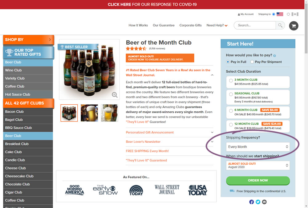
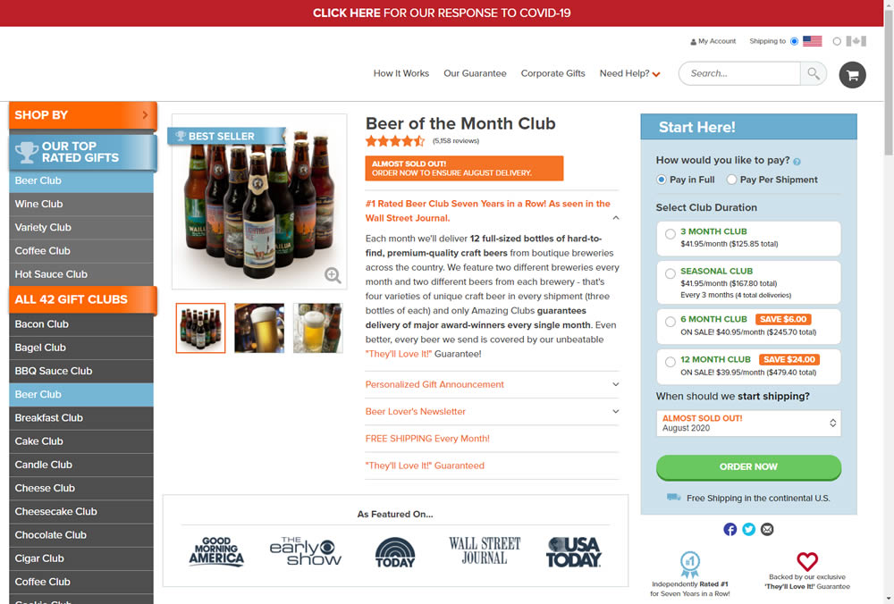
In this experiment, we tested a visible "Shipping Frequency" (A) option against a progressively displayed one (B) that would only appear after someone first chose a duration option. Thus in variation B, the buy box component would initially appear with fewer fields and smaller. The experiment measured initial progression and actual sales.
Note on the data: the experiment was run a little shorter than usual, as one of the variations triggered a stop rule to protect losses (so the effect might be somewhat inflated from a lower power).
Test #311 on
Backstage.com
by  Stanley Zuo
Aug 11, 2020
Desktop
Mobile
Home & Landing
X.X%
Sales
Stanley Tested Pattern #118: Category Images On Backstage.com
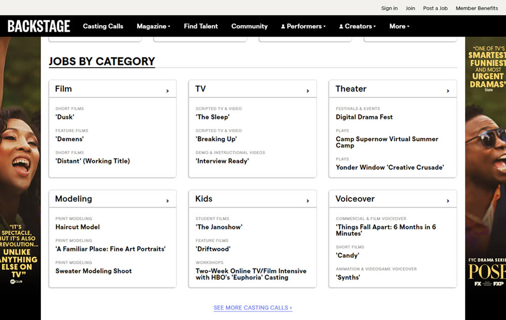
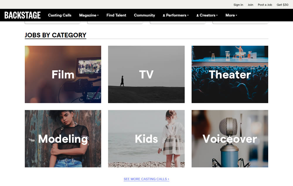
In this experiment, category links (linking to casting call search results) were replaced with tile images. In addition, 2 levels of categories were also replaced with a single text link for each tile. Finally, the font size of the link titles was also increased.
Test #310 on
Backstage.com
by  Stanley Zuo
Jul 25, 2020
Mobile
Listing
X.X%
Sales
Stanley Tested Pattern #77: Filled Or Ghost Buttons On Backstage.com
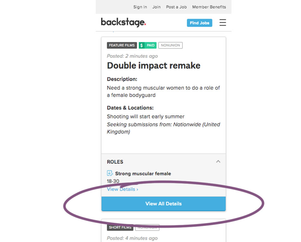
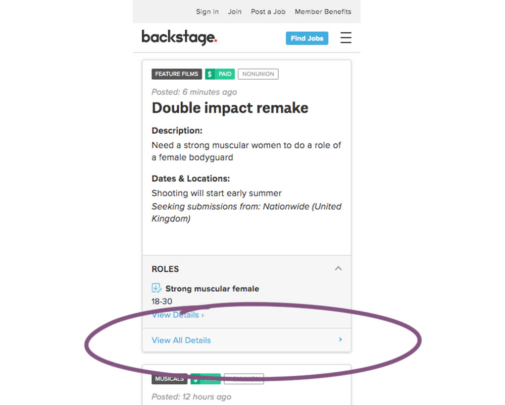
In this experiment, the style of a button leading to view detailed casting calls on a listing page was changed. In the A version the style was a filled high contrast blue background, and the B variation had a feint "ghost button" style.
Test #309 on
Thomasnet.com
by  Julian Gaviria
Jul 24, 2020
Desktop
Listing
X.X%
Progression
Julian Tested Pattern #72: Priming Step On Thomasnet.com
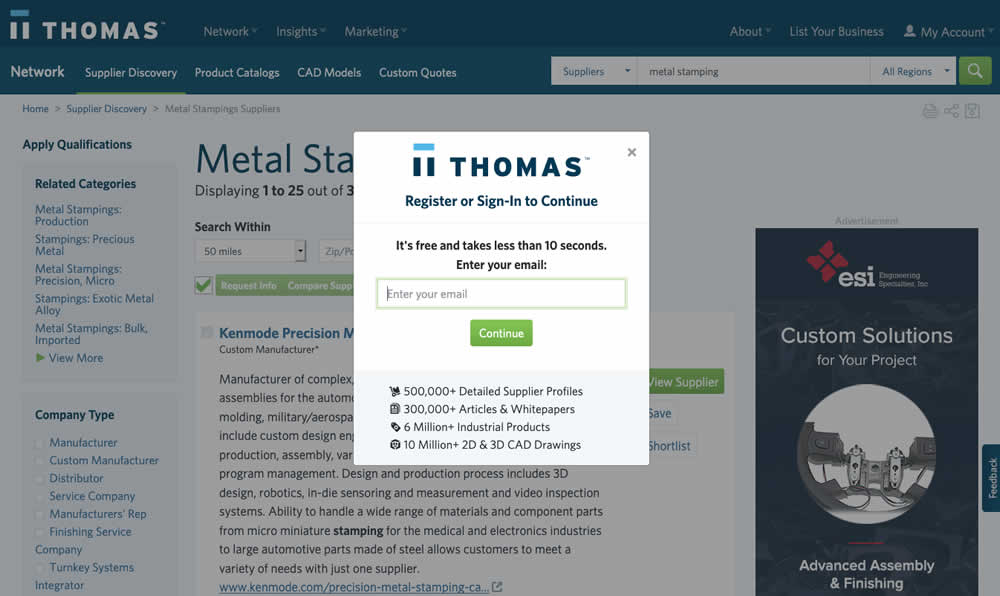
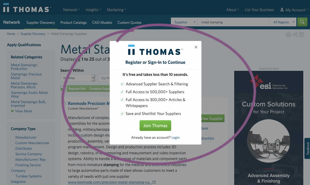
In this experiment, an extra step was prepended at the beginning of a multiple step signup modal flow. The signup modal would appear on listing pages after requests to contact a listed company. The idea was to prime users with benefits of signing up in order to increase their motivation to do so. The experiment measured the impact on the initial progression (to the step with the email form).
Test #308 on
Umbraco.com
by  Lars Skjold Iversen
Jul 23, 2020
Desktop
Home & Landing
X.X%
Signups
Lars Tested Pattern #4: Testimonials On Umbraco.com
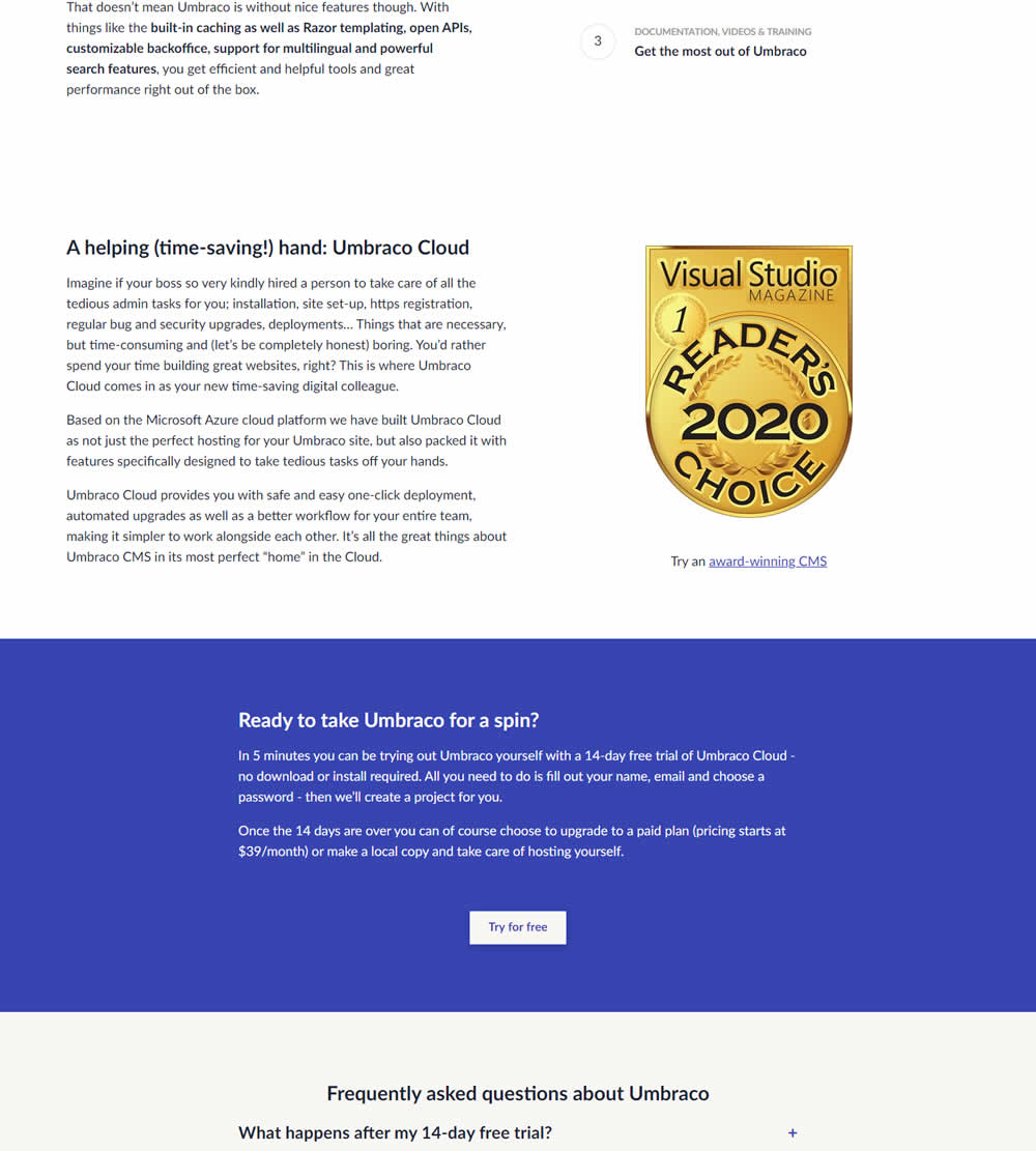

In this experiment, three testimonials were added mid way though on a CMS landing page. At the end of the customer testimonials an additional trial signup button was also added - which was also the primary metric.
Test #307 on
Volders.de
by Michal Fiech
Jul 17, 2020
Desktop
Thank You
X.X%
Progression
Michal Tested Pattern #77: Filled Or Ghost Buttons On Volders.de
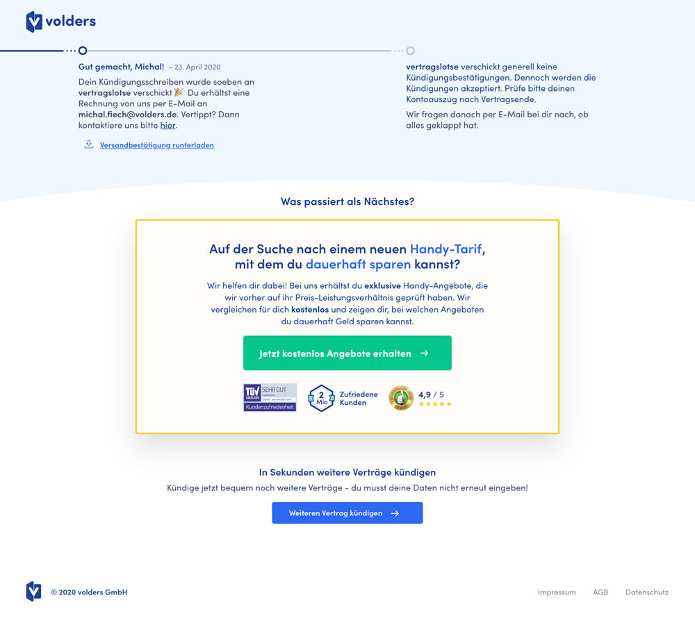
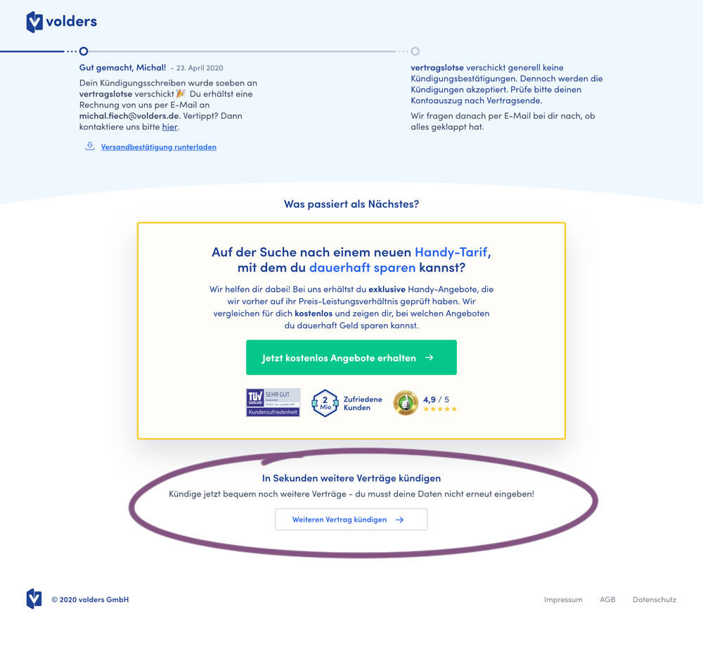
This experiment measured a shallow click goal on a button that would encourage to repeated the action that was just completed (in this case a contract cancellation). In the control version (A) a thank-you screen shows a filled button style, and the variant (B) there was a ghost button. As a note, I also flipped the A-B in this experiment for the purpose of matching it to our ghost button pattern, which means that Volders in fact was starting out with a ghost button to begin with.
Test #306 on
Backstage.com
by  Stanley Zuo
Jul 09, 2020
Desktop
Mobile
Pricing
X.X%
Sales
Stanley Tested Pattern #69: Autodiscounting On Backstage.com
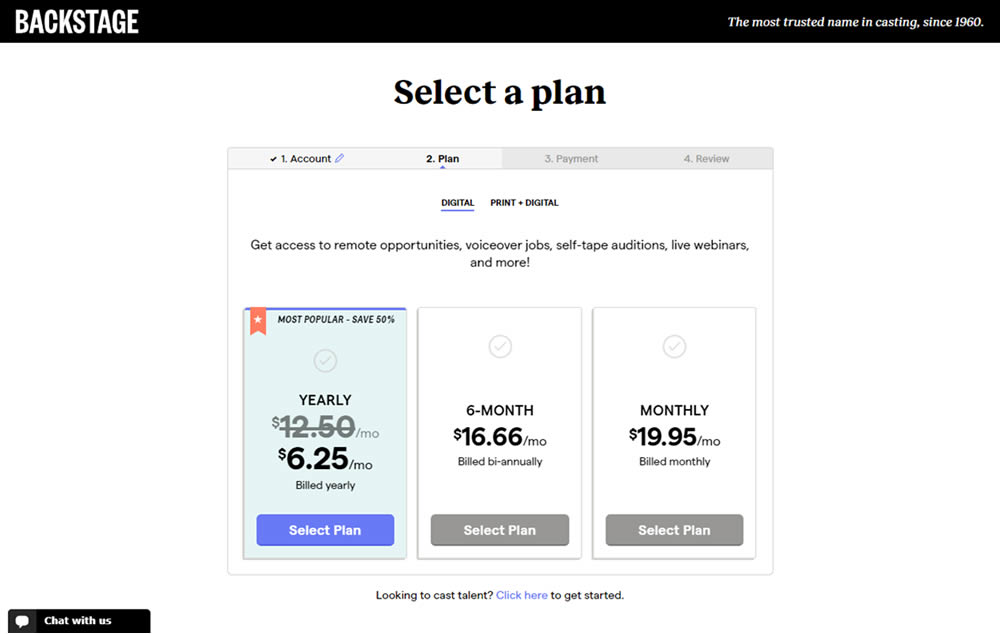
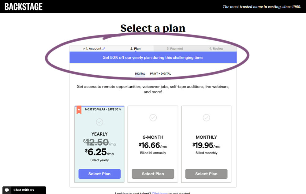
In this experiment, the only change was an added message at the top of the pricing screen, clarifying that there is an active discount on a yearly plan. The discount was already communicated with a strike-through price on the control version as well. The variation simply emphasized this aggressively.
Test #305 on
Volders.de
by Michal Fiech
Jun 30, 2020
Mobile
Desktop
Home & Landing
X.X%
Sales
Michal Tested Pattern #94: Visible Search On Volders.de

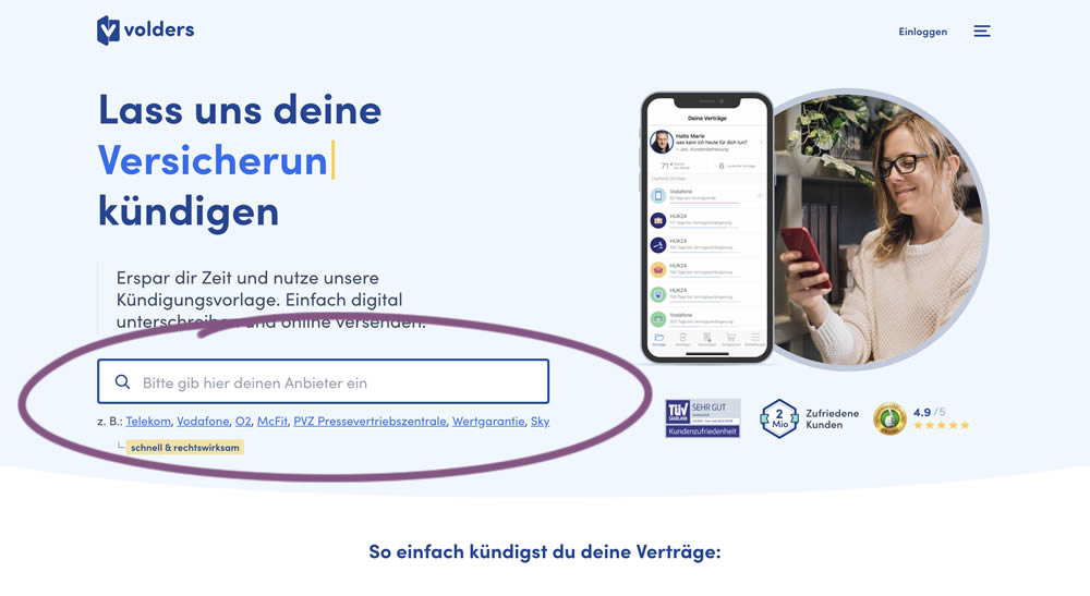
In this experiment, a search input field (to look for companies) along with most popular links (also company names) were displayed on the homepage of a leading contract cancellation service. The control (A) version instead had a button that sent users to a next page where the same selection could be made - only later. The measurable success criteria were the number of paid cancellations - a few steps down the funnel.
Test #304 on
Backstage.com
by  Stanley Zuo
Jun 29, 2020
Mobile
Product
X.X%
Signups
Stanley Tested Pattern #97: Bigger Form Fields On Backstage.com
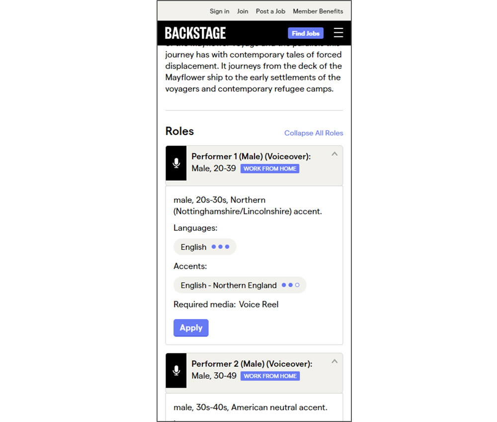
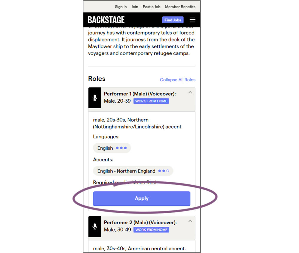
In this experiment, larger "Apply" buttons were shown on a casting detail page. The application funnel would take users through a series of steps leading to a paid membership subscription. The experiment measured initial progression and account signups (email signups).
Test #61 on
by  Someone
Jun 26, 2020
Desktop
Checkout
X.X%
Sales
Someone Tested Pattern #9: Multiple Steps
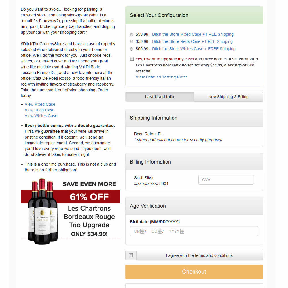
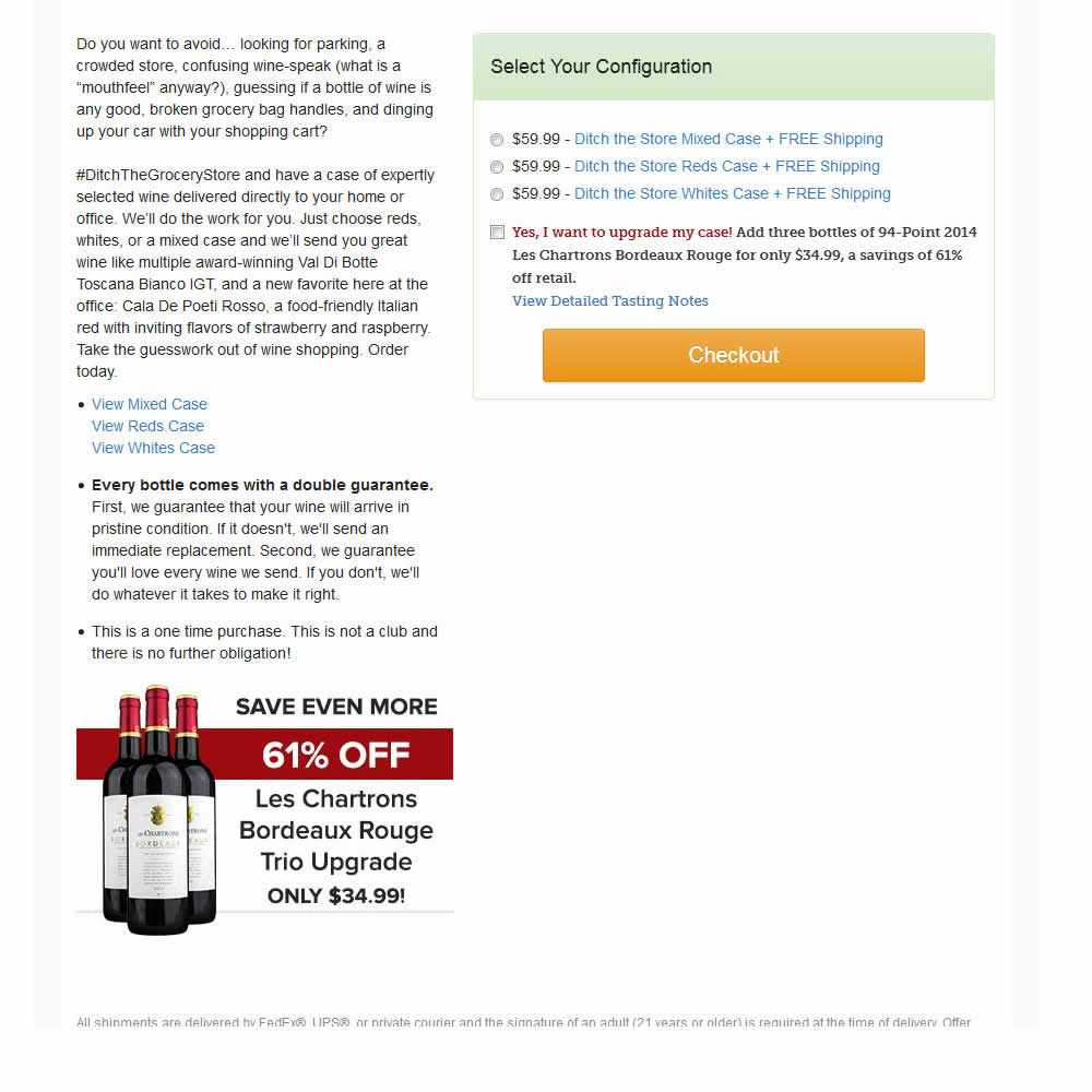
In this experiment, a single screen checkout was turned into a series of smaller steps in variation B. This was achieved by showing fewer fields on the first step, and shifting the remaining ones into a 3 step modal popup. The experiment measured successful transactions (sales).
Test #303 on
Thomasnet.com
by  Julian Gaviria
Jun 26, 2020
Desktop
Mobile
Global
X.X%
Leads
Julian Tested Pattern #14: Exposed Menu Options On Thomasnet.com


In this experiment variation, the saved suppliers feature was surfaced in the global navigation.It was already possible to save supplier companies from listing and specific company pages. This experiment aimed to increase the saving functions visibility and possibly increase more leads.
Test #302 on
Volders.de
by Michal Fiech
Jun 09, 2020
Desktop
Mobile
Signup
X.X%
Sales
Michal Tested Pattern #83: Progressive Fields On Volders.de
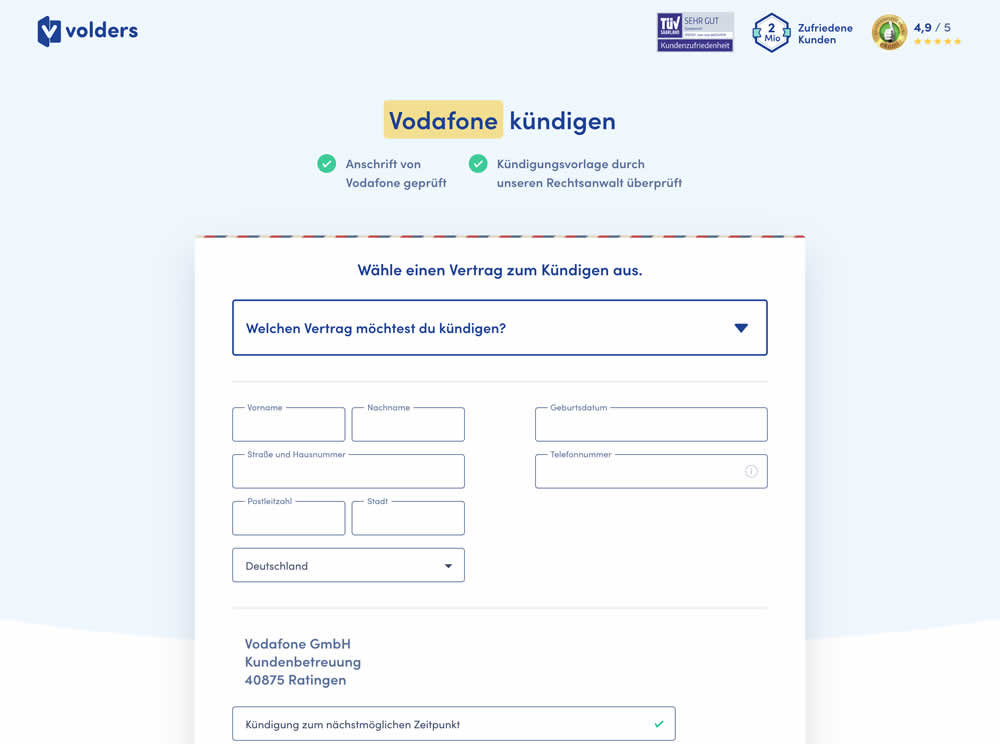
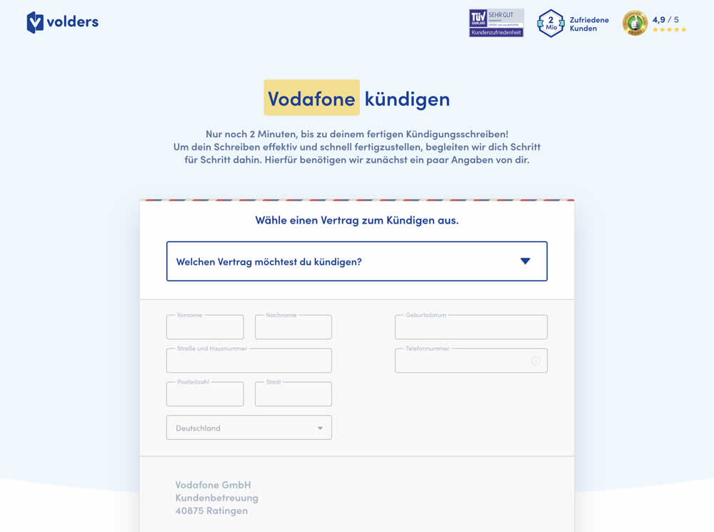
In this experiment a long form (A) was replaced with a progressive form interaction (B). Most of the form fields would appear in a grey-disabled style, until the prerequioste fields were first filled out.
Test #301 on
Zapimoveis.com.br
by  Vinicius Barros Peixoto
May 31, 2020
Desktop
Mobile
Product
X.X%
Leads
Vinicius Tested Pattern #21: What It's Worth On Zapimoveis.com.br

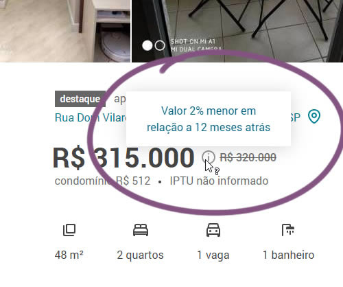
In this experiment, the B variation property prices were framed using higher and crossed out price points from 12 months ago - achieving a relative discount. A tooltip was also shown which explained the higher price point on hover. The example in the screenshot translates to "2% less compared to 12 months ago". This high-power experiment measured the number of leads that were generated on property (product) screens.
Test #300 on
Volders.de
by Michal Fiech
May 25, 2020
Desktop
Mobile
Signup
X.X%
Progression
Michal Tested Pattern #3: Fewer Form Fields On Volders.de
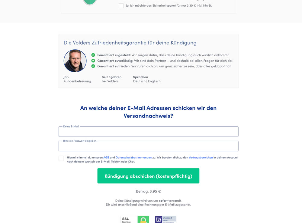
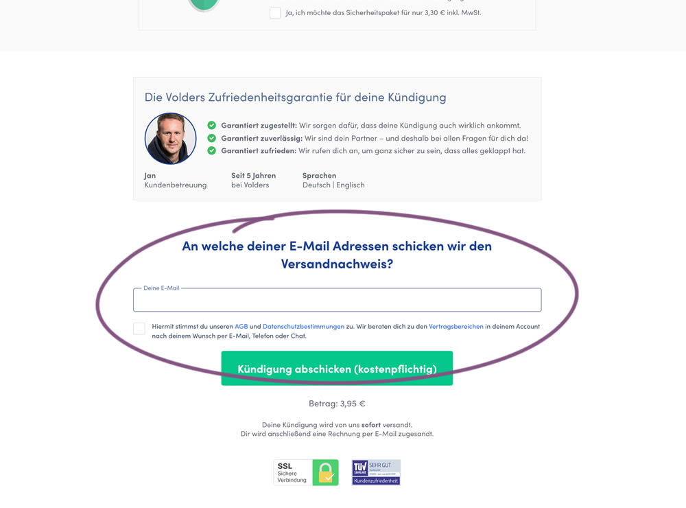
In this experiment, a password field was removed on a contract cancellation form (Volders).
In the control version, users were required to enter their email address and a password. If the email address was associated with an existing account, then the password was used to authenticate the user (and validated). When users entered a new email address, then the password field was used to create a new account.
In the variation, the password field was removed, as the authentication happened after the conversion itself using other backend mechanisms.
Test #299 on
Backstage.com
by  Stanley Zuo
May 22, 2020
Desktop
Mobile
Listing
X.X%
Sales
Stanley Tested Pattern #60: Repeated Bottom Call To Action On Backstage.com
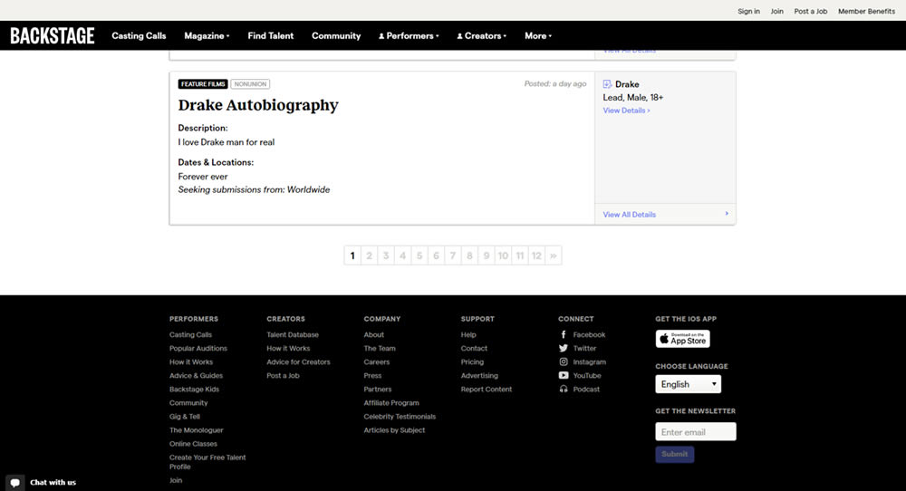
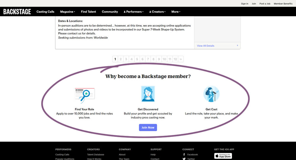
In this experiment, at the bottom of a search results screen, a membership join button was added along with 3 encouraging reasons. The experiment measured membership funnel starts, as well as paid membership transactions (sales).