All Latest 571 A/B Tests
Become a member to unlock the abiltiy to see the highest impact a/b tests. Being able to see the actual test results and sort by impact allows growth and experimentation teams to take action on the biggest gains first
MOST RECENT TESTS
Test #362 on
Vivareal.com.br
by
 Vinicius Barros Peixoto
Jun 23, 2021
Desktop
Mobile
Product
Vinicius Barros Peixoto Tested Pattern #7: Social Counts In Test #362 On Vivareal.com.br
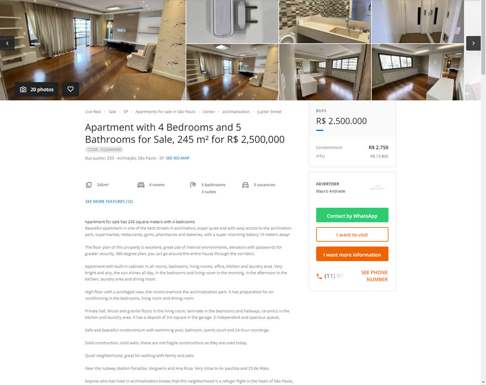
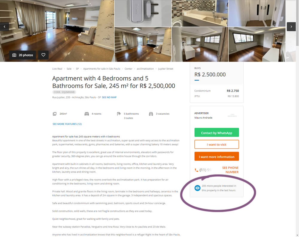
In this experiment, the number of recent property views was displayed under the call to action. Impact on overall lead generation was measured. (Translated using Google from Brazilian Portuguese.)
Test #361 on
Chaosgroup.com
by
 Velin Penev
Jun 22, 2021
Desktop
Product
Velin Penev Tested Pattern #49: Above The Fold Call To Action In Test #361 On Chaosgroup.com
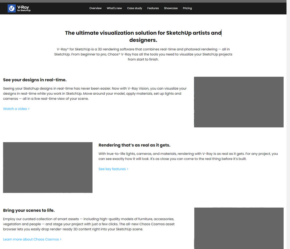
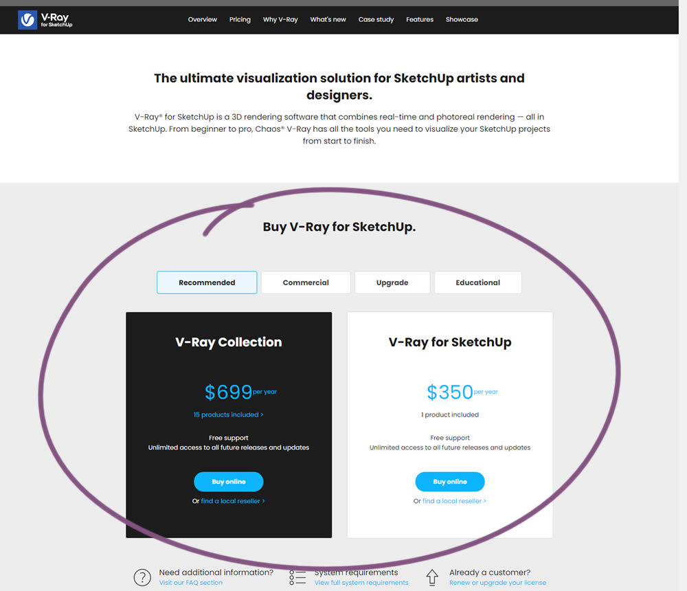
In this experiment, a pricing plan selector was shifted from the very bottom of a long product page towards (almost) the top. Impact on any transactions or sales was measured.
Test #360 on
by
 Jakub Linowski
Jun 16, 2021
Desktop
Product
Jakub Linowski Tested Pattern #60: Repeated Bottom Call To Action In Test #360
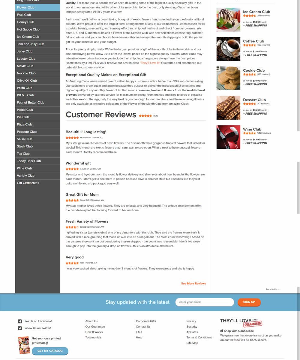
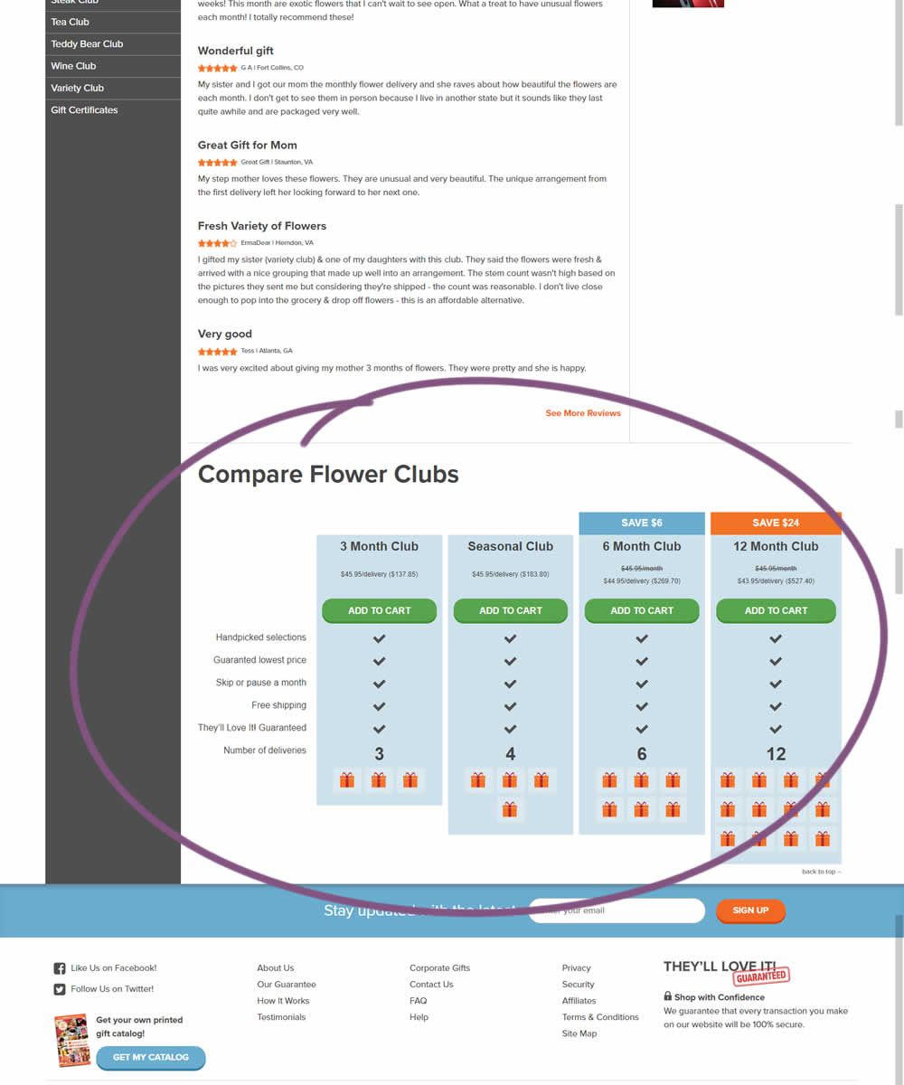
In this experiment, a comparison chart with various purchasing options was appended at the bottom of a product page.
Test #359 on
Snocks.com
by
 Samuel Hess
Jun 11, 2021
Desktop
Mobile
Product
Samuel Hess Tested Pattern #43: Long Titles In Test #359 On Snocks.com
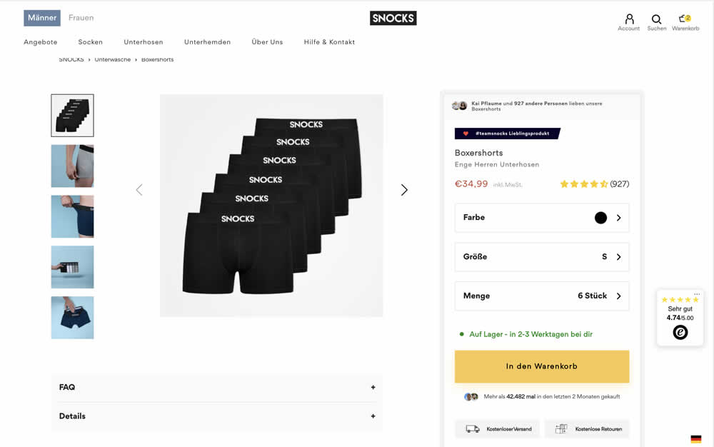
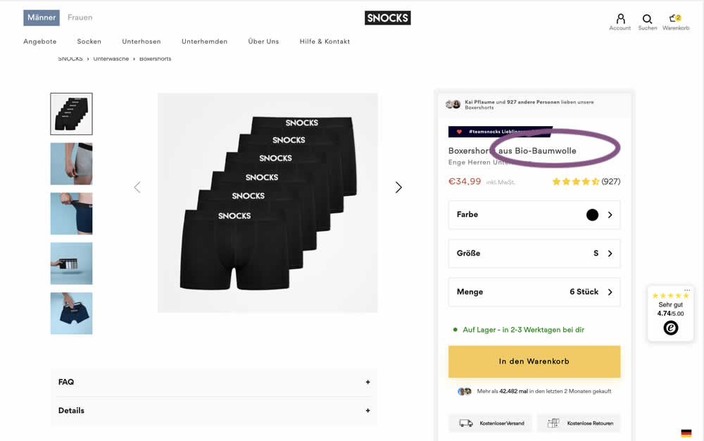
In this experiment, product titles were extended with descriptive copy. Instead of just showing the product name, "with organic cotton" was appended on product and category/listing pages. Impact to adds to cart and sales was measured.
Test #358 on
Preply.com
by
 Gleb Hodorovskiy
Jun 03, 2021
Desktop
Home & Landing
Gleb Hodorovskiy Tested Pattern #58: Full Height False Bottom In Test #358 On Preply.com
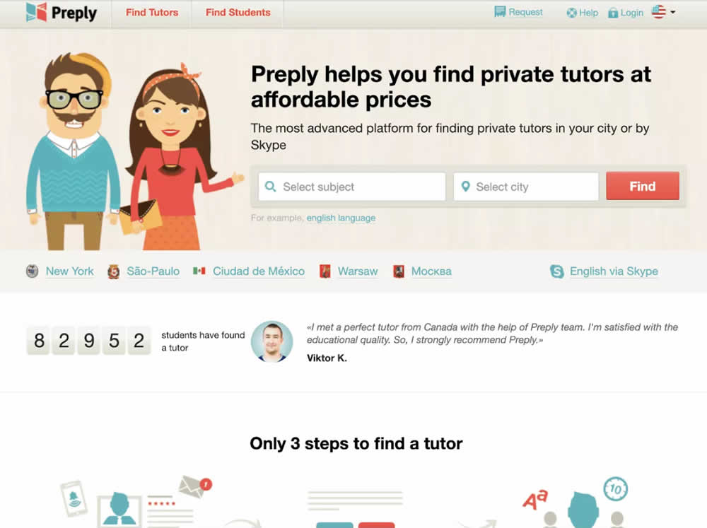
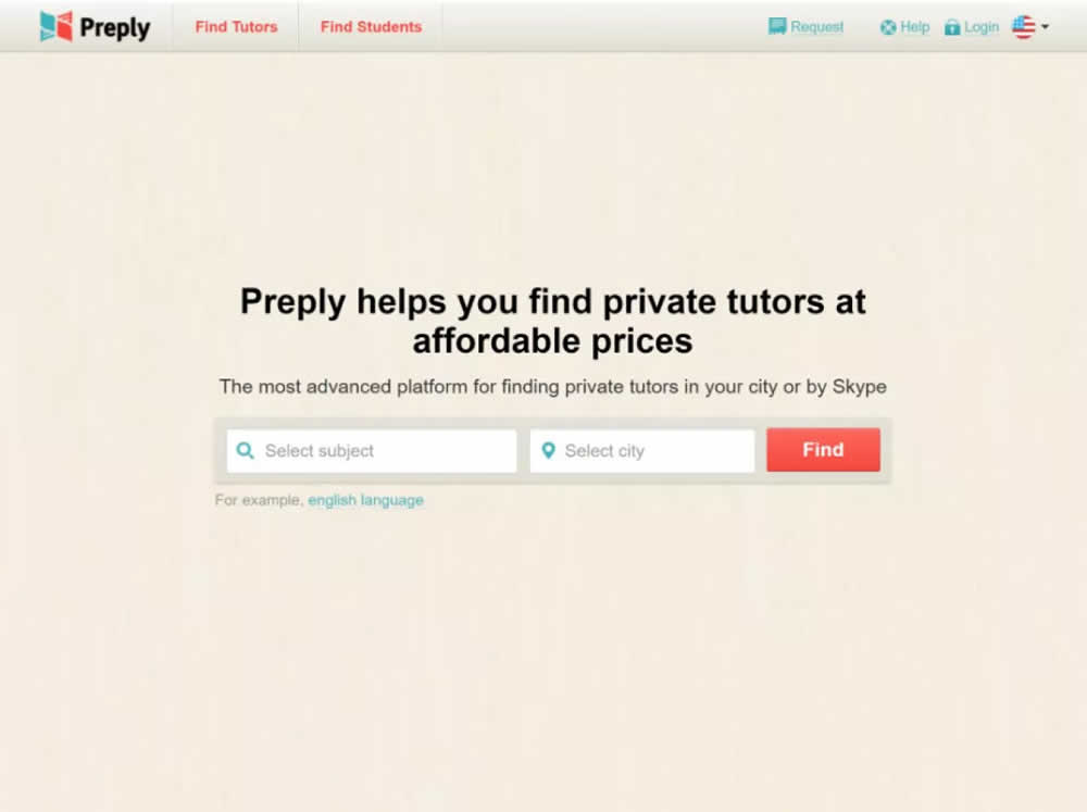
In this experiment, the header section of the homepage drastically focused around the call to action. This was done by removing elements and forcing a false bottom.
Test #357 on
Baremetrics.com
by
 Brian Sierakowski
Jun 02, 2021
Desktop
Mobile
Pricing
Brian Sierakowski Tested Pattern #113: More Or Fewer Plans In Test #357 On Baremetrics.com
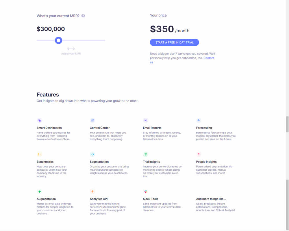
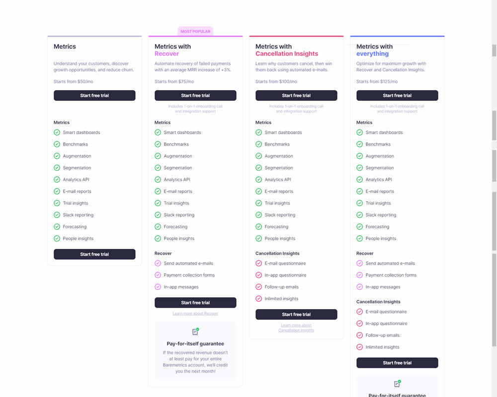
In this experiment, a single focus signup was transformed into a pricing comparison table. Impact on signups was measured.
Test #356 on
Mvideo.ru
by
 Andrey Andreev
May 29, 2021
Desktop
Mobile
Home & Landing
Andrey Andreev Tested Pattern #135: Product Categories In Test #356 On Mvideo.ru
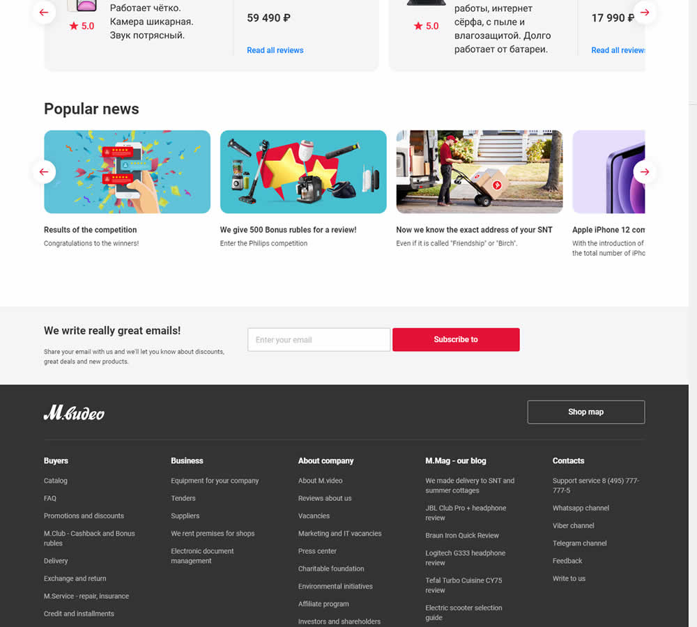
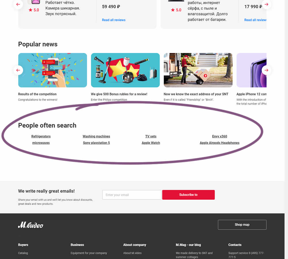
In this experiment, popular search terms were added at the bottom of a long e-commerce homepage. Hence, the variation showed additional search triggers that lead to results pages. (Translated from Russian using Google Translate)
Test #355 on
by
 Jakub Linowski
May 28, 2021
Desktop
Mobile
Home & Landing
Jakub Linowski Tested Pattern #79: Product Highlights In Test #355

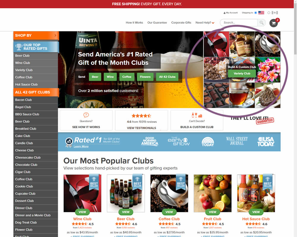
In this experiment, an extra product choice was added to the header of a homepage. Instead of only highlighting a set of four specific products, the option to build custom variety one, was added.
Test #354 on
Mvideo.ru
by
 Andrey Andreev
May 25, 2021
Desktop
Mobile
Product
Andrey Andreev Tested Pattern #69: Autodiscounting In Test #354 On Mvideo.ru
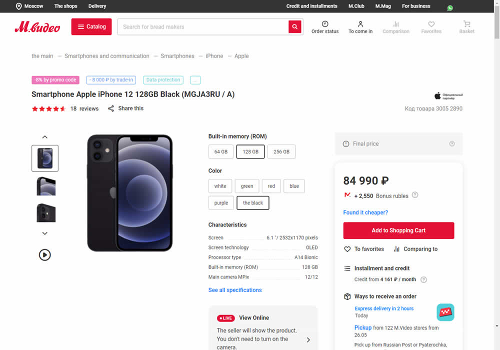
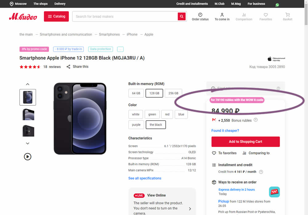
In this experiment, the discounted price was shown along with an active promotion. The control only showed that the relative -8% discount was present with the pre-discounted price.
Test #353 on
Backstage.com
by
 Stanley Zuo
May 12, 2021
Desktop
Product
Stanley Zuo Tested Pattern #13: Centered Forms & Buttons In Test #353 On Backstage.com
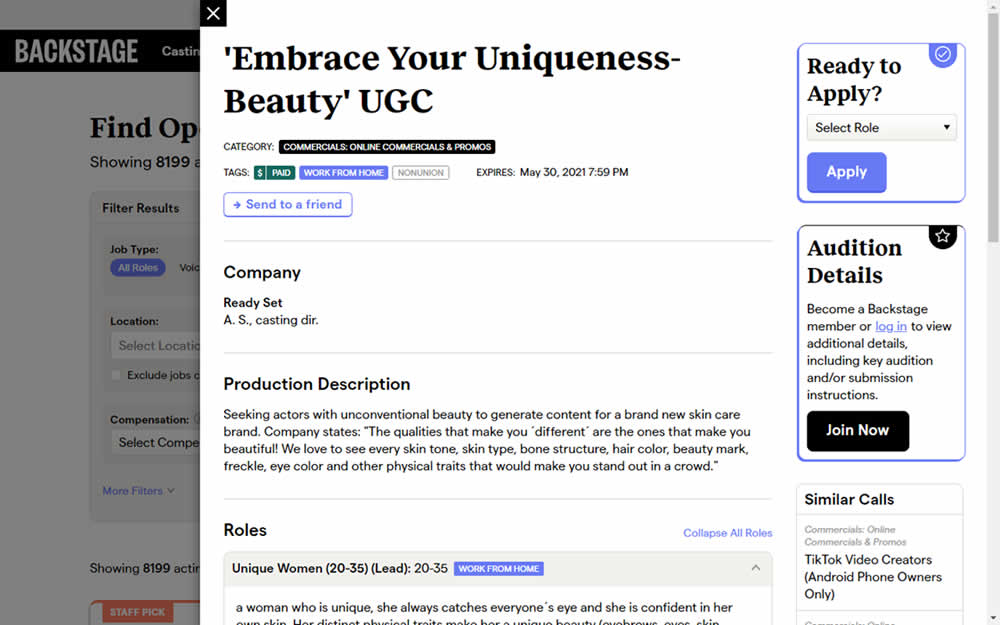
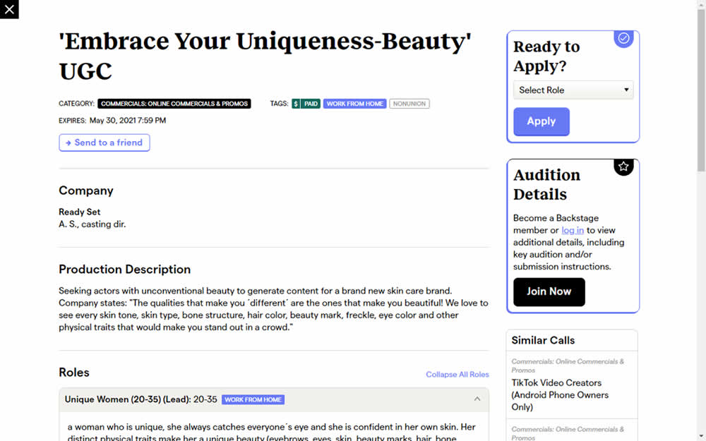
This experiment challanged a right aligned detail page. After clicking a result of a job role on a listing page, an overlay would appear on the right with the details. The variation used a full width screen instead - effectively centering the page.
Test #352 on
Us.flukecal.com
by
 John Hickey
May 11, 2021
Desktop
Global
John Hickey Tested Pattern #123: Single Or Double Column Form Fields In Test #352 On Us.flukecal.com
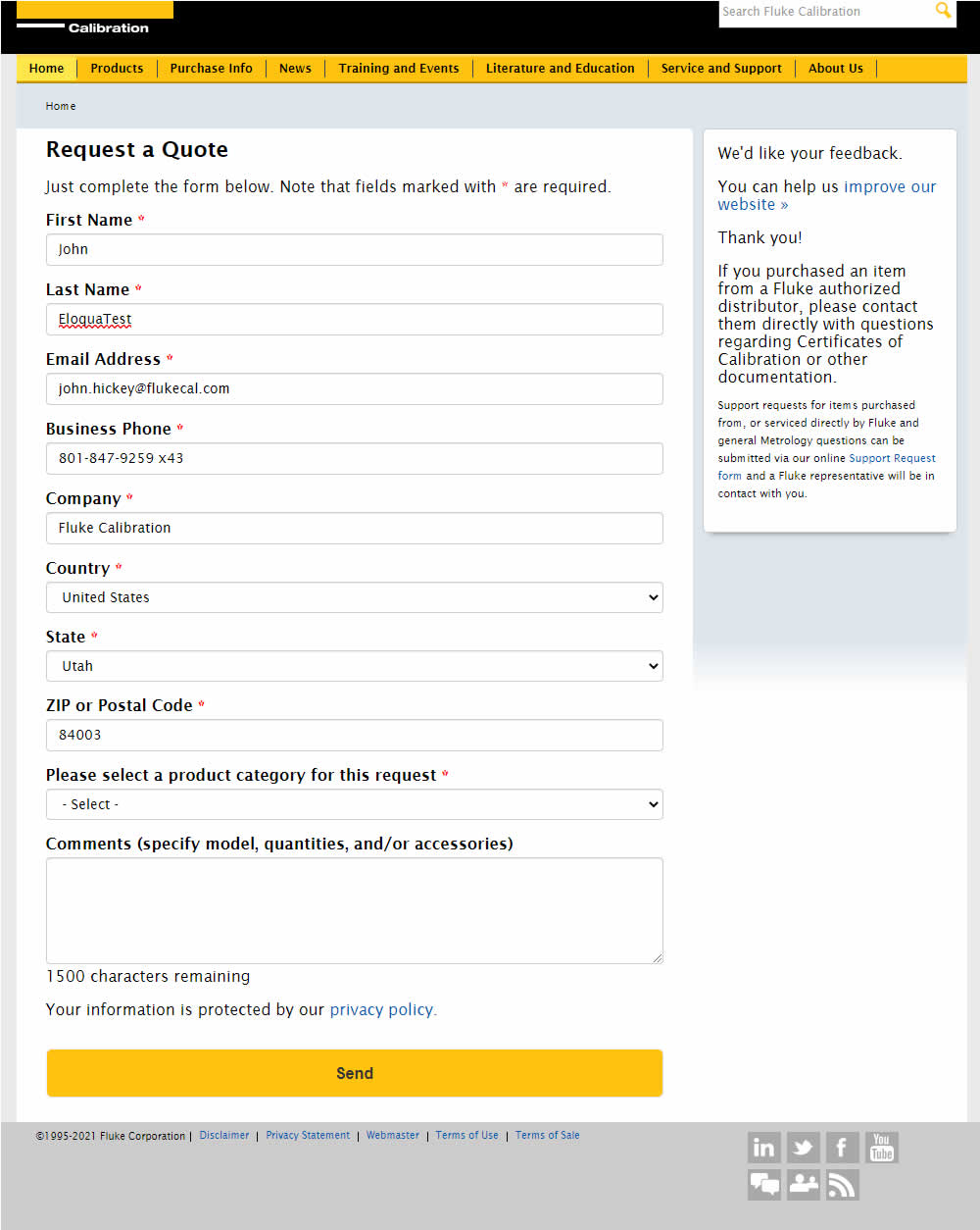
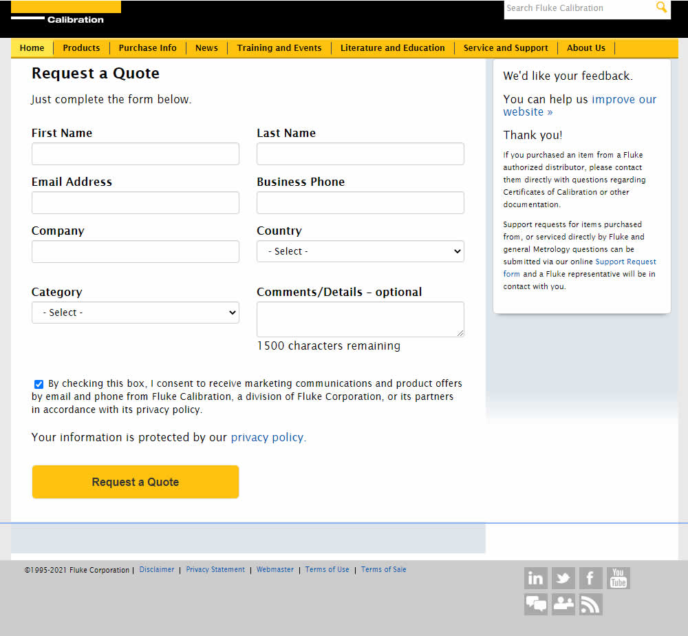
In this experiment, single column (longer) form fields were tested against a two column layout (more compact).
Test #78 on
Mvideo.ru
by
 Andrey Andreev
May 06, 2021
Desktop
Mobile
Listing
Andrey Andreev Tested Pattern #90: Out Of Stock Or In Stock Products In Test #78 On Mvideo.ru
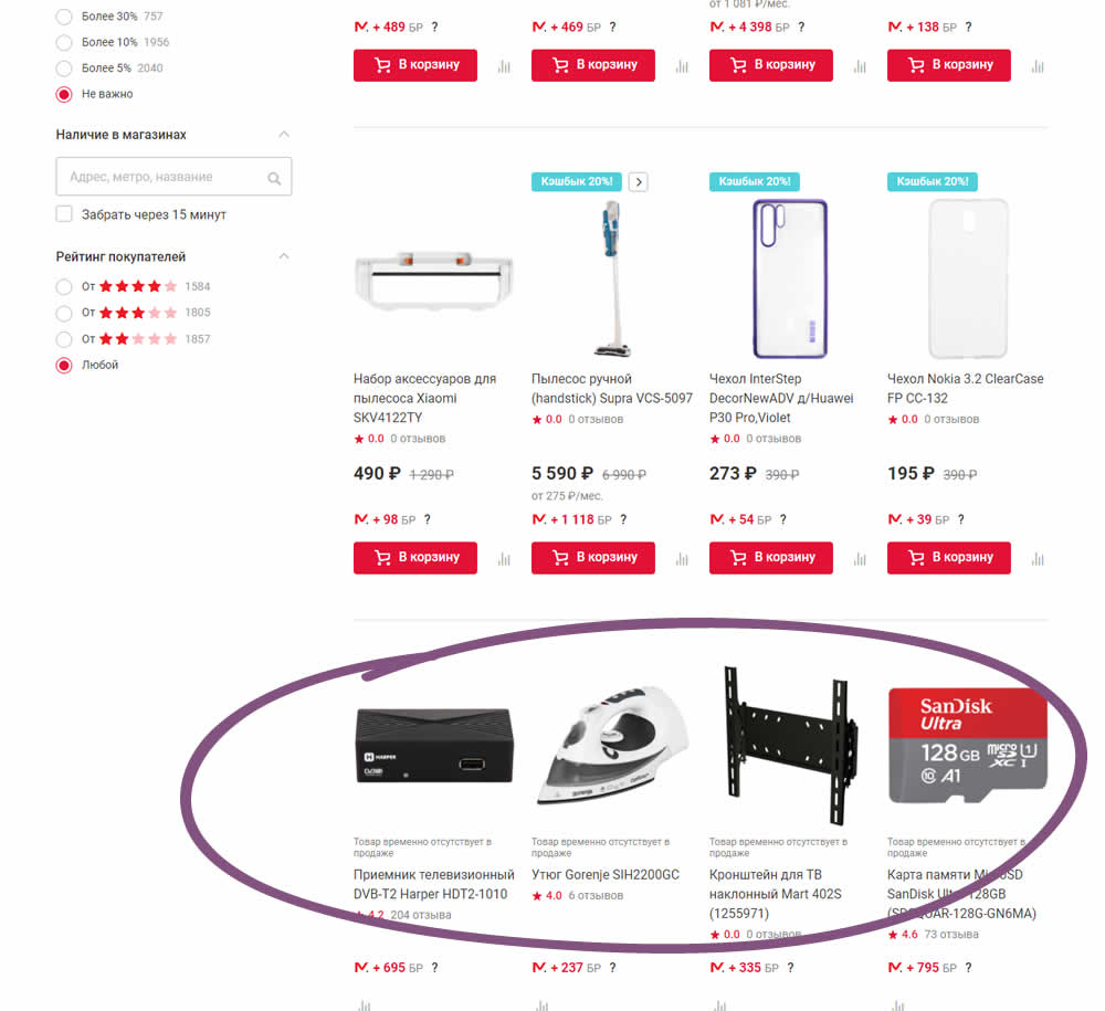
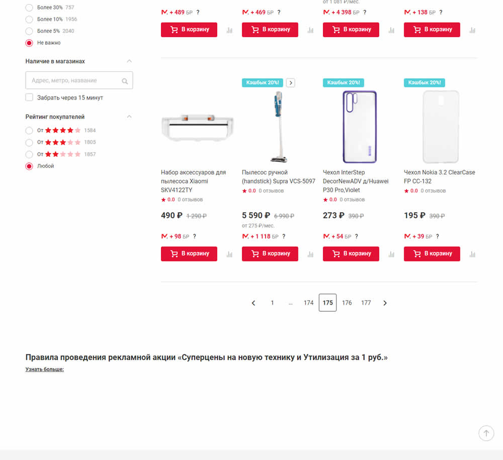
In this experiment, products which were out of stock were removed from listing pages and replaced with in stock ones (not visible in the screenshot).
Test #351 on
Baremetrics.com
by
 Brian Sierakowski
Apr 30, 2021
Desktop
Mobile
Home & Landing
Brian Sierakowski Tested Pattern #11: Gradual Reassurance In Test #351 On Baremetrics.com
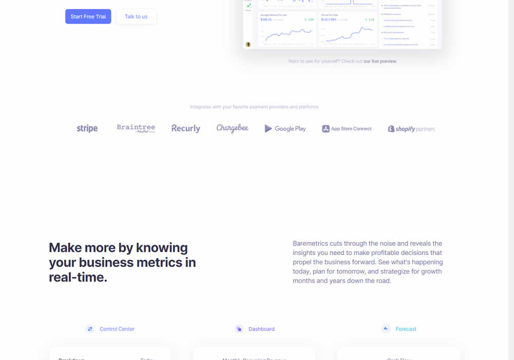
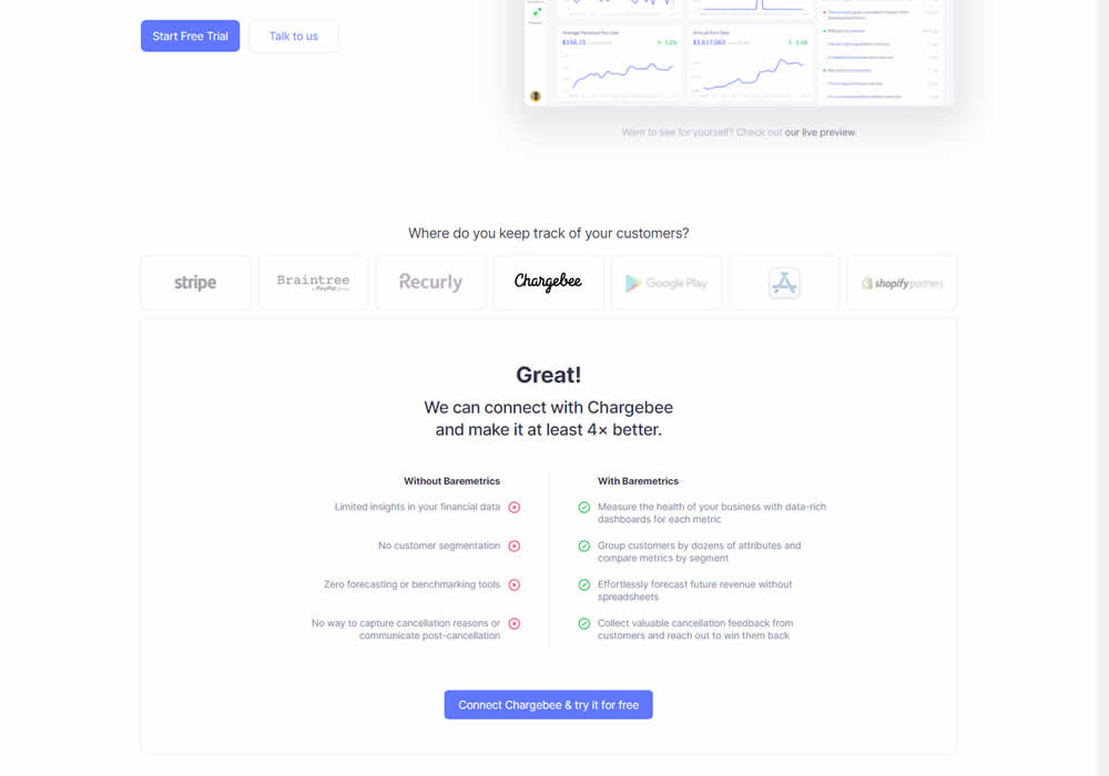
In this experiment, static integration logos were replaced with selectable ones that reassured users to signup. After clicking an integration logo, a comparison chart would appear showing how Baremetrics improves upon a selected payment processor, along with a call to signup. Impact on signups was measured.
Test #350 on
Expertinstitute.com
by
 Ardit Veliu
Apr 29, 2021
Desktop
Content
Ardit Veliu Tested Pattern #16: Welcome Mat - Partial In Test #350 On Expertinstitute.com


In this experiment, a lead generating section with a call to action (welcome mat) was appended at the top of article pages. Impact on lead generation was measured.
Test #349 on
Backstage.com
by
 Stanley Zuo
Apr 27, 2021
Mobile
Global
Stanley Zuo Tested Pattern #49: Above The Fold Call To Action In Test #349 On Backstage.com
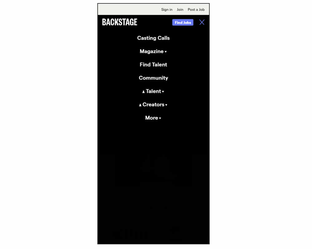
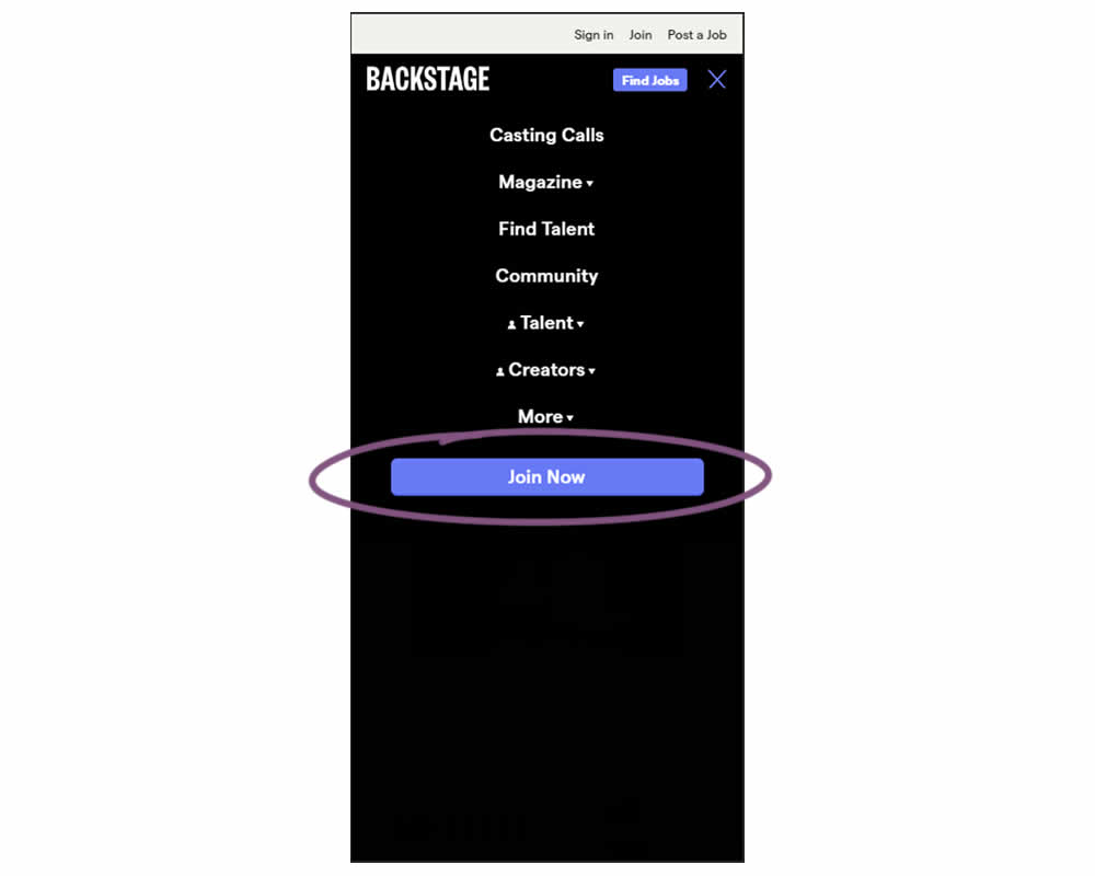
In this experiment, a simple "Join Now" button was added inside an expanded mobile navigation menu. Clicking the button would start a multiple step membership subscription process. Impact on subscription starts and final sales were tracked.
Test #348 on
Flukenetworks.com
by
 Marika Francisco
Apr 22, 2021
Desktop
Home & Landing
Marika Francisco Tested Pattern #97: Bigger Form Fields In Test #348 On Flukenetworks.com


In this simple experiment, the size of the "Get Quote" button in the top navigation was increased.
Test #347 on
by
 Jakub Linowski
Apr 07, 2021
Desktop
Mobile
Home & Landing
Jakub Linowski Tested Pattern #26: Cart Reminder And Recently Viewed In Test #347
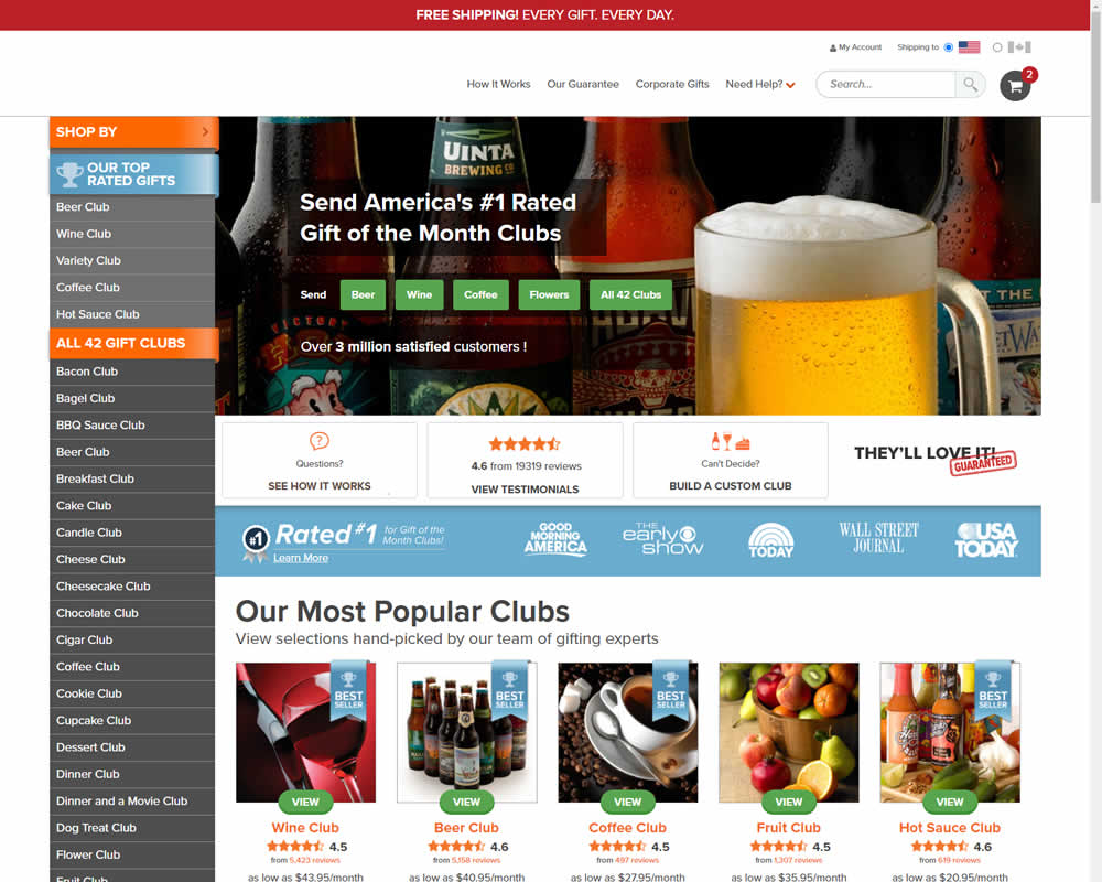
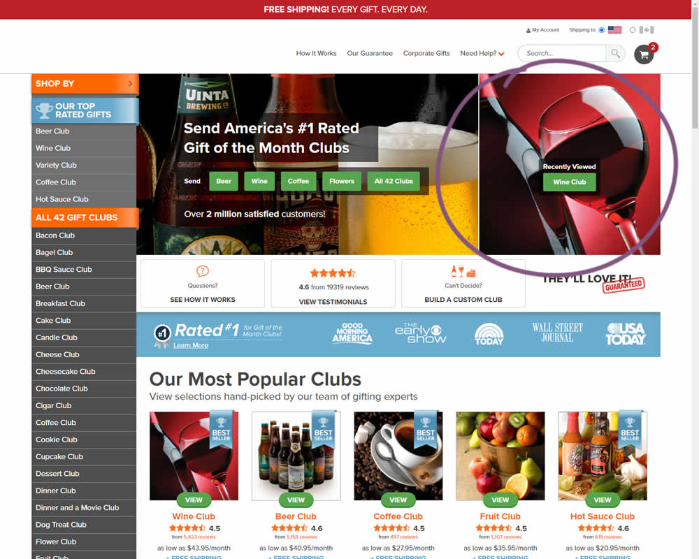
In this experiment, when customers viewed a product and returned to the homepage, they would then see the most recently viewed one - a delicate nudge. The experiment ran with full traffic and impact on sales was measured.
Test #104 on
3dhubs.com
by
 Rob Draaijer
Mar 31, 2021
Desktop
Listing
Rob Draaijer Tested Pattern #15: Bulleted Reassurances In Test #104 On 3dhubs.com
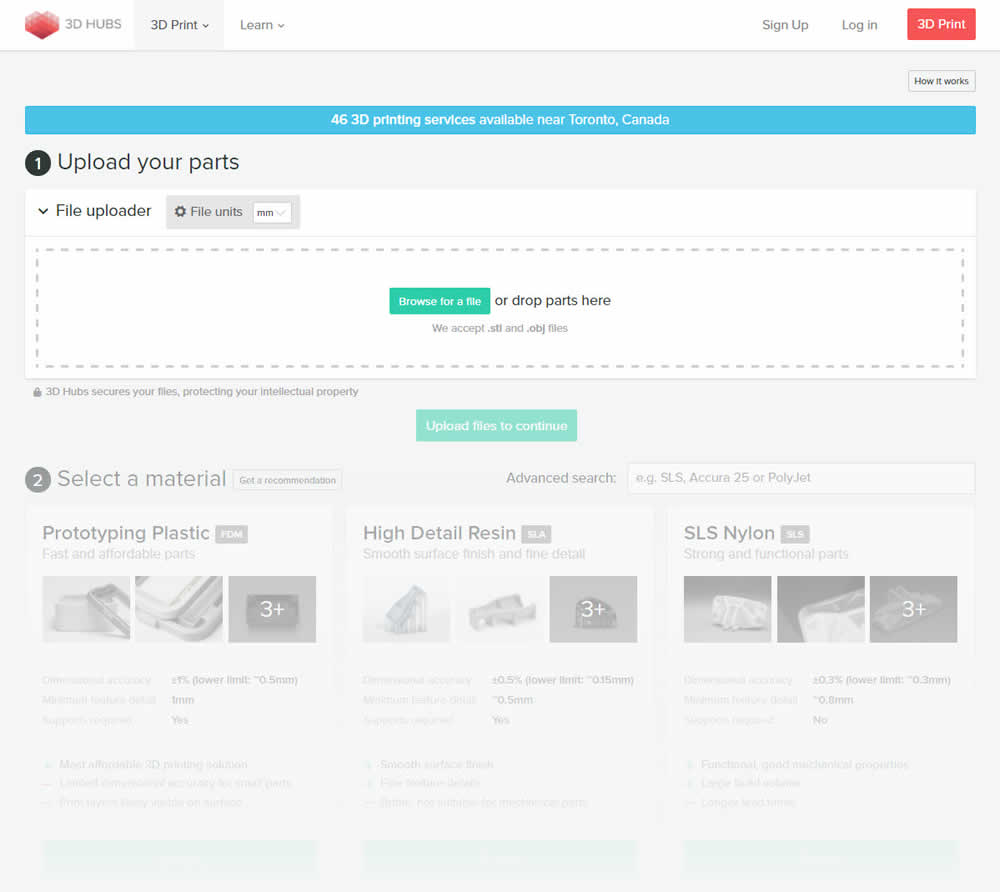
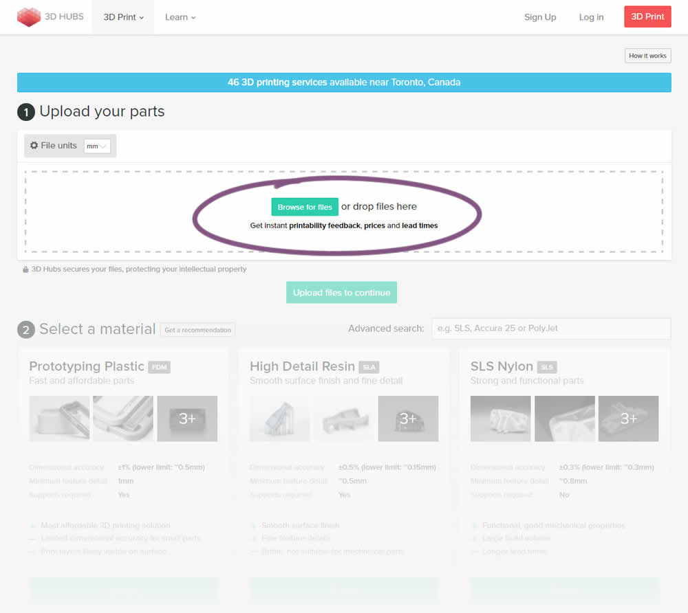
This experiment attempted to increase the number of leads on a lead-funnel. As the first step, users were being asked to upload a file. The control showed the file types that were allowed, whereas the variation changed the copy to show a number of benefits for taking that action. The text-based benefits included the: receiving feedback, prices and lead times.
Test #346 on
by
 Stanley Zuo
Mar 30, 2021
Desktop
Mobile
Home & Landing
Stanley Zuo Tested Pattern #117: Company Logos In Test #346
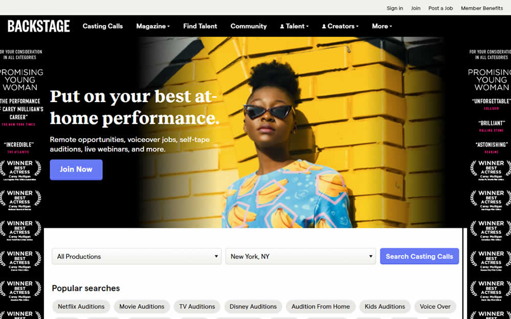

In this homepage experiment, company logos were added to the homepage. These were example clients or companies that Backstage works with and offers casting (job) listing from. Impact on the registration flow and membership checkouts was measured.
Test #345 on
Getninjas.com.br
by
 Rodolfo Lugli
Mar 29, 2021
Desktop
Home & Landing
Rodolfo Lugli Tested Pattern #9: Multiple Steps In Test #345 On Getninjas.com.br
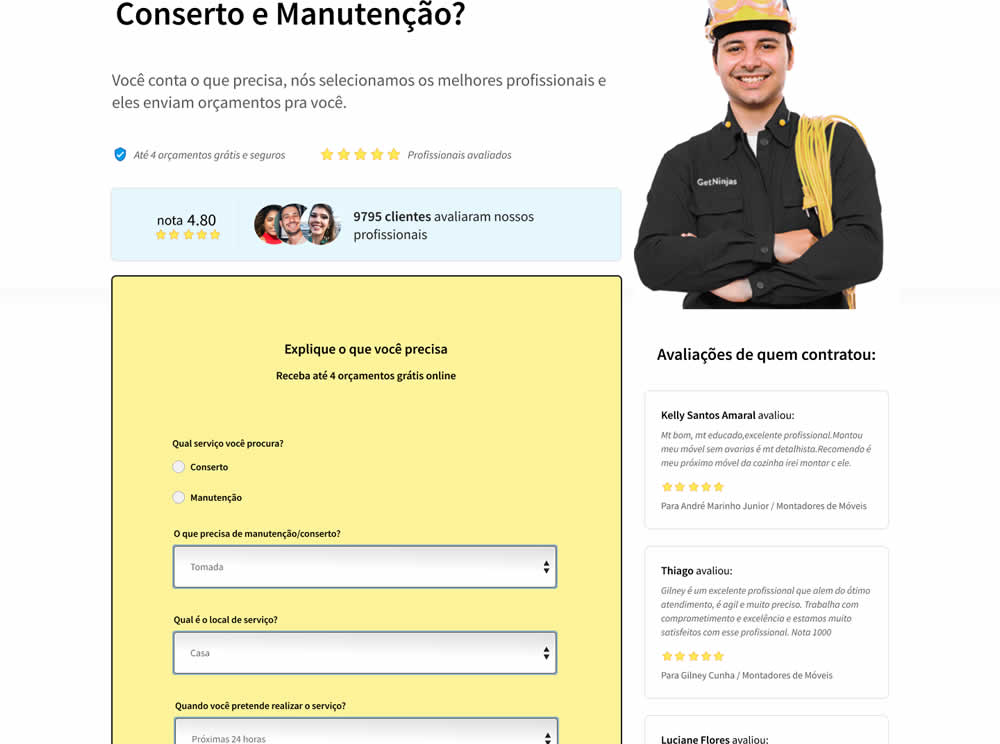
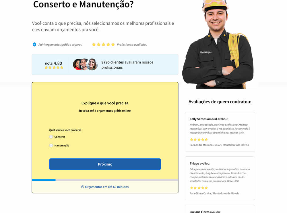
In this experiment, a single long form was broken into at least 3 steps.